Archive for June, 2018|Monthly archive page
University of Brighton School of Art Degree Show 2018 pt 1: dystopia/utopia
 Comments (1)
This year’s review of the degree show is split into three parts: dystopia/utopia, collage, nature and protest.
The academic year of 2017/18 has been a tough one both internal and external to the students graduating this year. Externally, the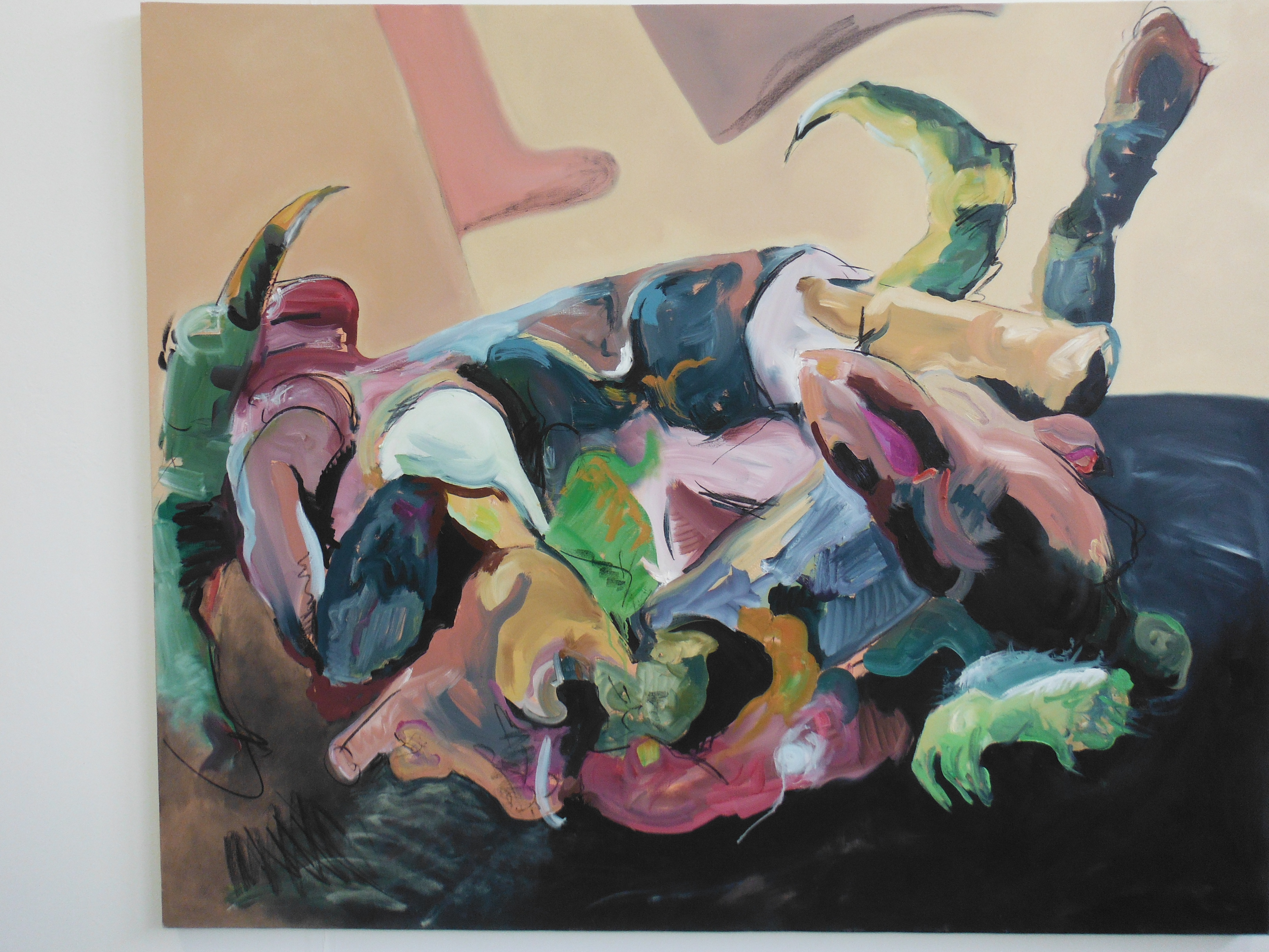 world has turned progressively ugly. Artists have traditionally represented the ugliness of epochs in all of art’s forms: painting, sculpture, textiles, ceramics, etc. It would have been surprising if this year’s graduates had not reflected the external world in their work for this show. A disclaimer here: some of the artists I mention here may dispute my classification; but in the accompanying panels for much of the work, dystopia/utopia kept appearing.
So, for example, Judyta Sokolowska’s work (left) investigates the represention of mould, decay and rot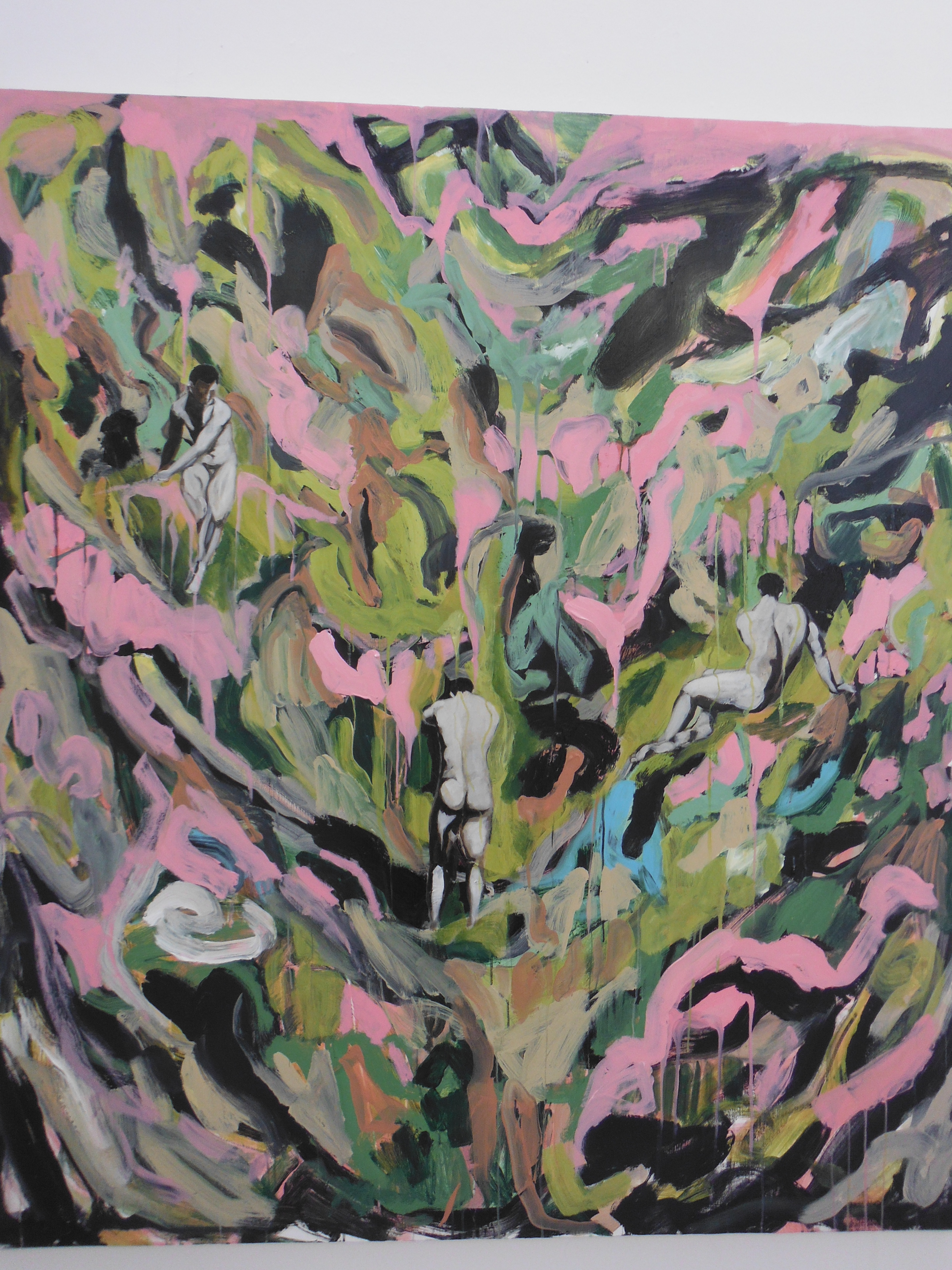 ting flesh on canvas. This is done, admits Sokolowska, because of her sense of our disconnection from nature and recognition of its vulnerability. In the same room one finds the work of Harley Redford (right). Redford’s style, we are told, “conveys the abyss of my longing”. Abyss is a dystopia-type word, even if the self-penned panel continues “the erratic nature of my brush strokes contrast the seductive and more finished presence of the nude male figures in my images. They have the effect of luring you into their own fetishised utopia”. I have to say that I am not entirely sure what that means. But the stylised nude males did it for me.
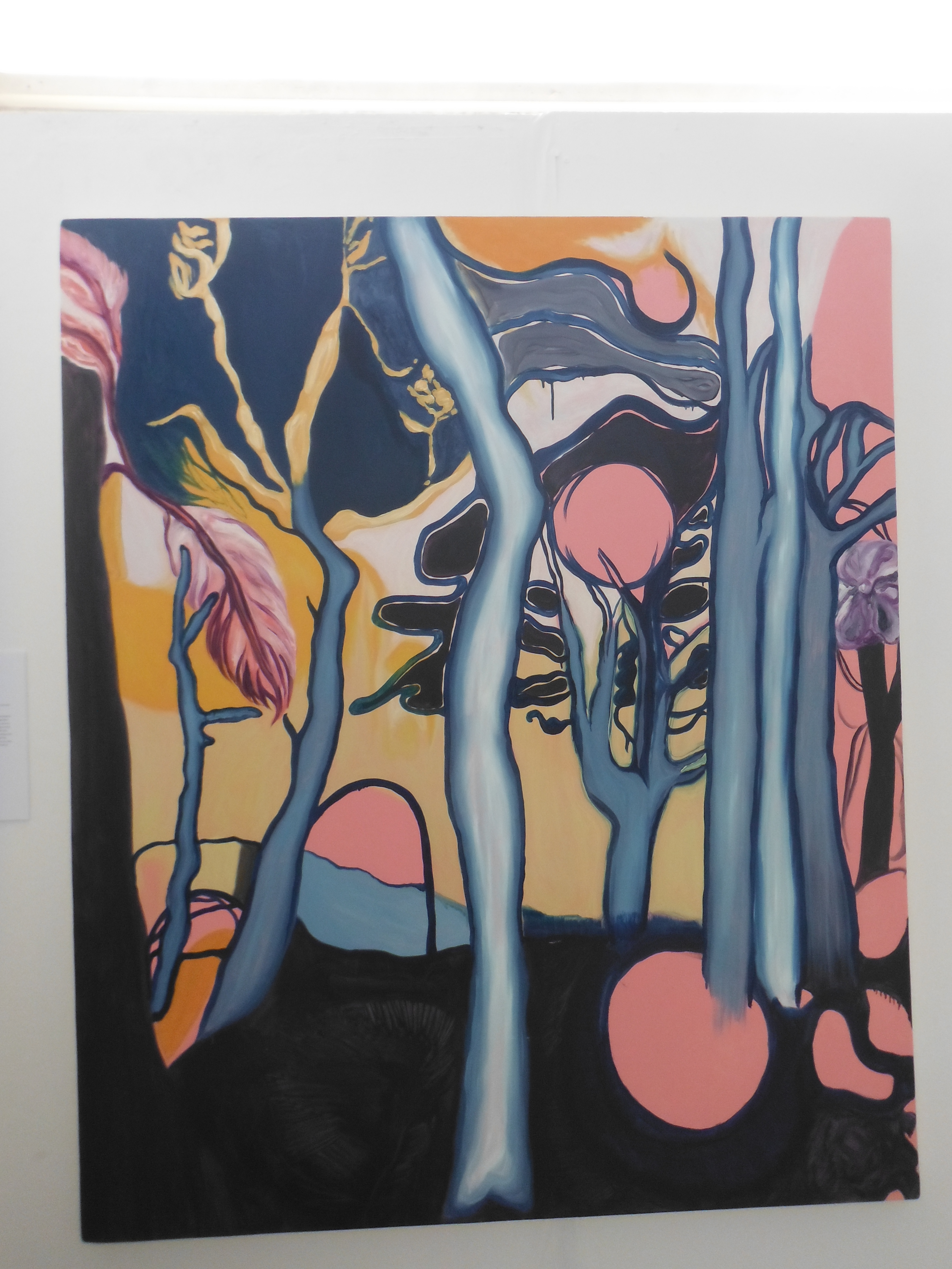 And so to a series of three pictures entitled Endenic by Angelica Pownal (left). At first sight, Pownal’s work is familiar (forest), warm, albeit a shade surreal. Indeed, she says of her work “while my images don’t project any evil, they entice a sadness within the viewer that mirrors the disappointment we all feel as part of the human condition”. A curious thought. Projecting on to us a possibly unwarranted disappointment seems presumptuous. But her method of progressively distorting her original images (using photoshop) beyond recognition is bound to result in alienation and a sense of foreboding.
For my next choice, I’m afraid I have not recorded the artist’s name. However, her artefacts have been created under the title “Bohemian Allegory of Slavic Beginnings of my Journey through Pattern and Form”. The journey in question is the transformation of what was Czechoslovakia between 1973 and 1993. As the artist says, it was a time of communist nomenclatura, propaganda, brutalist architecture in a “post-Prague Spring chaos…before the velvet revolution”. It was an “unsettling” time. The form has, she notes, “hidden meanings”. Whatever they are, they unsettled me. Incidentally, if anyone knows the name of artist, please tell me.
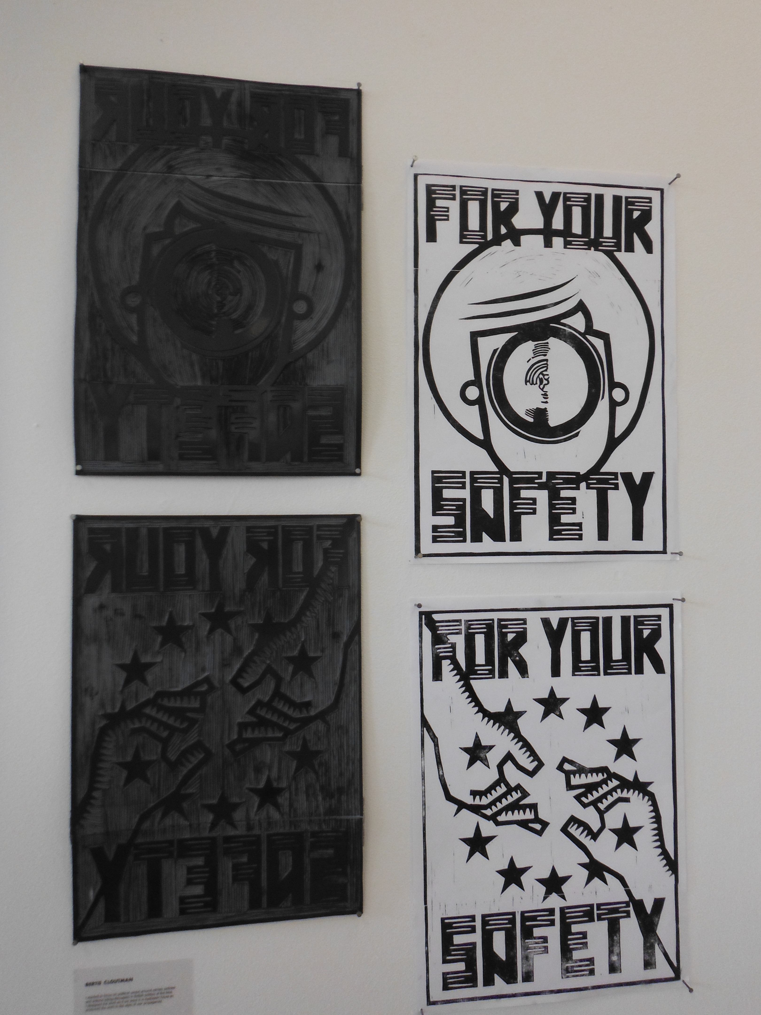 Next comes the graphic design work of Bertie Cloutman. Cloutman’s work, if I understand it correctly, focuses on political unrest around certain policies and represents it as some sort of dystopian future in the style of war propaganda. Mr Cloutman has certainly achieved his aim. I was curious, however, about his mixing of eras and styles and whether these were his view of our collective future or were just his sense of nostalgia.
This has been the year of our waking up to the surveillance capabilities of states (and increasingly corporations). As if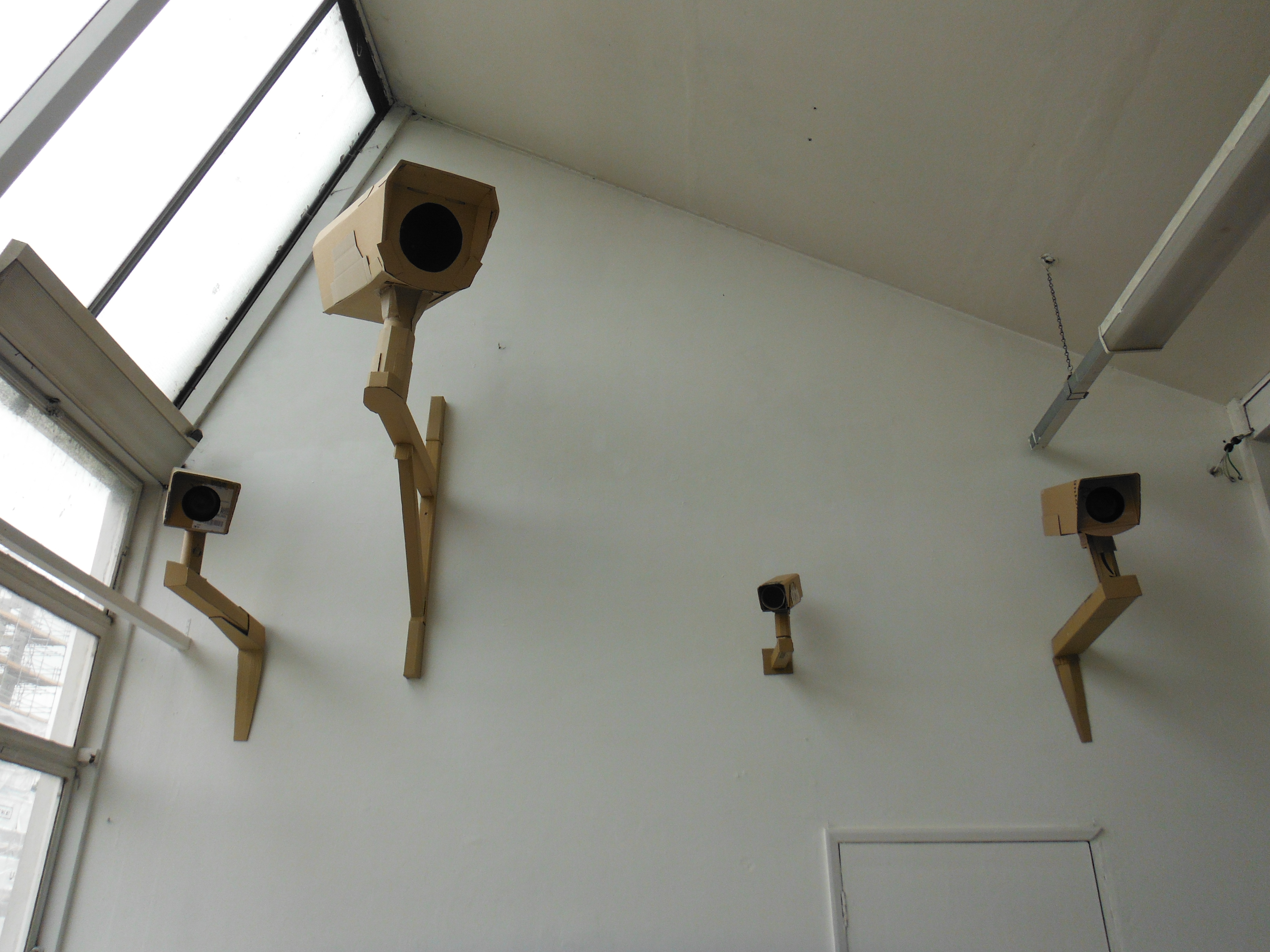 were not sufficiently paranoid already, Tom Cafferkey elevates our “sense of fear” with his quirky but sinister cardboard-sculptured CCTV cameras (right).
Next I turn to the work of Yasmine Amanda Ansari (left) who has catalogued the actions of “The Save Movement” dedicated to bearing witness to the journey animals make to the slaughterhouse. As someone who has spent 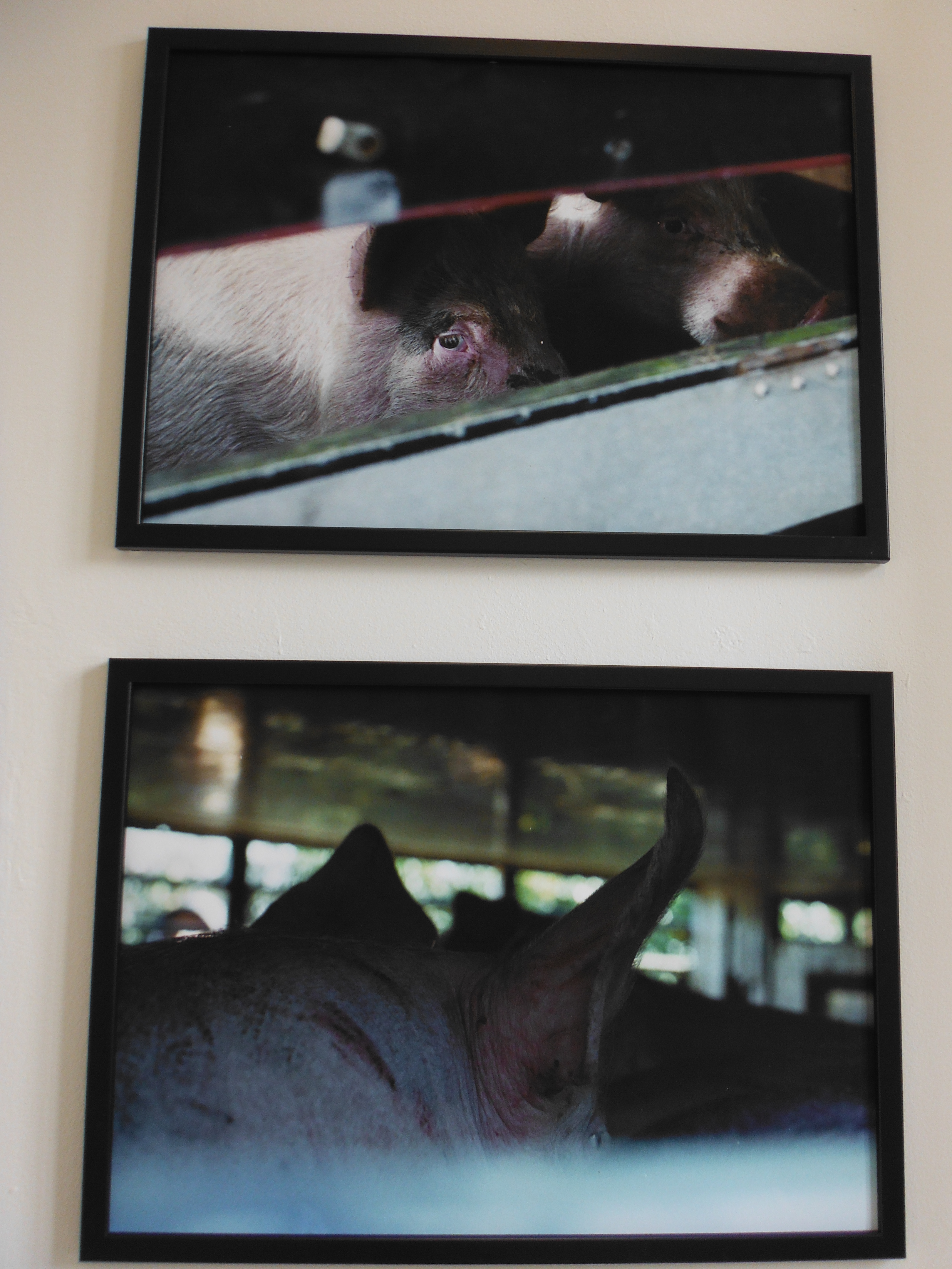 much of his life doing just the same, Ansari’s work is poignant. The photographs are haunting. It is not just the facing death, which my own witnessing tells me is clear to the animals themselves, but the dreadful journey there (physically in trucks, but also metaphorically). I always found the pigs to be particularly aware.
Let me move on to utopias – or more probably the natural world and our place in it. The work that potentially generated the most laughs was the Heath Robinson/Wallace and Gromit presentation by Peter McConnon (right). The premise here is flight. McConnon is a former mechanic with the urge to fly. Most of us would buy an airline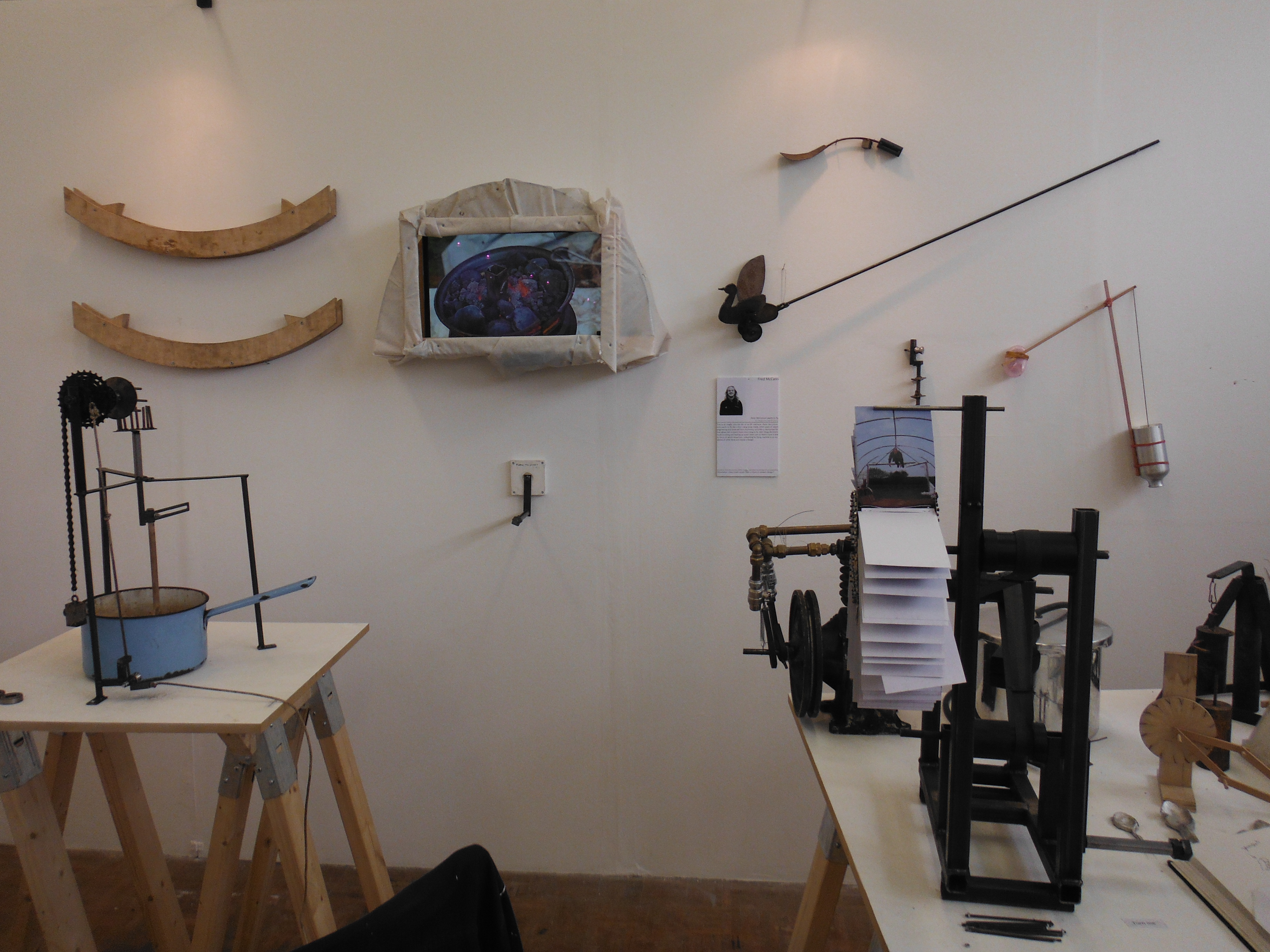 ticket, but McConnon seems to want to do it in a bird-like fashion with flapping wings. He creates a collection of overtly mechanical and unnecessary devices ranging from a mechanical tooth brush, a food stirrer and a bath scrub. There is an accompanying video of McConnon in some sort of farm environment living the life – there is one scene of him sat in a bath being towed by a driverless tractor.
 Next up – my favourite from the textile exhibition – is the work of Ella McGarry. Taking her influence from the work of Charles Darwin and in particular the Galapagos Islands, she has imposed some stunning prints on to swimwear (left), shawls and handkerchiefs.
Not dissimilar is the work of Rosie Rara-Avis with her collection entitled “Planet Bloom”. Rara-Avis is clear about her objective “the collection is derived as a reaction to the world we live in an age of pending doom”. That is first-order pessimism. From that though comes beauty captured in a couple of wonderfully printed jackets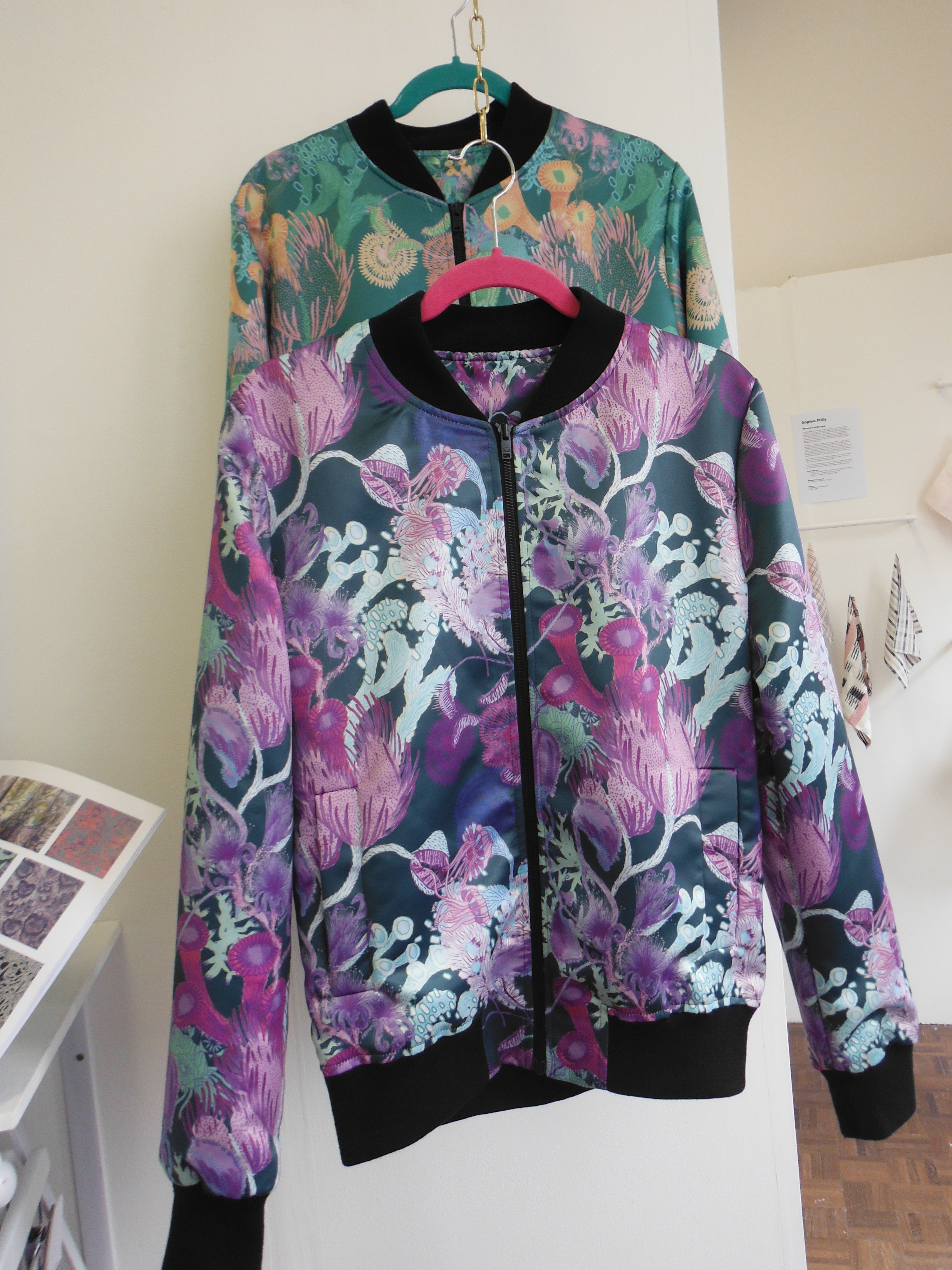 (right).
Finally, two further artists – Antonia Packham and Robyn Edwards. Both create beautiful objects from detritus.  Edwards’ work is entitled “Plastic Planet: An Exploration of Plastic Waste Through Jewellery” (plastic waste is a recurring theme). She has created a number of exquisite items – a little bulky for me (necklaces and earrings, left). But listening to some of the other visitors, there was a collective approval of her designs.
Packham’s collection of artefacts is entitled “Mining the Antropocene”. She creates this material called Plastiglomerate which is a stone formed of sand, wood, shells (natural stuff from the shoreline) cemented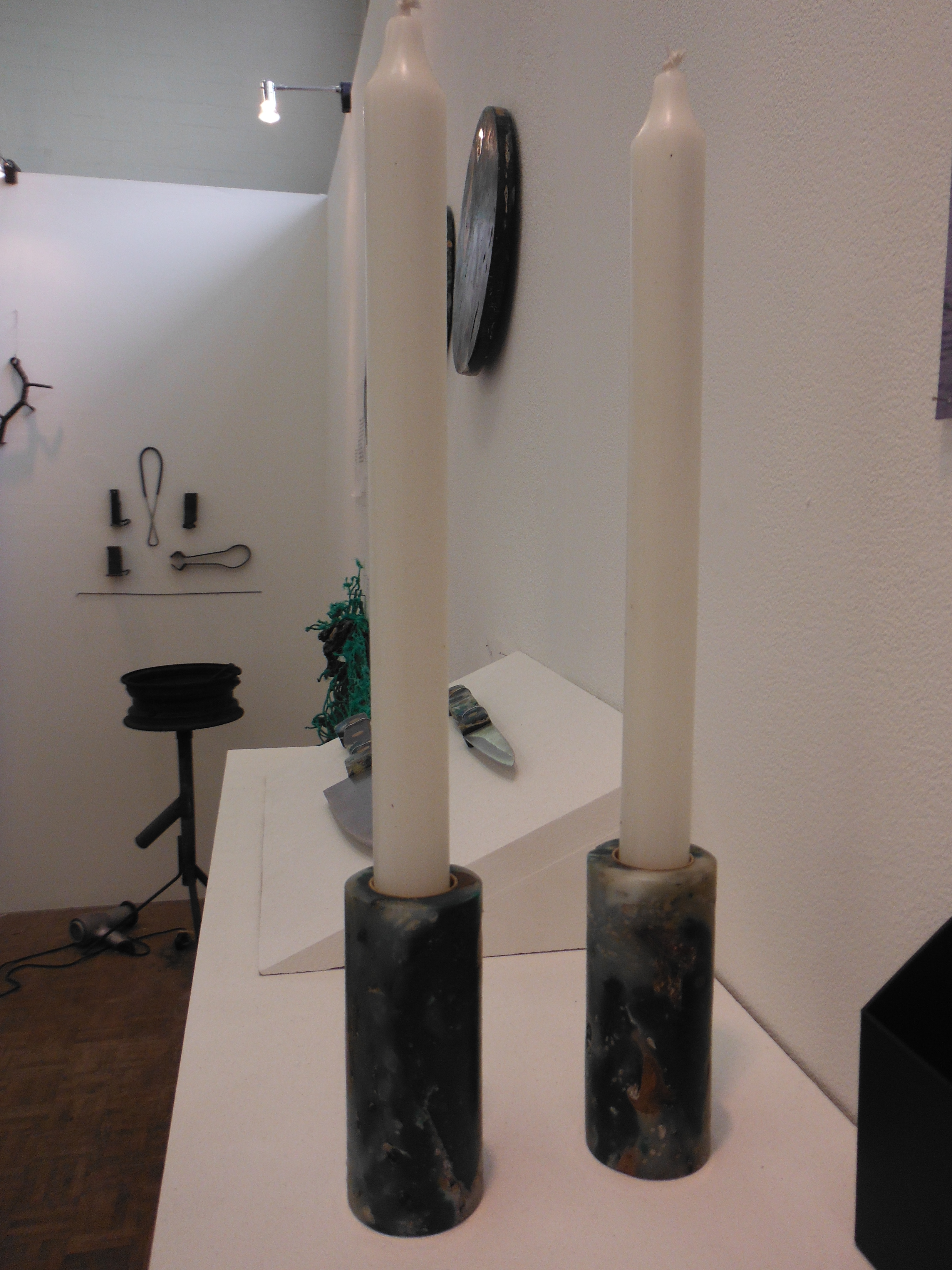 together in molten plastic (unnatural stuff from the shoreline). The artefacts are great. My favourite was the candle holders (right). I’m not entirely sure about the sustainability of process by which they were made, but there you go.
