Archive for the ‘Art’ Category
Amateur photographer
Filed under: Art, education, Photography, Travel | Tags: Brecon Beacons, Humber Bridge construction, Northern College, UEA, university education
 Leave a comment
I probably once aspired to be a good amateur photographer. I remember using my first camera (though I cannot remember what it was) given to me by my father when I was about 10. Roll film was expensive and developing even more. So I did not take too many pictures. But the ones I did reflect something about who I was going to be. For example, I took a picture of a Bristol Lodekker in Scarborough. It can be dated by the advertising – Val Doonican and Dailey and Wayne to 1976 (I was 12 years old). I was fascinated by buses. Actually, I was fascinated by bus systems (I learnt to read the 24-hour clock from a bus timetable).
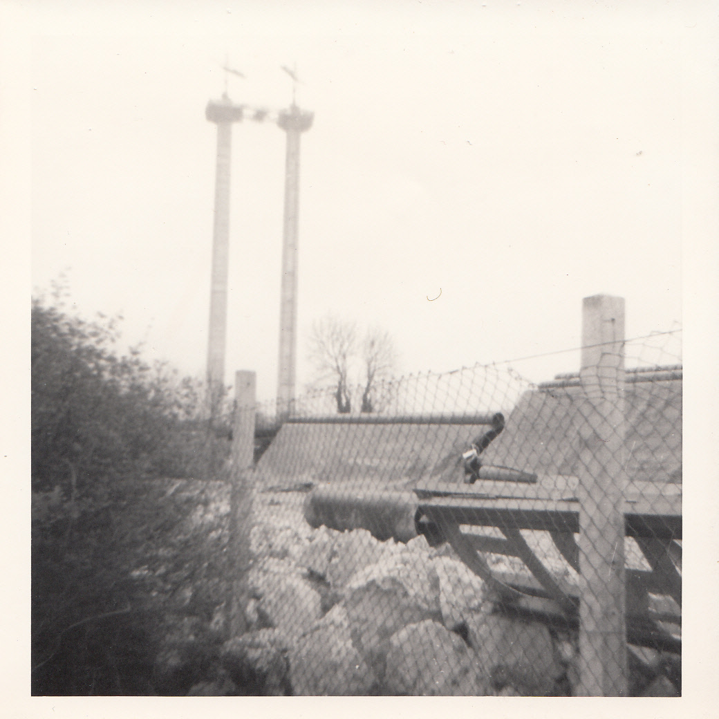
I do wish that I had taken more photographs of my eras. To the right is an incidental picture of the building of the Humber Bridge. This is the tower on the north side of the estuary being erected. It is the only one I have of the actual construction.
I have a raft of pictures of my youth. My time campaigning against animal suffering. These were taken in the days before social media and surveillance. I will not share these pictures; none depict activities that might be seen as unlawful. They are of demonstrations, meetings and social events. But I would not subject my friends and comrades to exposure, however long ago events.
In that period I used a Praktika PLC3 SLR. Praktikas were heavy had 42mm threads. They were not state-of-the-art. Whilst I drooled over Canon and Olympus SLRs, I went for a Praktika because it was not a Japanese brand. At the time I was traumatised by whaling – and the Japanese were some of the worst offenders. It was a protest (though endorsing the GDR at the time was perhaps not any better ethically).
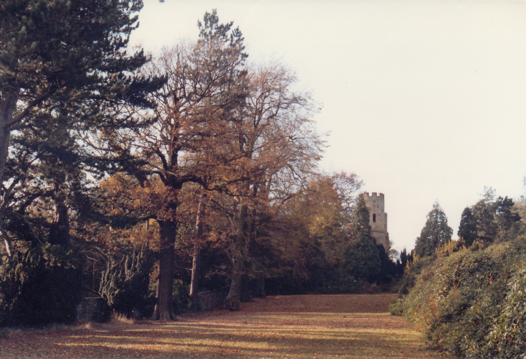
I left it all behind and went back into education. With no A-Levels and I went to Northern College in Barnsley on a scholarship from my trade union, ASTMS (Association of Scientific, Technical and Managerial Staffs). It was a 2-year residential based in a stately home in a valley looking over the M1. It represents a time of great happiness for me – the freedom to study and to be confronted by my arrogance, naïveté and immaturity. The grounds were awesome. The castle in the background is simply a folly. More importantly, just the concept of a 2-year residential studying labour and trade union history blows my mind.
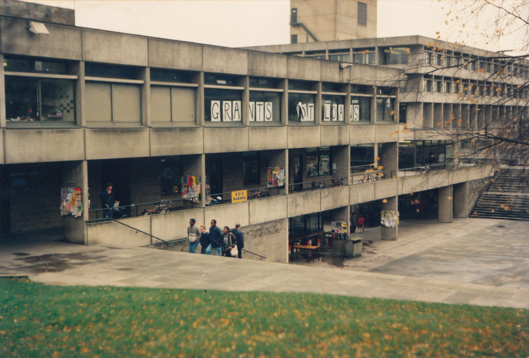
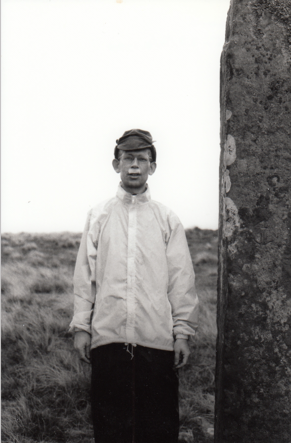
I then went unplanned to Norwich UEA. A brutalist concrete monstrosity. Which I love it for. I spent so much time in the library (which can be seen in the background of this campus square photo). It is autumn 1989. It is a time of student resistance to loans. I now work in a university – I could not have imagined that in 1989. My belief in the value of a university education independent of career opportunities so demanded by governments and policymakers is deeply embedded. It changed my life. It should be allowed to do so for young people today.
After completing my BA, I stayed in Norwich and endured 2 years of unemployment punctuated by life modelling at the nearby art college. That was a dare by a friend who was – and hopefully still is – a very handsome man. In the end he did not pursue it as a career, unlike me. I learnt a lot doing life modelling about how others perceive us/me. Being a life model is tough. Physically. It provided me with some self-confidence and willingness to use my body in protest and for art. For example, I participated in a naked protest against the Iraq War. I was also one of Spencer Tunick’s models when he did one of his famous shots in London in 2003.
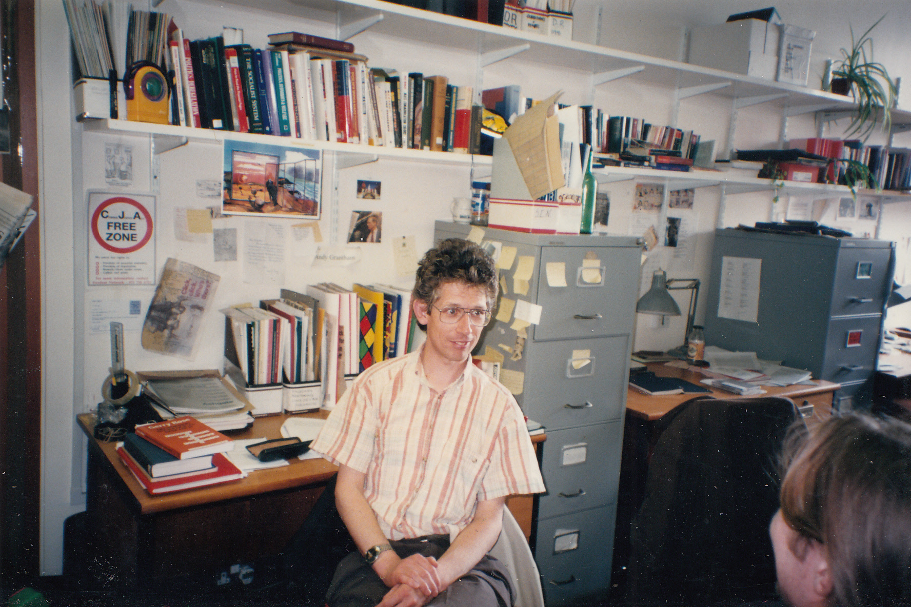
And then on to my PhD studies. This was pre-digital study. No PC. Lots of books and newspaper subscriptions. The newspapers would arrive 2 or 3 days after publication. I needed the Glasgow Herald for my case study. The CJA poster on the wall belies my ongoing life of demonstration. The Criminal Justice Act was an affront to freedom of expression.
Nevertheless, I felt so privileged to have a desk and access whenever I wanted. It was great. Style-wise, I did not have very much. Most of the time I was in jogging pants. In this picture (probably 1996) I was half decent. During this period I met a number of people who became close friends and others, whom I am no longer in touch with, but who showed me kindness and offered support. Again to maintain discreetness, the names are not for sharing. With one friend I shared a number of long-weekend adventures in national parks. We stayed in youth hostels, prepared gourmet meals in the evening and critiqued books afterwards, often to the chagrin of other hostellers. On the books, we agreed to read Penguin classics, partly because they were cheap (a mere
£1) and also because…well…they were classics.
On one of our trips to the Brecon Beacons the weather was awful. Towards the end of our first day I slipped on a rock and went head-first into a stream that had become a torrent. I split my lip very badly. My companion did her best to stick the broken bits together again as I had flatly refused to go to A&E. We never visited Wales again.
The Revenant and The Road back-to-back
Filed under: Art, Reviews | Tags: Film review, Leonardo DiCaprio, The Revenant, The Road, Viggo Mortensen
Leave a comment It is fair to say that I am deeply in my dystopia reading period, but it cannot all be about books. With a few hours “free” I accidentally started watching Alejandro González Iñárritu’s The Revenant instead of John Hillcoat’s, The Road. Easy mistake? But I am glad I did because the contrast is fascinating.
The Revenant stars Leonardo DiCaprio as the leader of a group of fur trappers in the literal Wild West (1820s, Dakota) – not the one I grew up with with John Wayne taking on “Indians”. The trappers are guilty of colonising both land and people. In fact the daughter of a chief was kidnapped and, if I understand correctly, ended up being the wife of Glass, DiCaprio’s character, and giving him a son who is, essentially, a trapping apprentice.
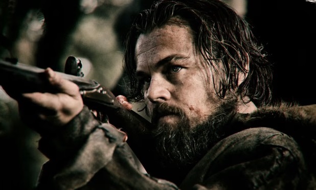
The film opens with an Arikara ambush on the trappers. There is gore. A few of them escape on a boat and then trek for quite some time back to the base trading post, Fort Kiowa. But on the way Glass found himself at the end of a grizzly bear’s temper (he is tracking her babies). She mauls him in a graphic 5 minutes of CGI realism. The injured Glass slows the progress of the trekking. It is agreed that one member of the team, John Fitzgerald, stays behind (along with the son, Hawk, and one other young trapper, Jim Bridger) to give him a Christian burial when he eventually dies. And to get paid for it. Fitzgerald is not patient and tries to speed up Glass’ passing. When caught trying to Euthanise him by Hawk, Fitzgerald kills him. He then partially buries Glass and takes the other boy with him.
Glass, however, not only remarkably and improbably survives, but witnessed the murder of his son. The will to survive, then, is driven by revenge. It becomes a classic Western with a familiar denouement. The improbability comes from scenes of self-surgery, extreme cold and wet. Some scenes resemble Bond movies with extended fight scenes. It is immersive, though. One feels the cold oneself. And the dirt is ground in. Notwithstanding the Western theme, this is a story, too, about nature. White humans exploiting it (in contrast to the native Americans). Certainly in that period, nature was to be tamed. A concept that is so familiar to us in the 21st Century. The problem with the movie – and one of the reasons I stopped watching them – is that the underlying narrative is that with enough will, nature can be tamed and overcome. It is fantasy.
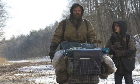
Whilst the backdrop to The Revenant is white colonialism, The Road is white decolonialism caused by some environmental catastrophe that ends civilisation. We never get to know what it is, but whatever it is it blocks out the sun so nothing grows. The whole point of existence becomes survival. The road in question is one followed by a man and boy (neither have names) to the coast on the assumption that there is a better life there. Though with no certainty. The passage is hazardous as one route to survival is cannibalism. I was not prepared for this, but I am constantly reminded that food security has been compromised by globalisation and the outsourcing of production to strangers in far away places. We are closer to “cannibalism” than we care to imagine. The Road reminds us that when hungry, people will do anything to survive, even eat one another. At least in the Revenant, food can be scavenged after the wild dogs have taken down a buffalo. In The Road, there are no animals to be scavenged, and by the time Man and Boy are on the road, all the shops and houses have been completely stripped.
In The Road, nature has taken back control. There are no blue skies. It rains relentlessly. The sea is grey. Man in pursuit of protecting his own son is prepared to kill – or bring on the death of strangers. The only compassion comes from the boy. Only the boy wants to share the food they have (accidentally found) with strangers who are equally hungry. The boy can see the transition from being the good guys – defined in terms of not eating others – and the bad guys who do. We are given few signs of hope. The discovery of a live beetle is but one.
After watching the films, I then read the reviews. Peter Bradshaw in the Guardian went as far to say that films like The Revenant are the reason he is a film critic. This was balanced by Carol Cadwalladr’s description of it as “meaningless pain porn“. Maybe that is why she no longer is employed by the Guardian/Observer and Bradshaw is? Bradshaw was less impressed by The Road, saying “I can’t fully share the critical enthusiasm it has widely gained elsewhere because of what seemed to me its fractional reluctance to confront the nightmare fully, though what Joe Penhall’s adaptation arguably does is import into the body of the movie a premonition of the unexpectedly redemptive and gentle tone in McCarthy’s final pages.” I have not read McCarthy’s book and it is not currently on my reading list. But frankly, another scene of cannibalism was not going to make this a “better” film. And like in The Revenant, women remain particular victims. It is they that try to protect the children and in so doing fall victim to hungry men who are, in all probability, responsible for whatever catastrophe caused the fall of civilisation in the first place.
What unites these two movies is the will of men to survive. Glass wants to survive only to avenge the death of his son. Man wants to survive because…we do not give up. There is a better world somewhere. All we have to do is find it. This is also a bit of a strange idea. I implore my students to leave the university and make the world a better place. I don’t say, go on a journey and find a “better” place. For a reason.
Florence – the Grand Tour, November 2025
Filed under: Art, Hotels, Museums, Travel | Tags: Florence, Florence Dome, Galileo Museum, Uffizi Museum
Leave a comment 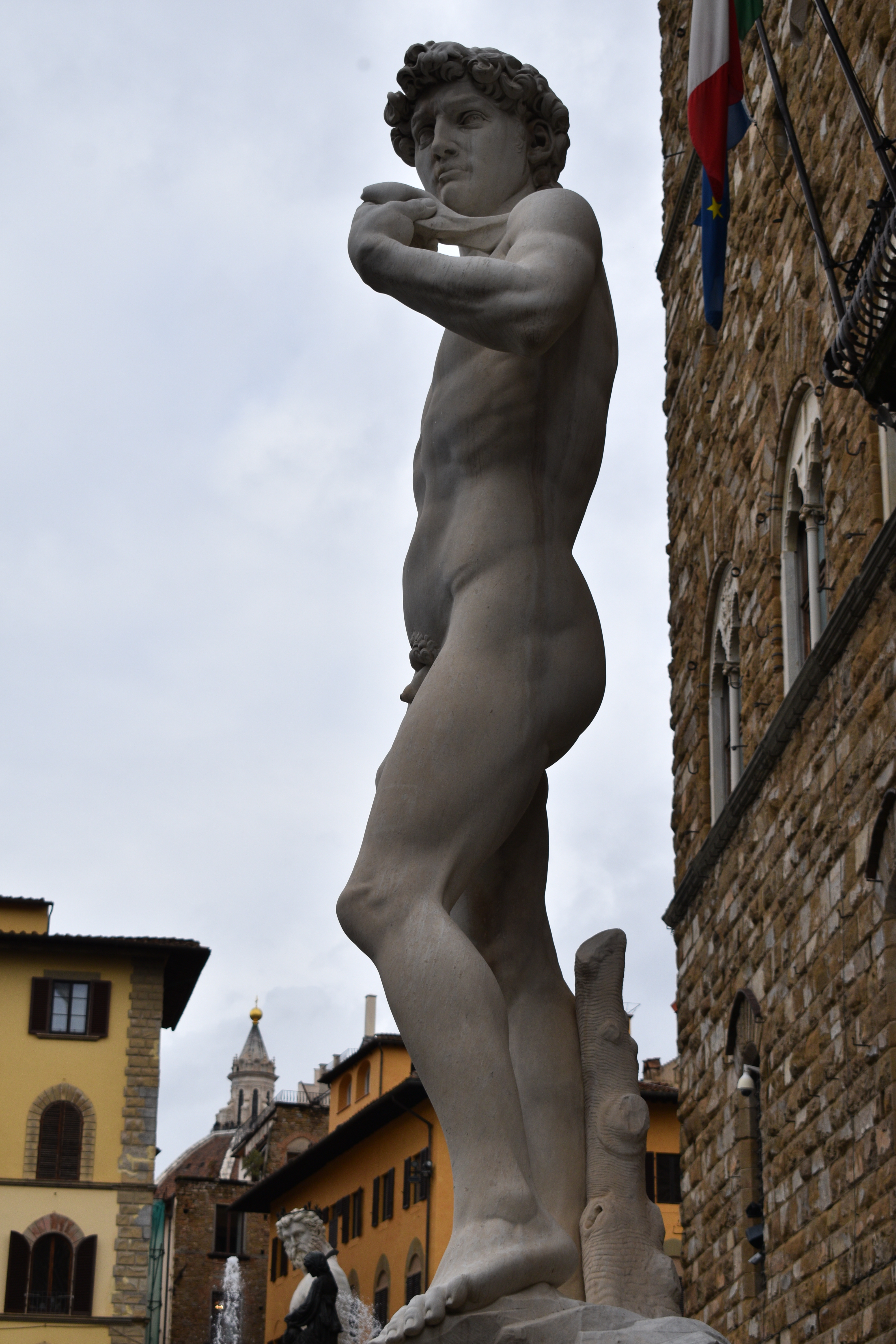
It is clearly about time. Florence. The Renaissance. History. So, we did it. Monday by train from Munich. Saturday back. We stayed at the Novotel near the airport (see below).
Day 1 – wandering around. Florence is one of those places that if you do wander around you are likely to see everything that is free. Including the reproduction of Michelangelo’s David, left. The original is in the Glleria Dell’Accademia di Firenze and has an entry fee.
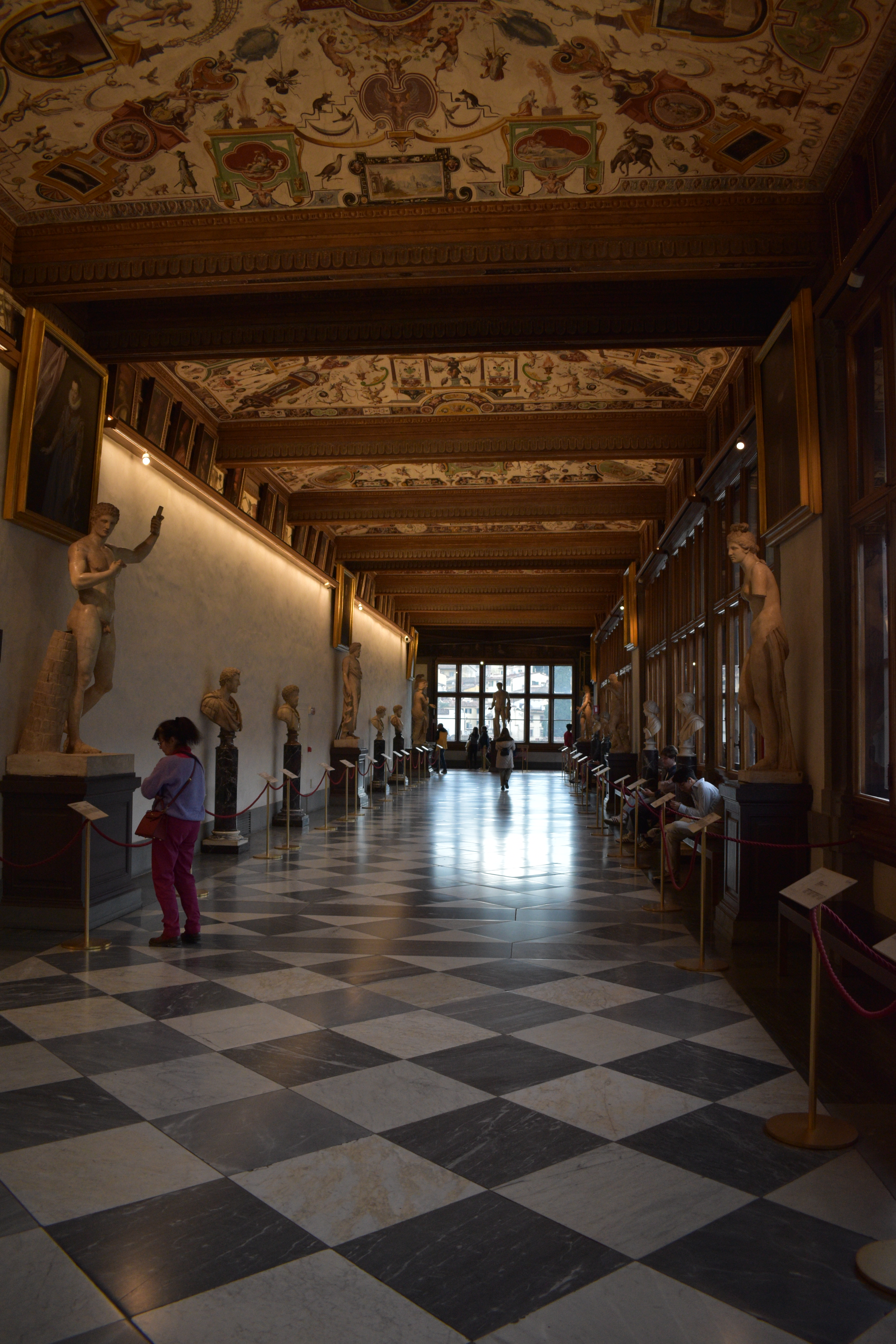
Day 2 – the Uffizi gallery. We must go and see Venus at the very least. And the Botticelli pictures more generally. It is a strange gallery. Note that it has ultra-strict security since the bomb attack in 1993. But basically, it is a rectangular building with small galleries off a corridor (right). The building itself dates from 1581. The upper floor is the gallery that comprises a corridor adorned with sculptures and frescoes. It is actually quite difficult to see all of this art without laying on one’s back. And so one wanders around taking in what the senses can appropriate.
There are unexpected surprises such as a smattering of Mannerisms, for example, Portrait of Gabrielle d’Estrées with one of her sisters, Bathing. This image is mischievous but also representative of a mannerist depiction of feminine beauty and fertility. Just oddly included in the collection.
Florence is not complete without the arrival of Caravaggio and his followers with some gruesome depiction of decapitation or similar. The Uffizi does not disappoint offering a themed gallery with my favourite being the Judith Beheading Holofernes by Artemisia Gentileschi. I suppose these pictures very much reflect Renaissance Florence, certainly somewhere violent enough for one’s head to be removed from one’s shoulders without too much effort. Though interestingly conducted by women.
Is the Uffizi a great gallery? It does have a remarkable collection. But I have to admit, I got a bit bored. It would benefit from an edit (I know that it is carefully curated, but…) largely because of the period. There is a lot of replication. Arguably the visitor could do their own edit ahead of time. Though let me put it this way, it is not the Louvre.
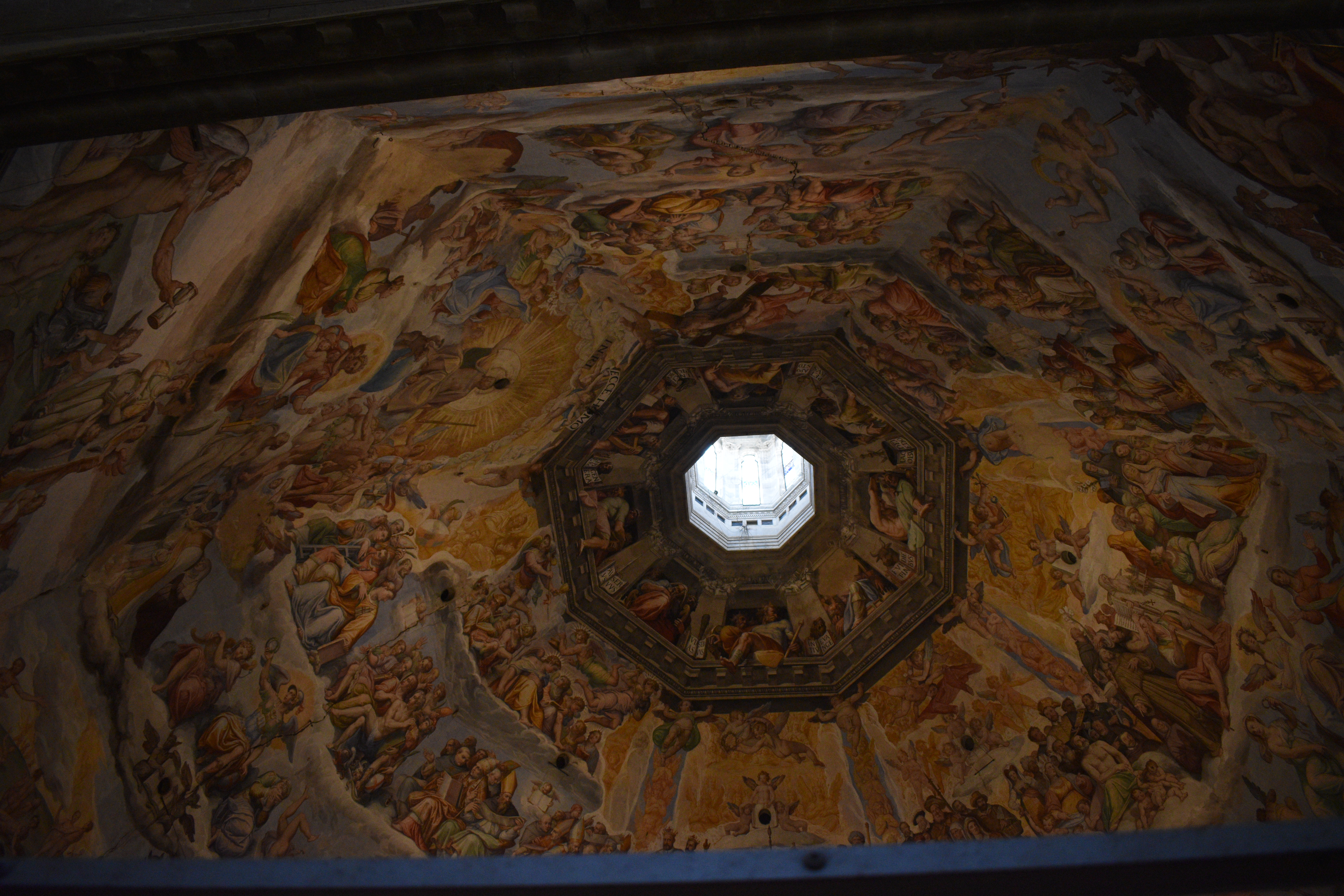
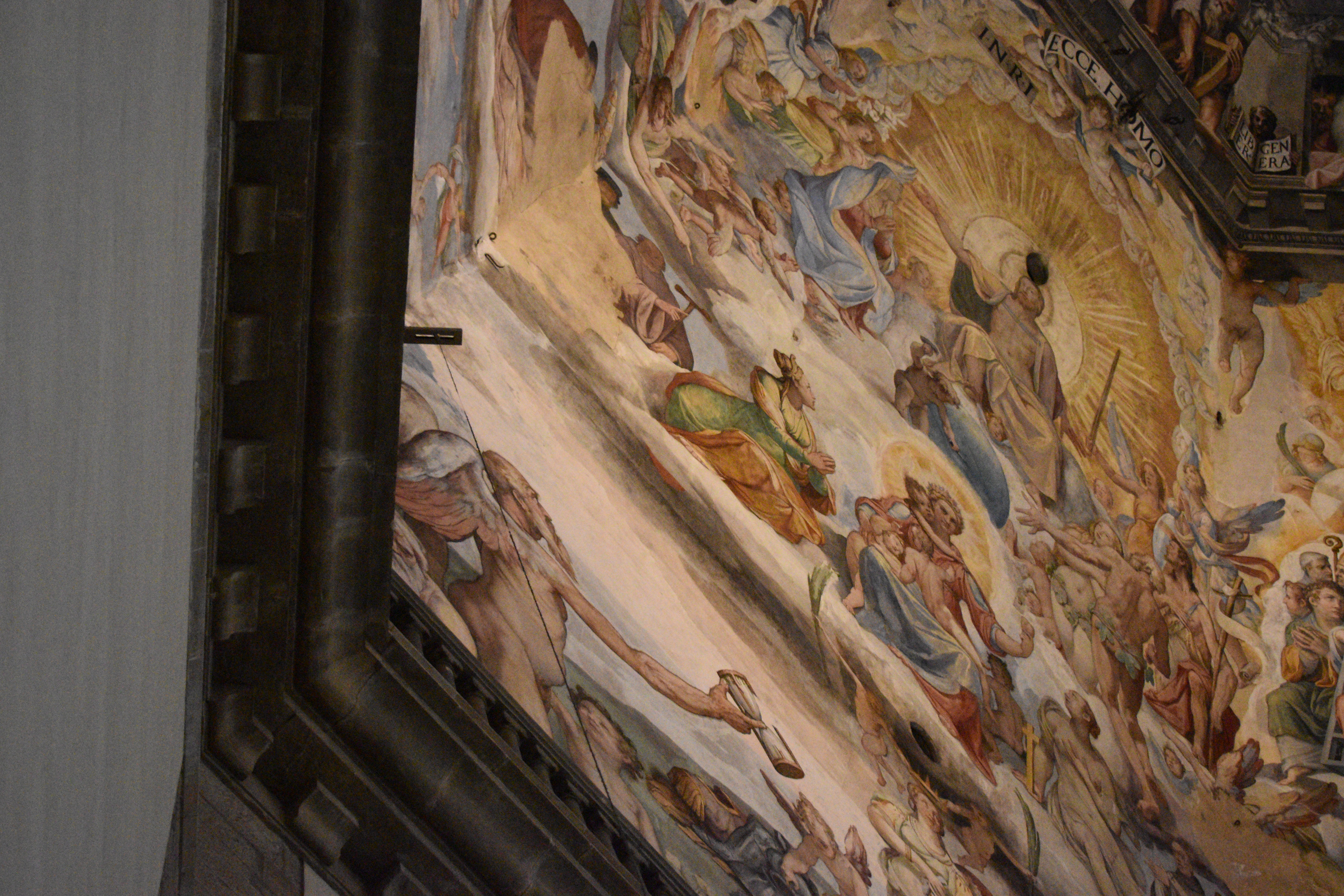
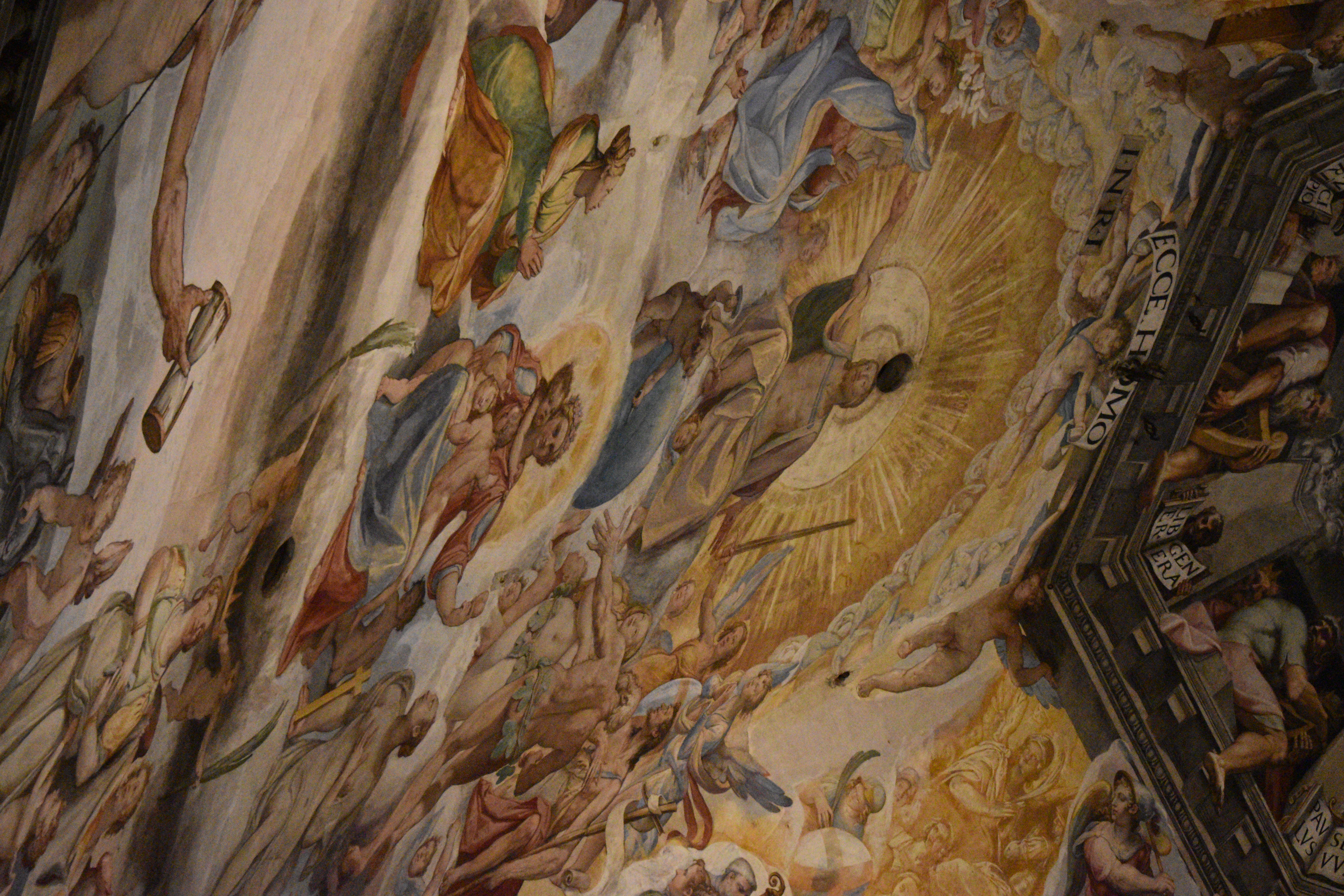
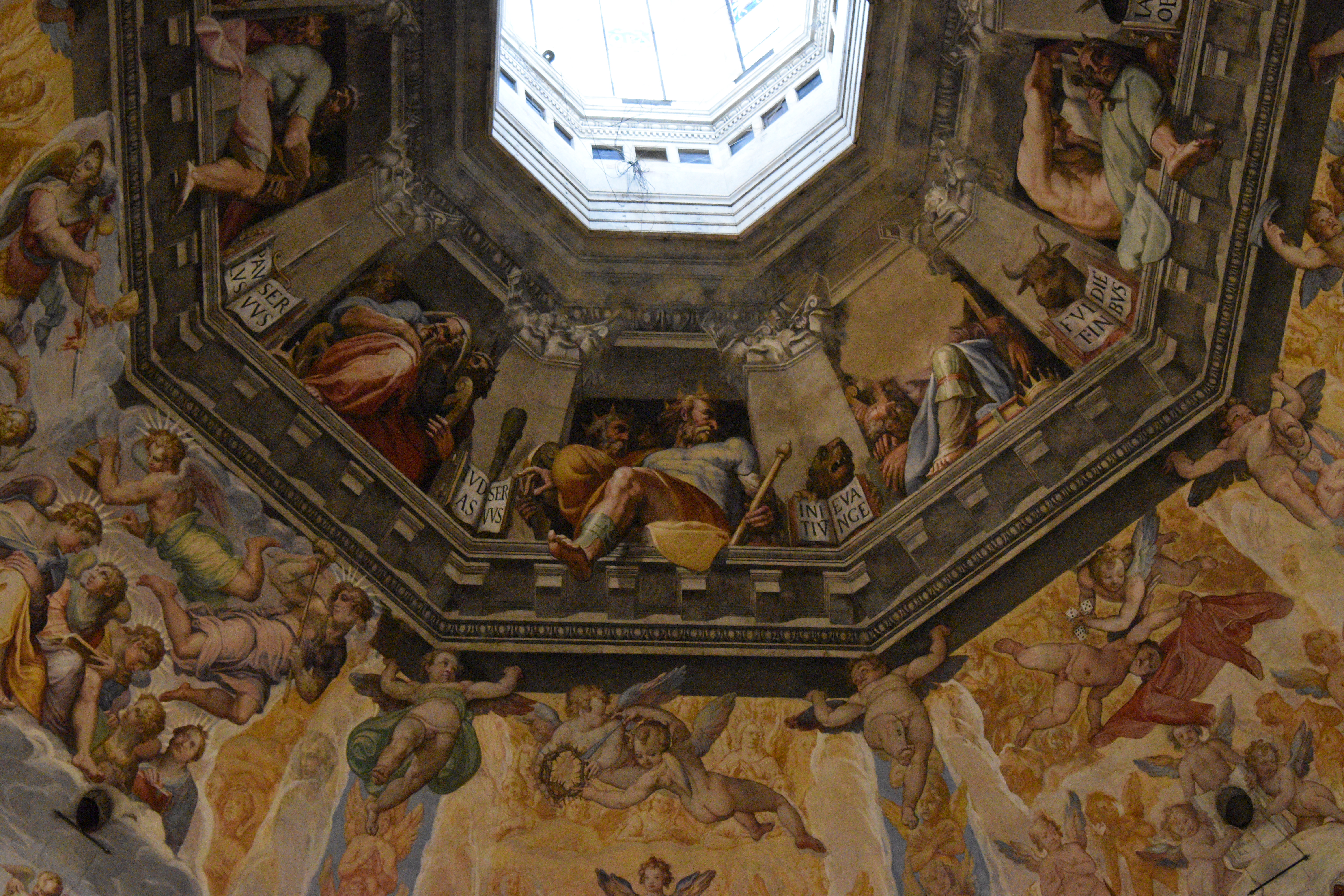
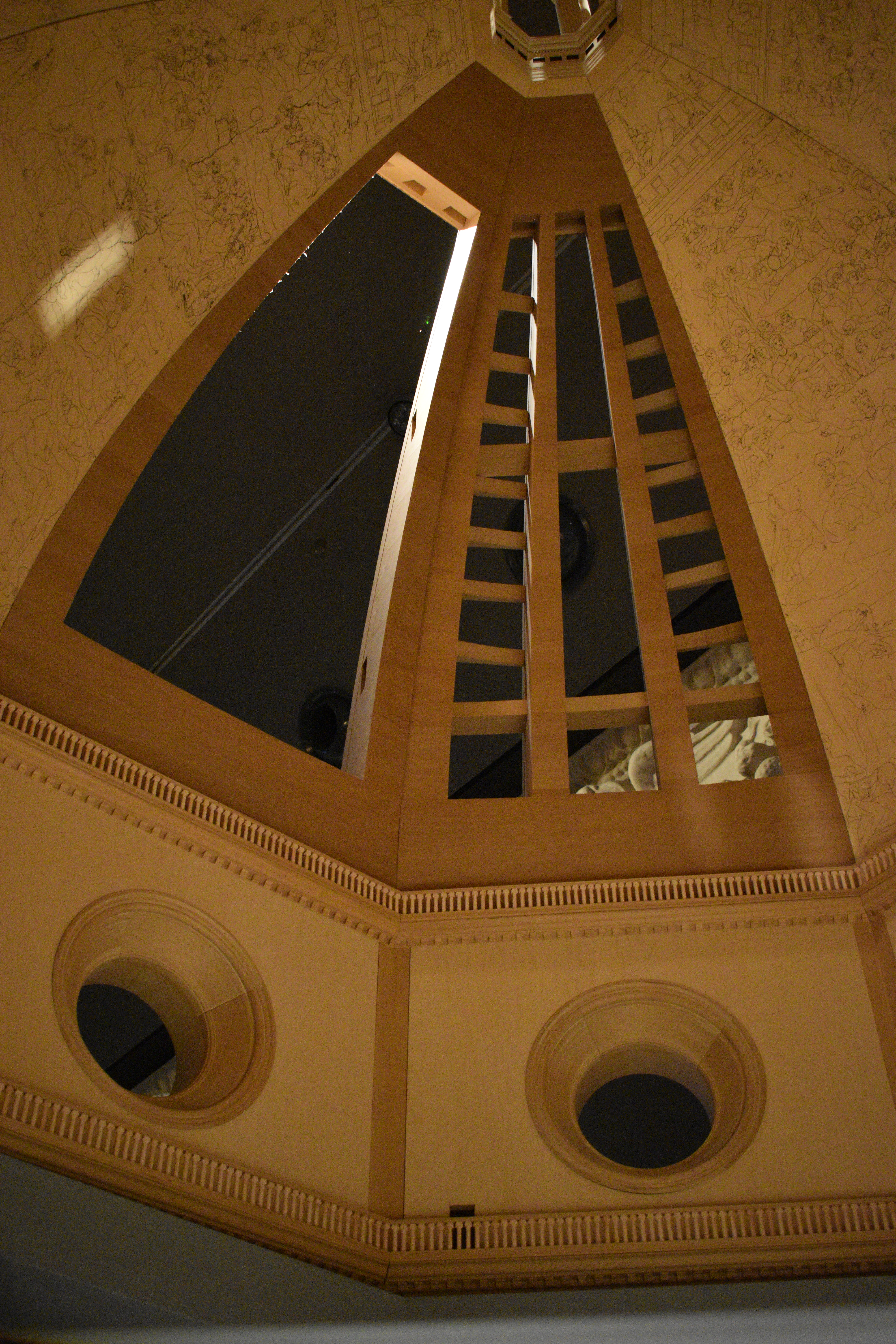
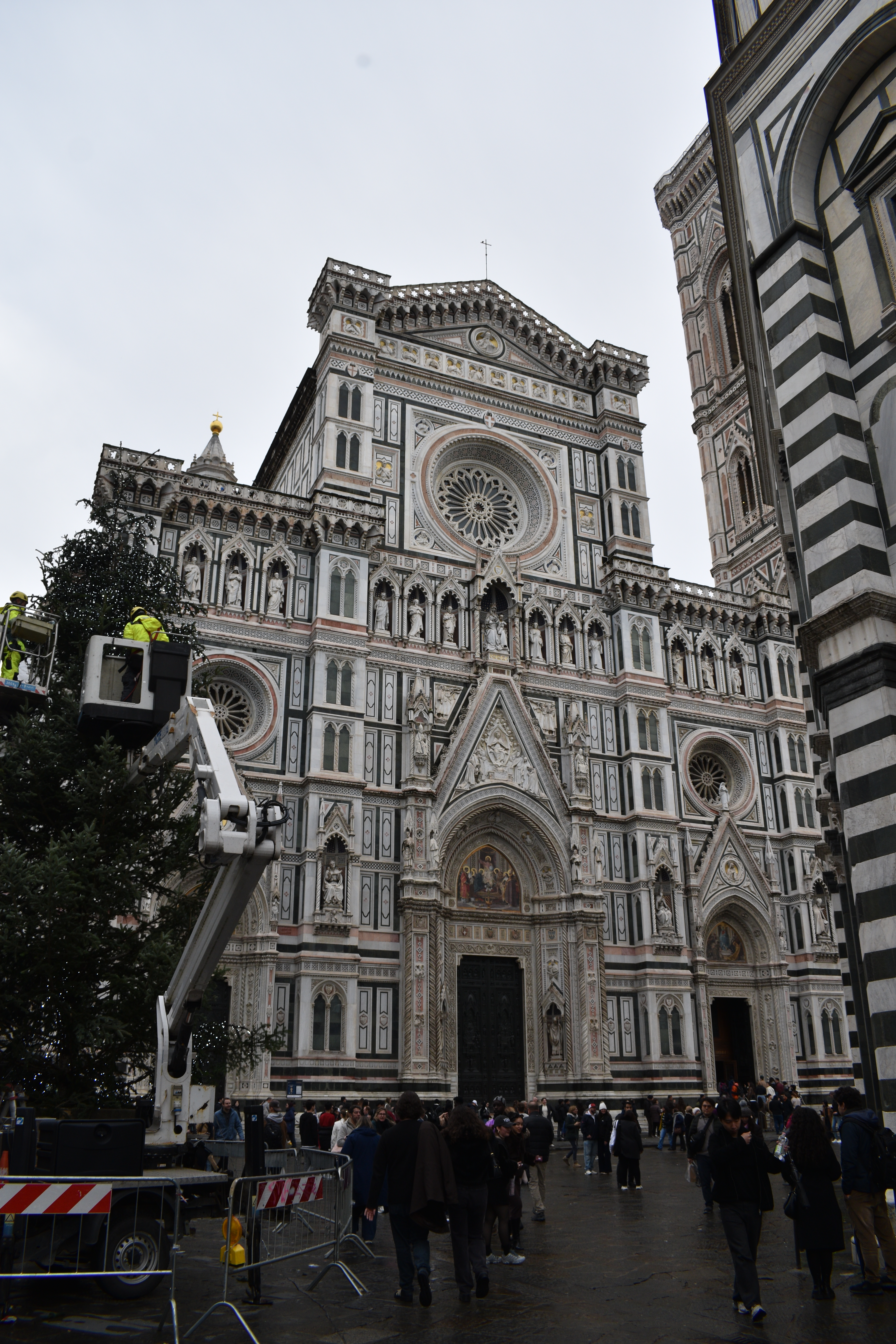
Day 3 – we must go to the cathedral (Cathedral of Saint Mary of the Flower) and climb to the top of the famous and unique dome. There are three compelling reasons to do this. First, the roof frescoes cannot be appreciated fully from the ground. Part of the way up the climb to the summit, one gets to walk around the base of the inside of the dome and almost touch them (see gallery below).
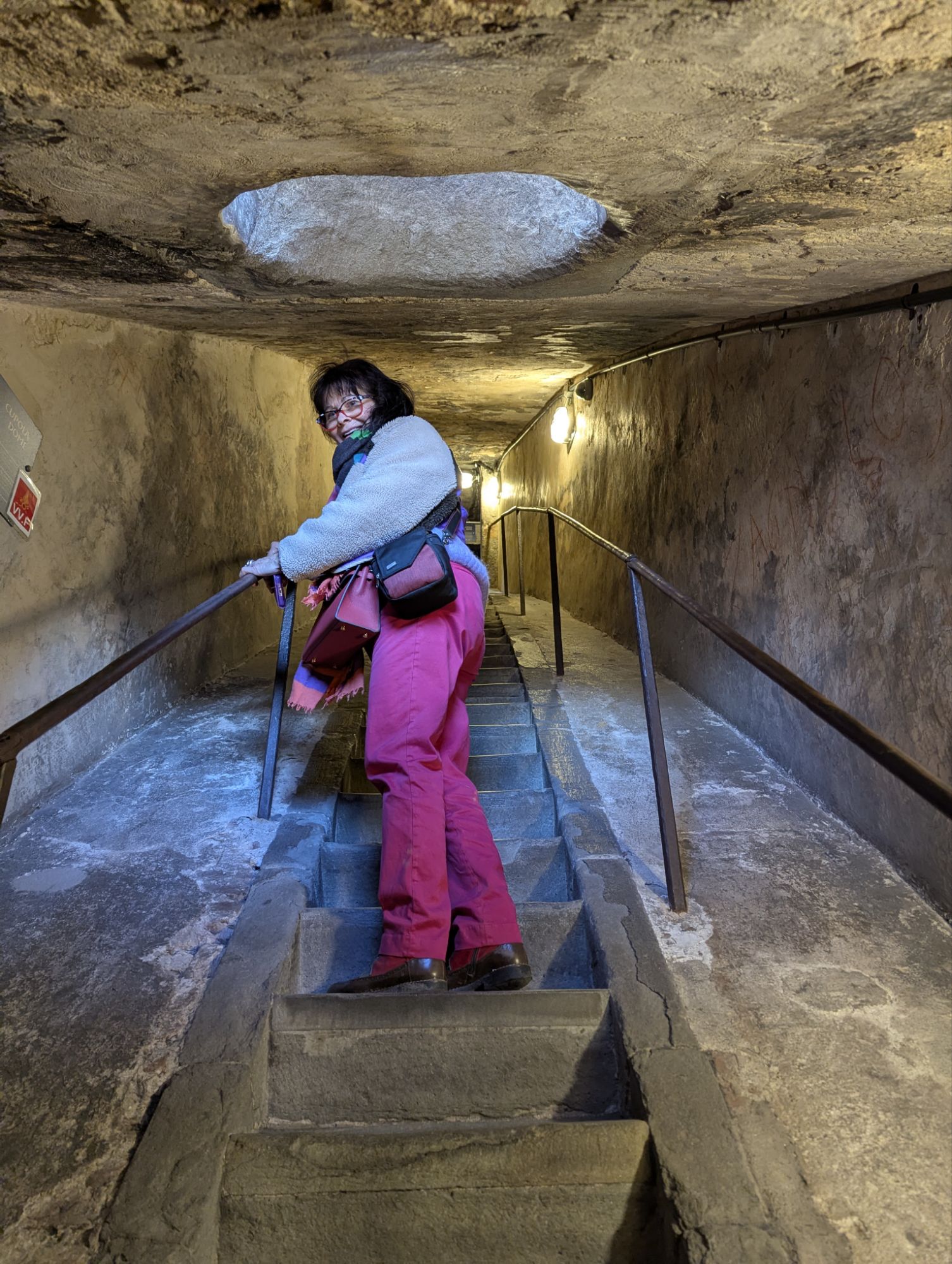
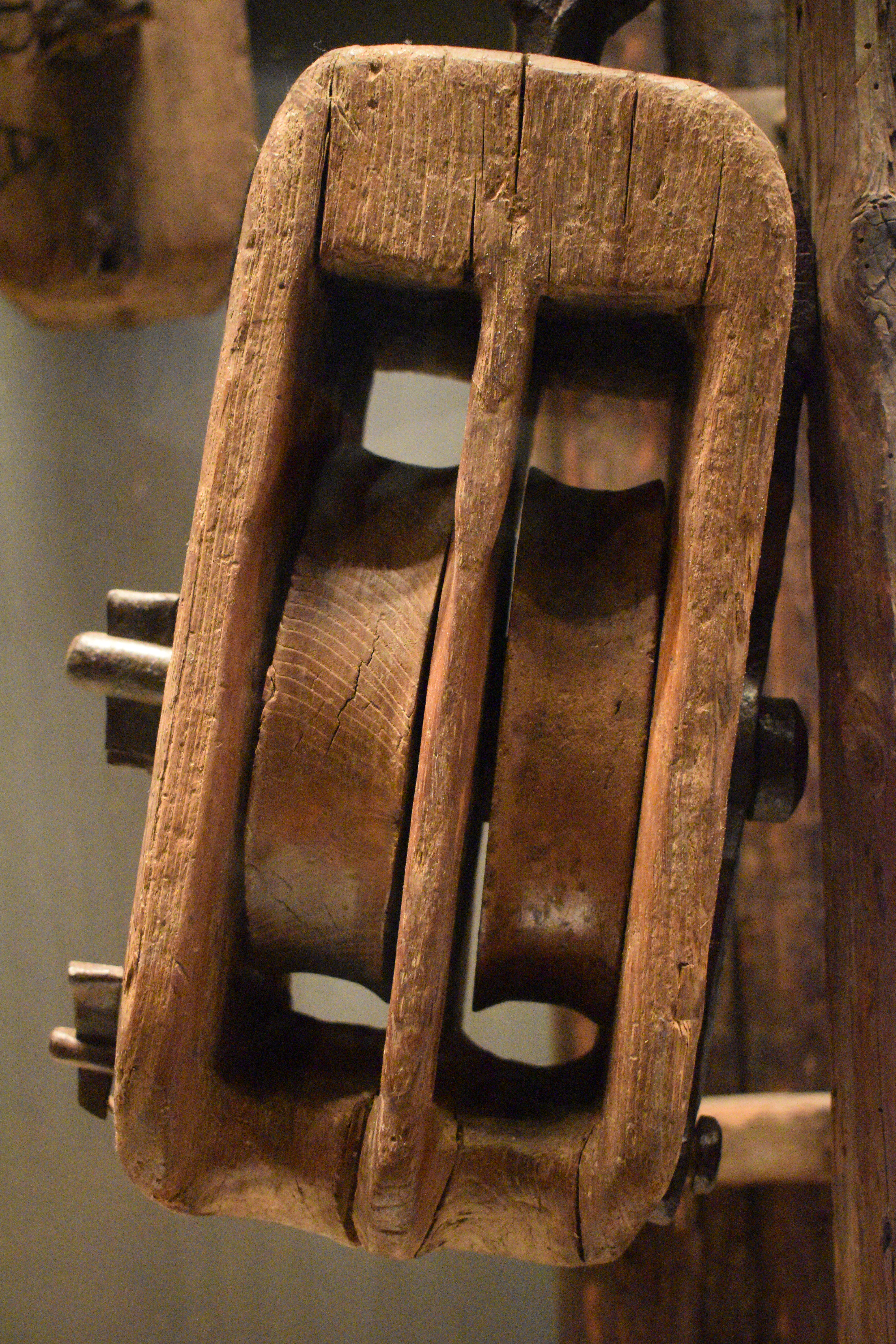
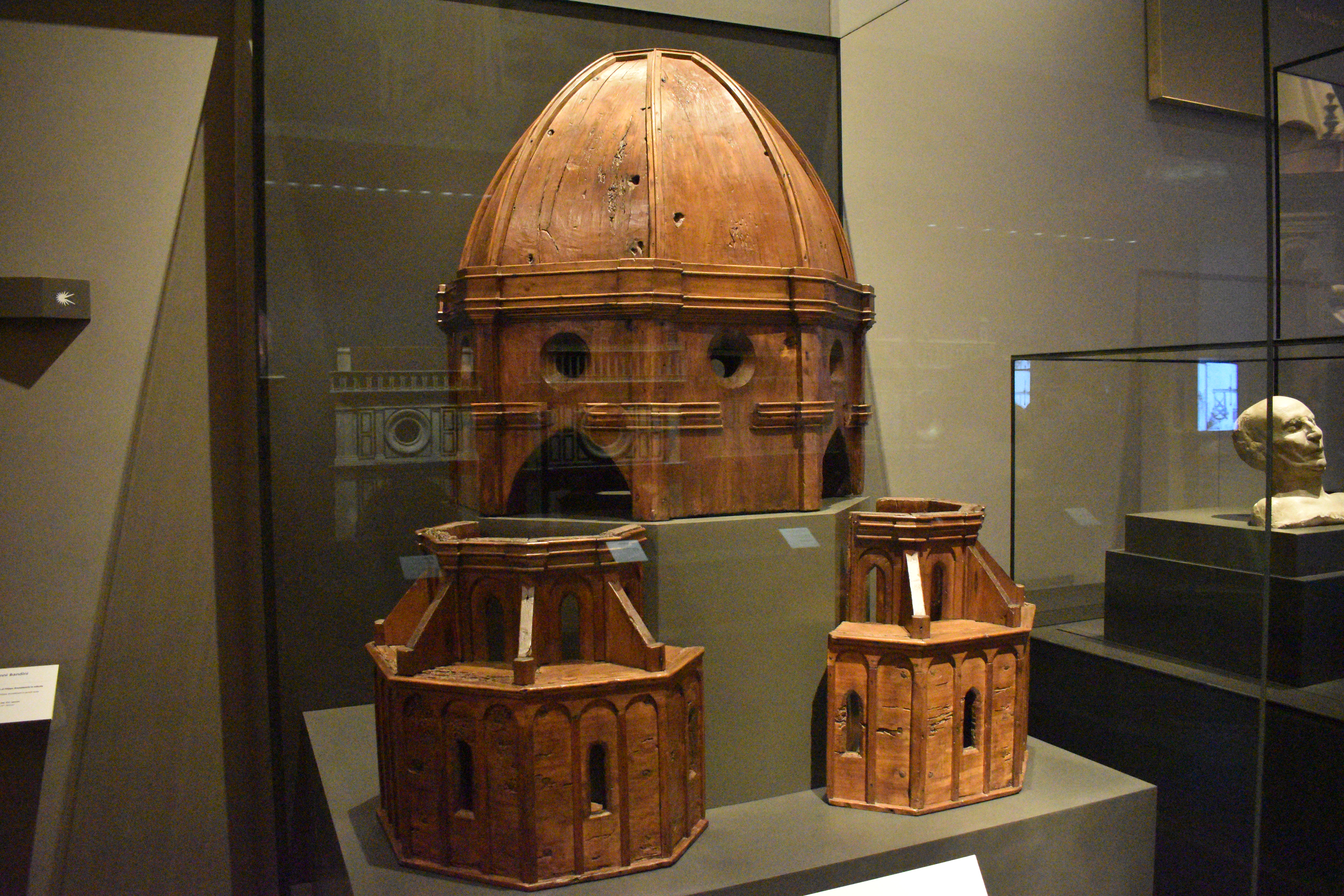
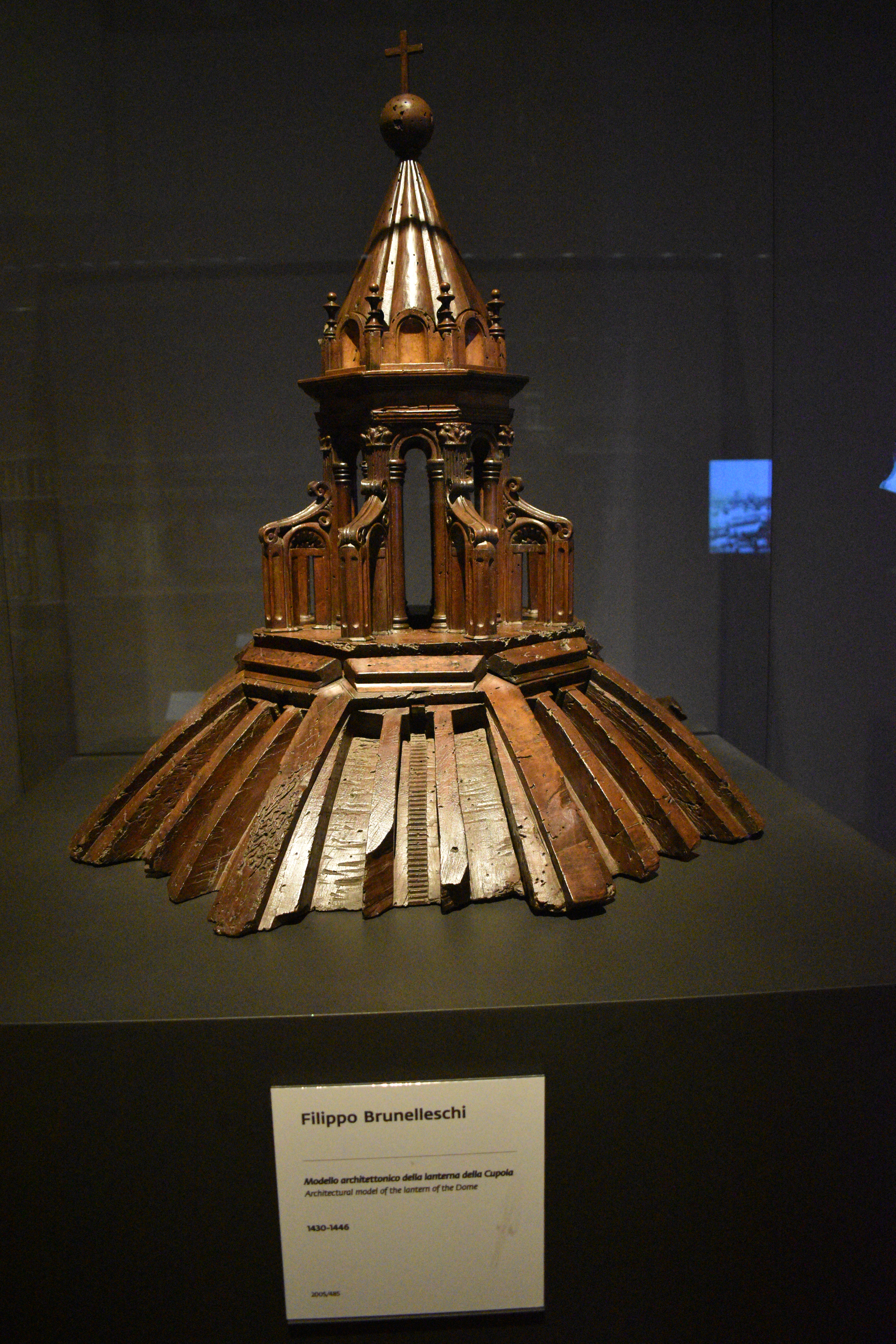
Second, your get to walk in between the two structures that make up the dome. The amazing thing about the dome is that prior to its construction there was little understanding about how to make such a structure. The architect Filippo Brunelleschi, such that he was, sort of made it up. He created a secret formula that involves a dome inside a dome. And the staircase to the top walks you between the two structures (left). The precise physics are explained and illustrated with models in the cathedral museum which is also well worth a visit (see gallery below).
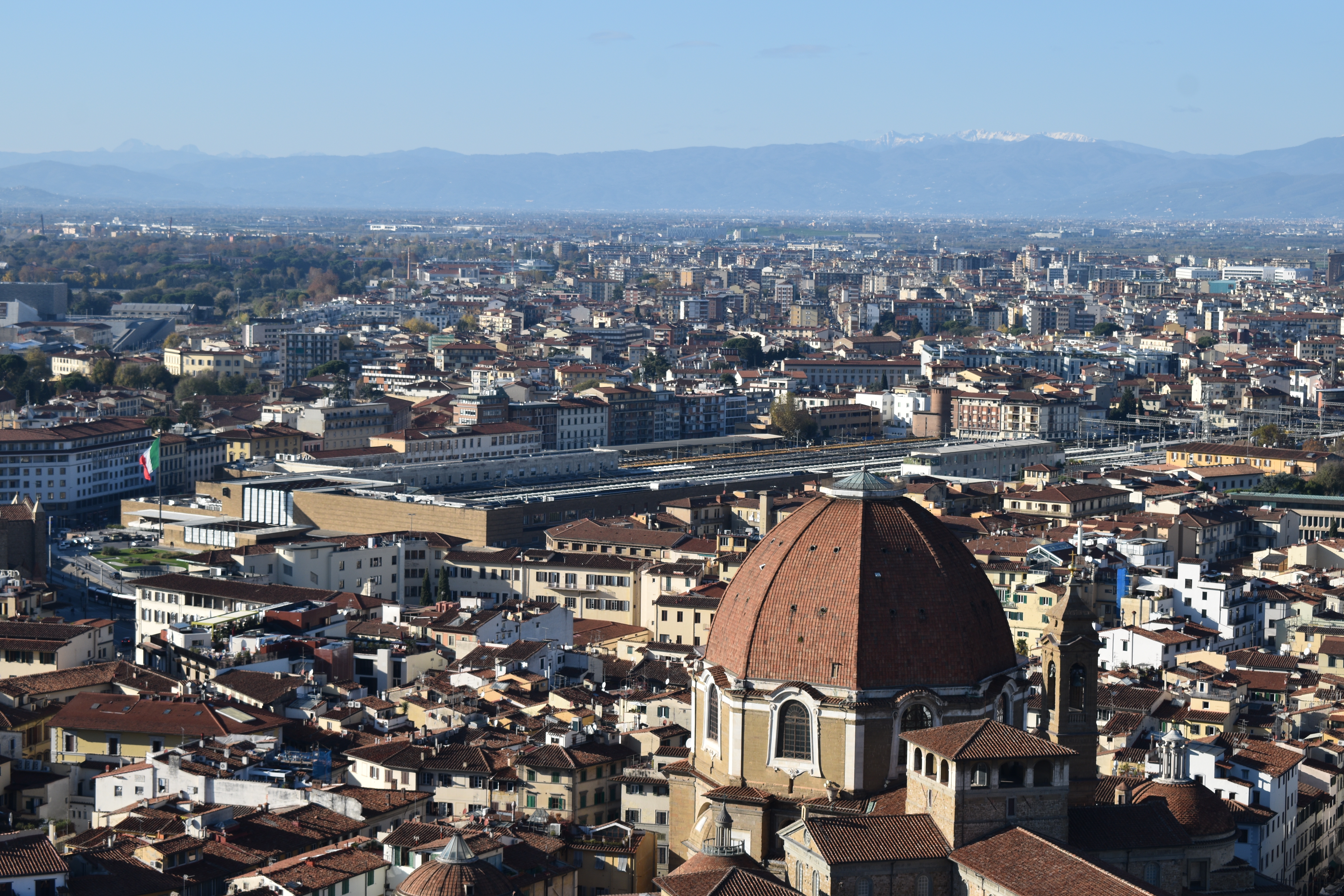
Third, on a clear day, there is a spectacular view from the top. I have to say, I was pleased to be able to see the railway station (right). Of all landmarks in a city, the railway station is the one that most captures modernity. In this case, location, bearing in mind the historical roots of the city predating the arrival of the railway, to have it so central speaks loudly. Florence is a city that was embracing and inventing technologies as much as it was doing art (see Galileo Museum below).
Book in advance. Space at the top is limited and it is popular, even in November.
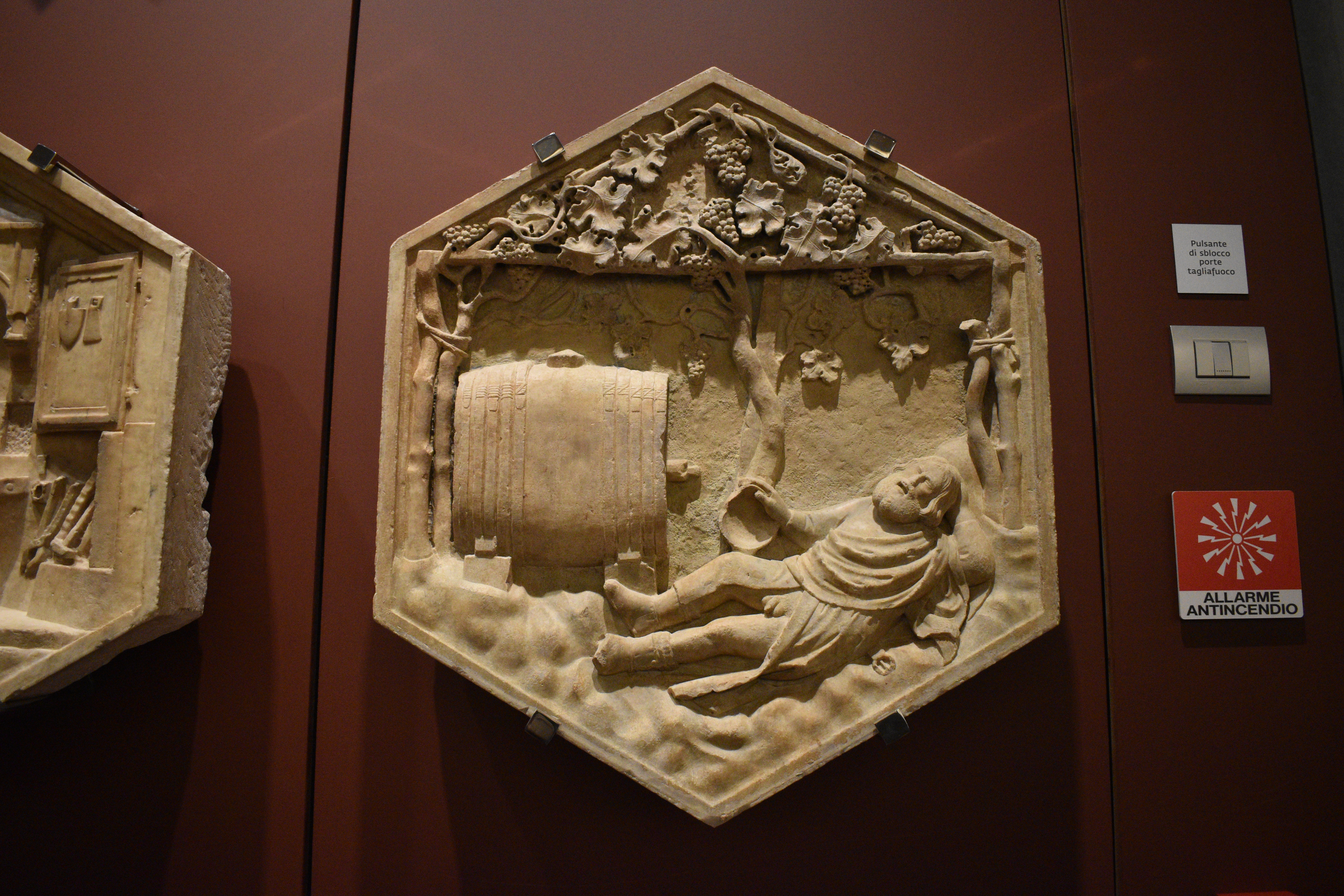
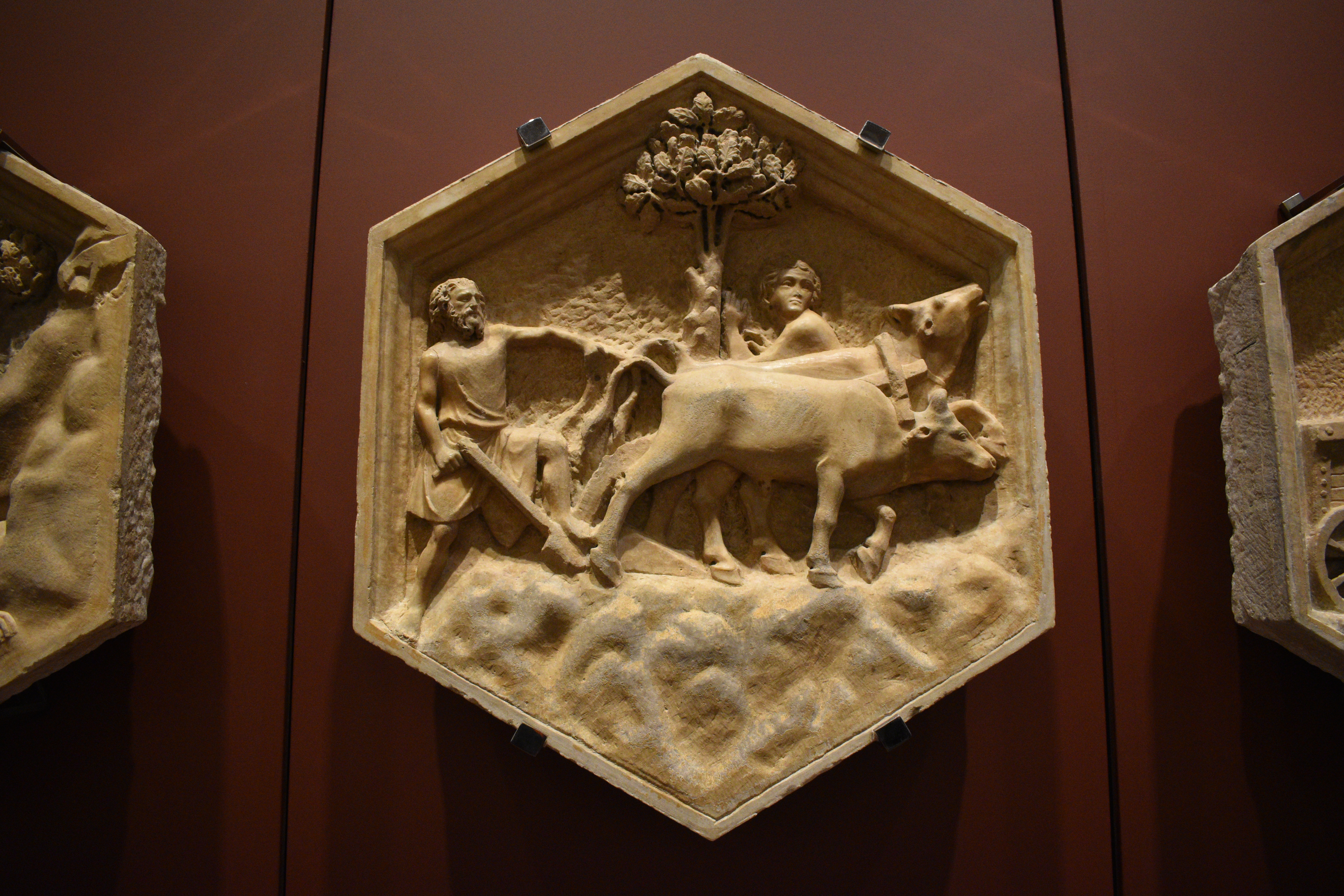
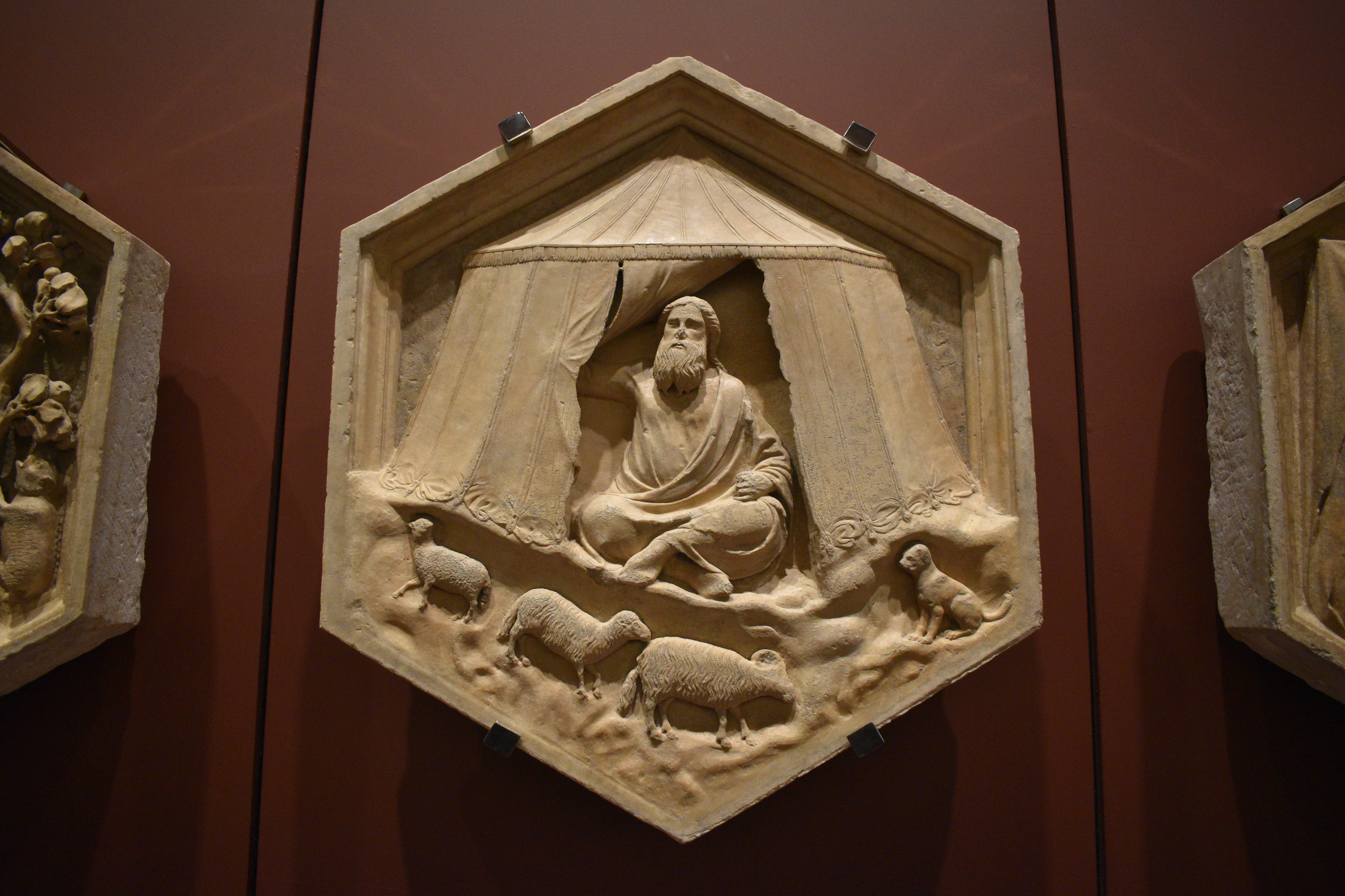
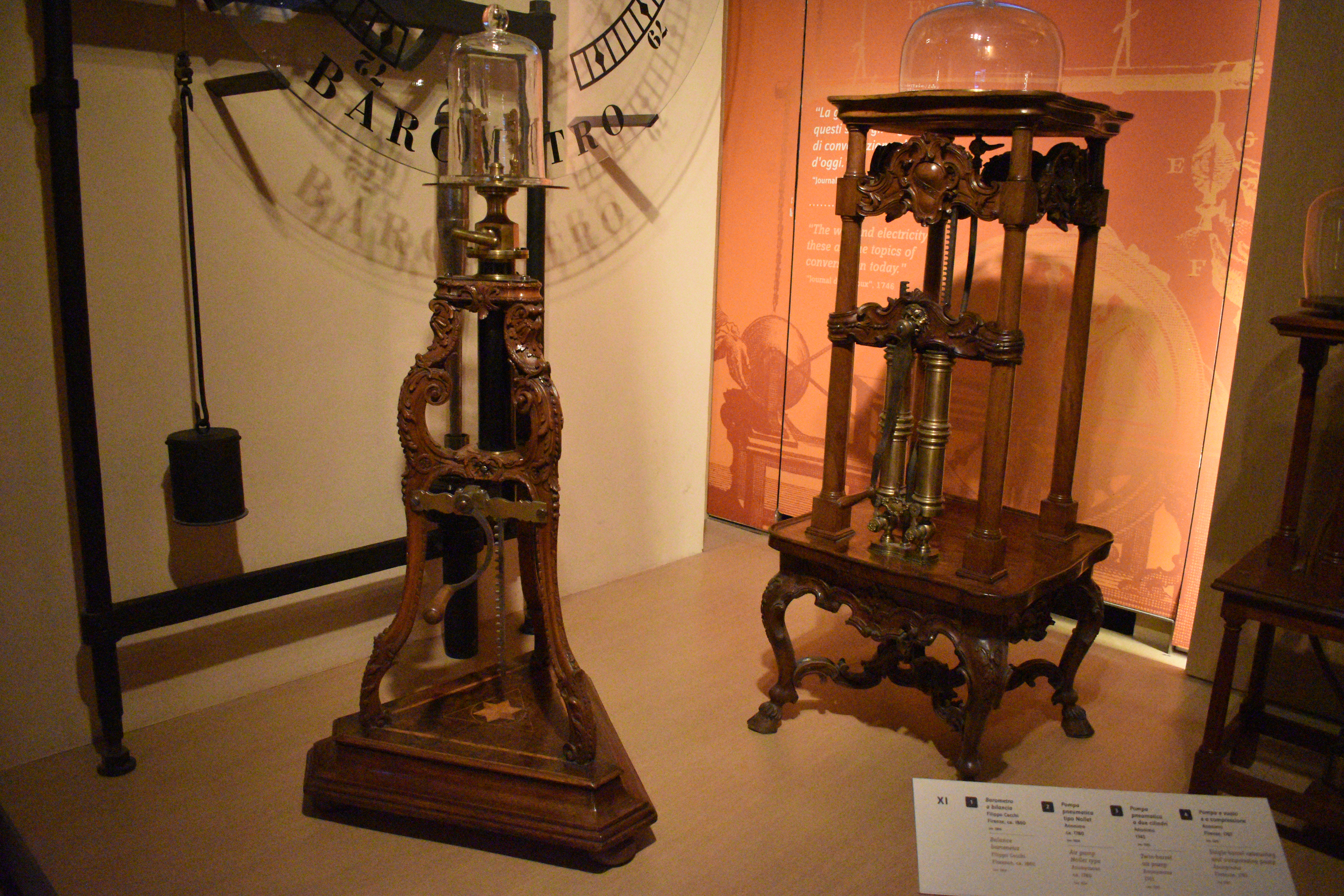
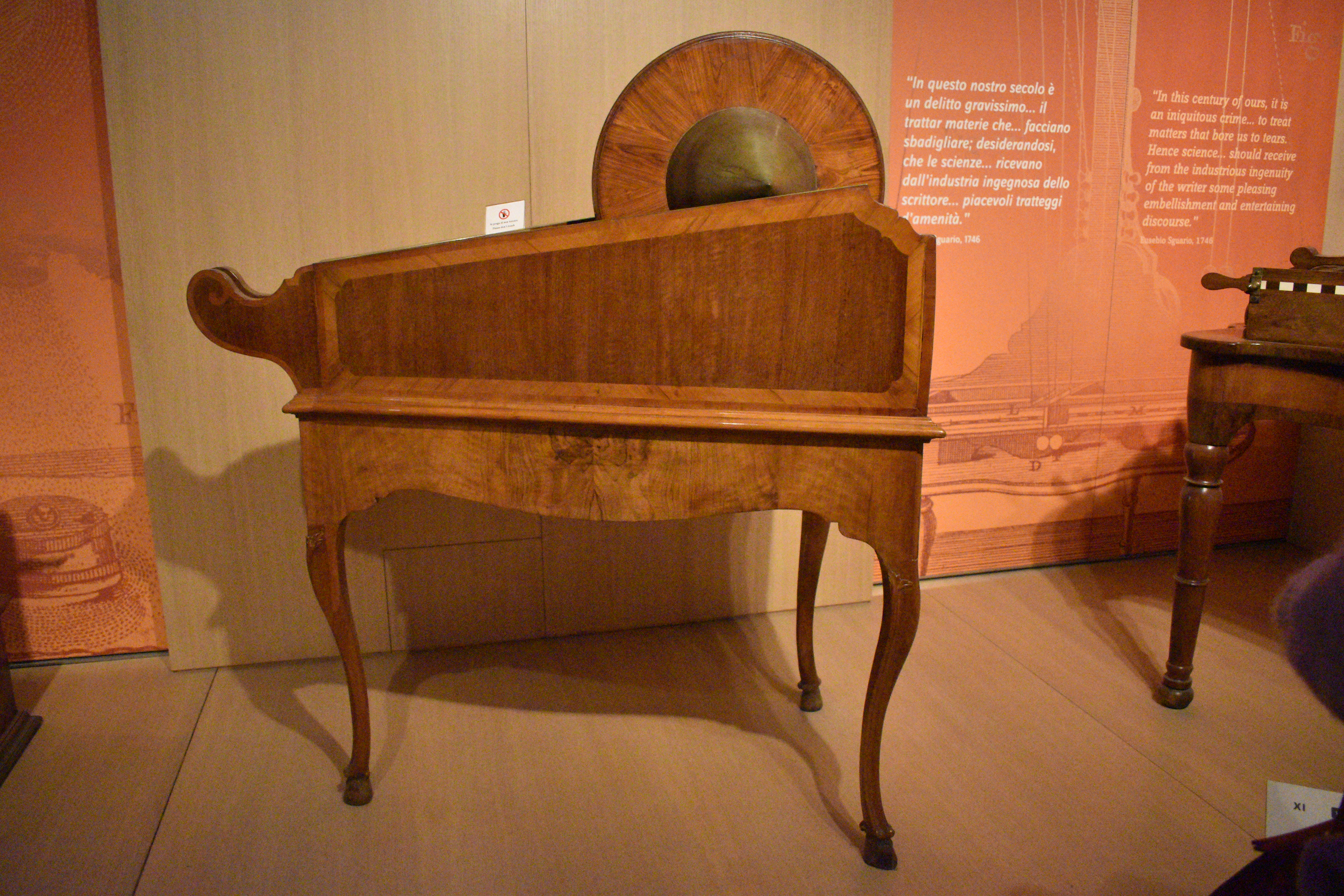
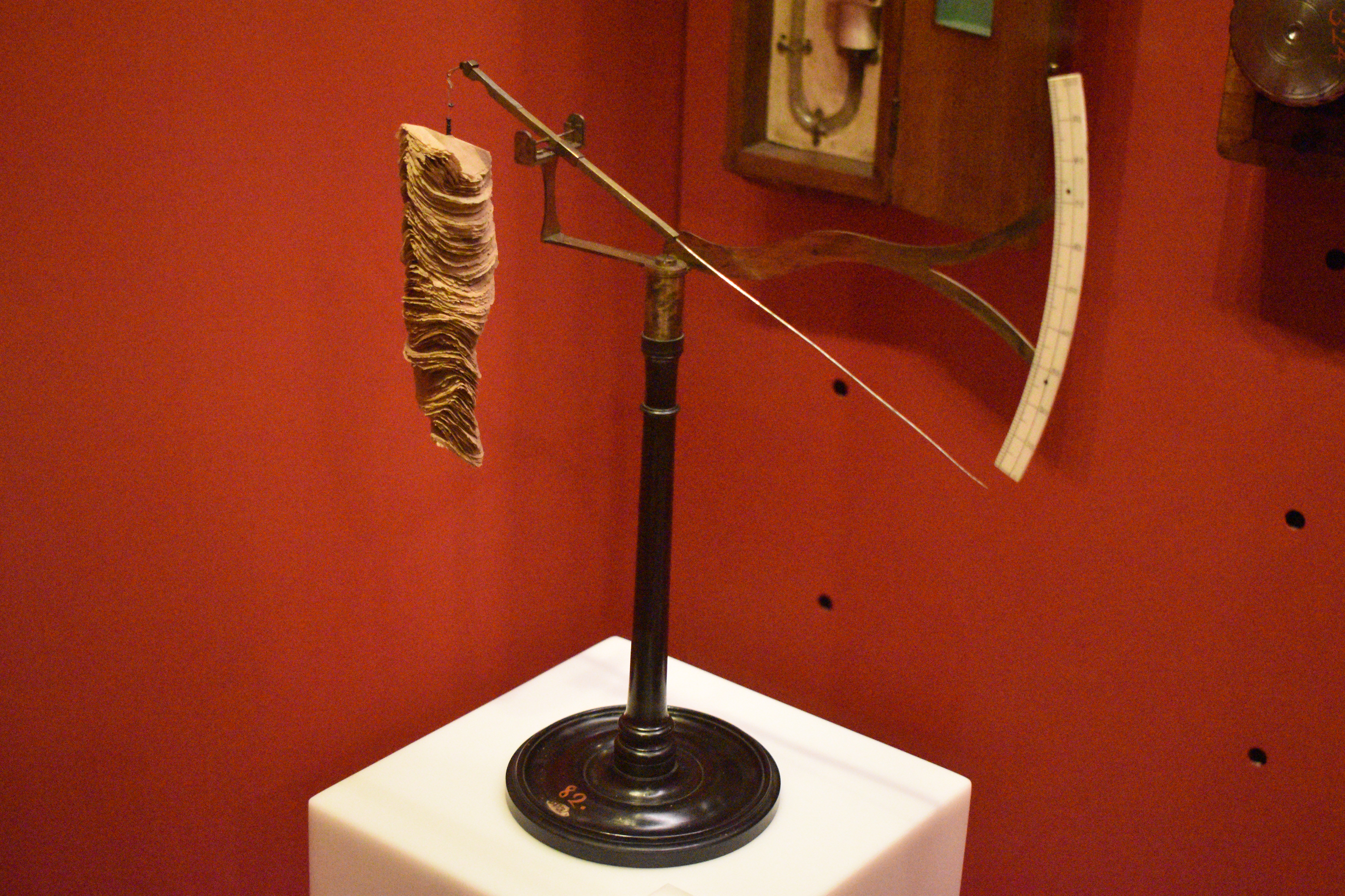
Day 4 – the Galileo Museum.
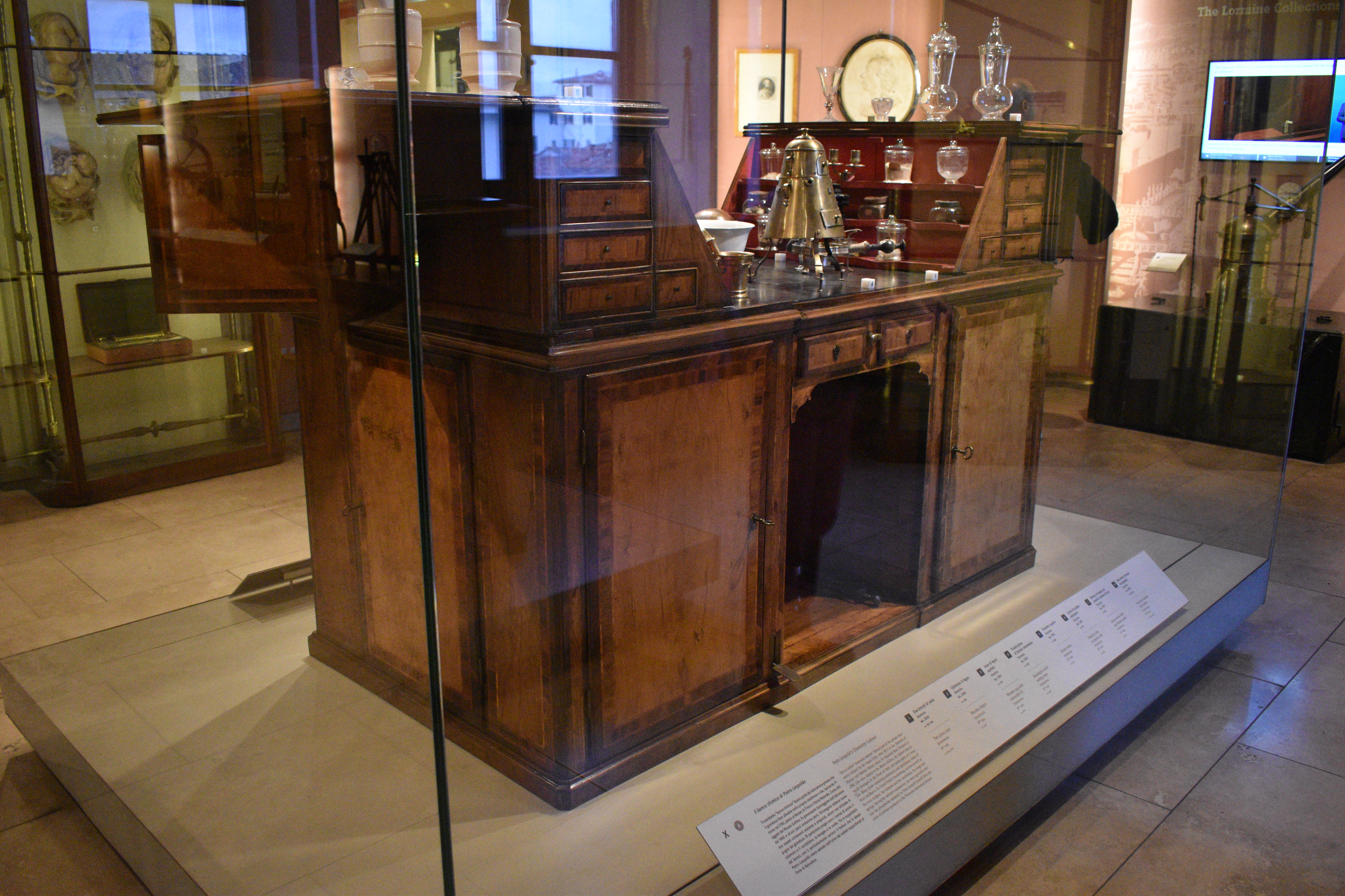
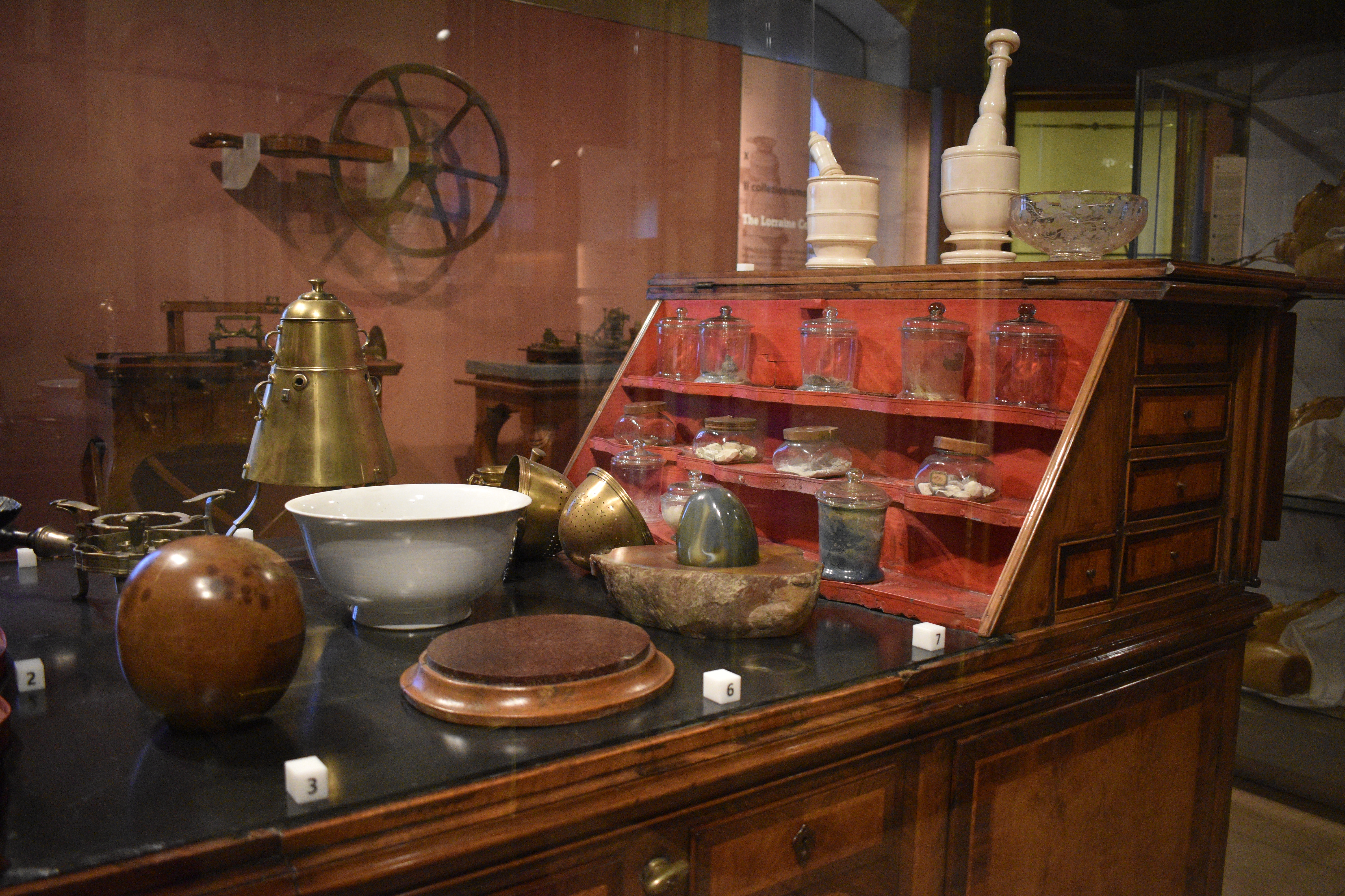
I have to say, that if visitors to Florence do not patronise this museum, then they are missing out. Plus, it is relatively quiet (though, clearly, it should be really busy). This is a museum packed with analogue scientific instrumentation as art. Functional, yes, but that was never enough for the pioneers – professional and amateur – it had to be beautifully made, whether it be a chemistry cabinet (left) or a timepiece. This museum is packed with artefacts that came out of the Renaissance and beyond that eventually led to humanity’s greatest discoveries facilitating developments that laid the foundation for 20th Century civilisation.
Getting around
It should be easier than it is. Some pitfalls. Buses are unreliable. And in the evening, less frequent. If a bus does not turn up in the evening, it can be a long and uncertain wait for the next one not to turn up. The two tramlines are more reliable, but they too fail. If you have a train or plane to catch, be ready with a taxi number. Probably better to stay centrally (for the train) or at the airport (if flying). Though check that the hotel is in fact at the airport and not just close to it.
Here are some more pictures.
Dome Frescoes
Dome Museum
Galileo Museum

Gilbert and George at the Hayward, Isobel Rock at the Hastings Contemporary
Filed under: Art, Environment, Politics | Tags: Gilbert and George, Hastings Contemporary, Hayward Gallery, Isobel Rock
Leave a comment I have to admit, in my 61 years, I have never been to the Hayward Gallery on the Southbank in London. I also have to admit to not taking that much interest in the work of Gilbert and George. It is also true that I do not go often enough to the Hastings Contemporary. Last weekend, myself and my beloved shared the Hayward and Gilbert and George and topped it off with a visit to the Hastings Contemporary. This is what we found.
Gilbert and George, on the face of it, were two graduates of a London art school who found each other because they could not actually find themselves – more specifically, if they were going to be artists, what kind of artists were they going to be? Seemingly starting off quite bohemian (poor) they built a reputation out of performance and then provocative painting – for want of a better term. And everything they needed subject matter-wise was in their neighbourhood; namely, the somewhat salaceous East End of London. There was violence, drunkenness, vagrancy and camaraderie. Oh, and themselves.

The retrospective, then, at the Hayward (until 11 January 2026) charts their digital period. All galleries are filled with huge “canvasses” themed around the above subjects plus slugs (something shared with Isobel Rock). Not forgetting red pillar boxes, phone boxes and rather quaint post marks. Ever present are the artists themselves, always clothed. I used to think they were immaculately dressed, but looking closely they they seem not to own a trouser press.

For those of us of a certain age and nationality, there is much here to celebrate. All of the events, most of them involving violent death (captured in newspaper headlines reproduced like Wahol did with Marilyn Monroe). Their politics were always on the right side of history – indeed, their parents shot fascists (right), but one walks away feeling that the exhibition could have done to have had an editor (Gilbert and George famously curate their own exhibitions).
Because of the size of the Hastings Contemporary, exhibitions are tightly curated. Isabel Rock’s extraordinary work was limited to one room, a couple of walls and a remarkable cupboard (more on this below). Unlike with Gilbert and George, I could have sat with her artworks all day and not get bored or witness every nuance. Her work is fantastical and, crucially, addresses very contemporary issues, primarily climate and consumption.
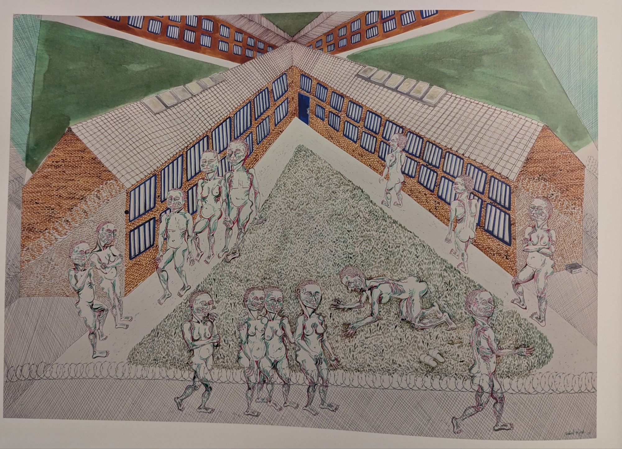
Climate is so important a theme for her that she went to prison for it. She was one of the protestors in 2023 who climbed on a gantry over the M25 motorway in London to Just Stop Oil. Like so many of her peers, she spent some time in prison for that act. When she emerged, she had significant material for her illustrations. All of her inmates are naked. Incidentally, the aforementioned cupboard a replica of her prison cell which she seemingly shared with a giant slug. She was found not guilty, too.
It is not just slugs, there are rats (enjoying a birthday party), crocodiles – well crocodile-like with extra legs just to wear shoes. Shoes are a feature here. Then there is Pippa Pig – suitably renamed as I am sure the lawyers would have been round otherwise. Pippa Pig is a victim of intensive farming: huge, bloated, tattooed and free. The tables have turned. These pigs eat humans.

There is one masterpiece. It is the one that should detain visitors – there is a bench immediately in front of it for that reason. The picture in question is called Mere Anarchy is loosed upon the World (2024). It is a modern take on Hieronymus Bosch’s Garden of Earthly Delights, but without the heaven. Hell is an Earth of felled or dying trees. What is left is inhabited by grotesque animals doing strange things like playing violins and keyboards, cooking and eating bits of themselves and playing board games. The humans are zombie-fied. The whole scene is looked over by this black female sphynx-like figure taken directly from Niki de Saint Phalle (unknown to me but obvious to my cultured beloved).
To sum up, the Hayward show is Gilbert and George at scale. It is volume, “look at us”. It is also, to be fair, a retrospective. These do have value, but do beg the question, as I did with the Hockney retrospective at the Fondation Louis Vuitton in Paris, is that it? What about the now? Interestingly none of these artists have children of their own (though Rock says she climbed the M25 gantry for the sake of her nephew and niece). My equivalent is doing what I do for the grandchildren of my wife. It could be that for Rock the art is not enough. For me, teaching without purpose is pointless. Meaning is everything. And because of that, this Hayward retrospective was an exhibition too far. Whilst Rock’s wonderful exhibition was a simple short walk from the front door.
David Hockney, Paris, August 2025
Filed under: Art, Museums, Travel | Tags: Art, David Hockney, exhibition, exhibitions, Luis Vuitton Fondation, painting, Paris
Comments (1) 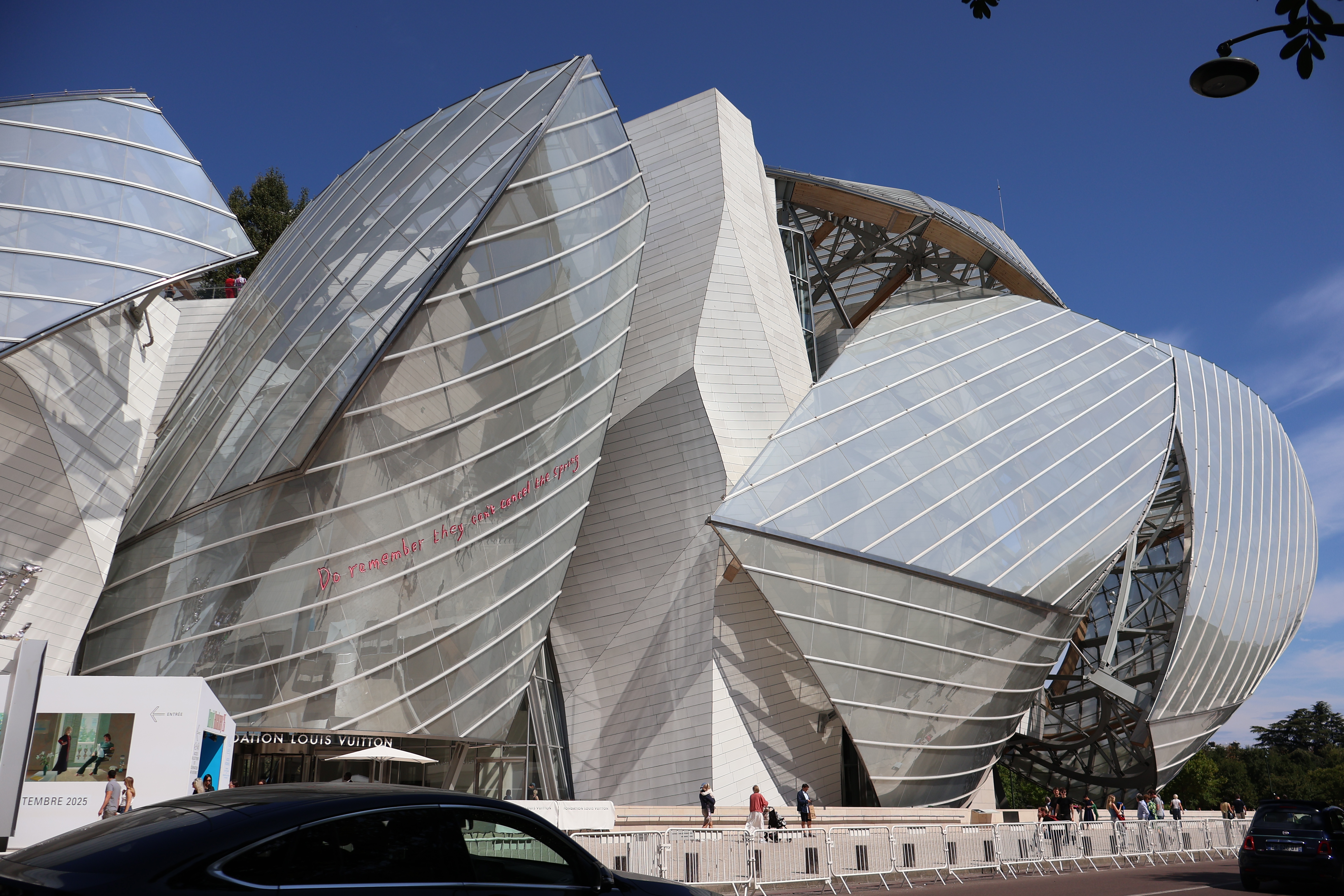
Eurostar from London, dinner, nearby hotel, sleep and then work out how to get to the Fondation Louis Vuitton building that, due to my lack of preparation, turns out to be a Frank Gehry building (left). It sits in a bizarre park that is home to a retro amusement park, amongst other things. Over breakfast we decided to walk – Google maps advised nearly 2 hours, but such is Paris, walking is a delight. By chance we ended up meeting up with an electric bus shuttle from Arc de Triumph to the building – further than we thought. Anyway, the marketing for the exhibition is here.

Once into the building we did as we were told and started in the first gallery. It was an exhibition that was organised chronologically by date. So Hockney’s earliest works can be found in that gallery, including the portrait of his father, life in what is now Greater Manchester (right) and series of abstract paintings exploring his early understanding of his sexuality. Then in 1964 he heads off to California. This period delivered some of his most famous images, for example, the Bigger Splash and a series of other poolside paintings that are now beyond my price bracket. But I have to say, I found this rather boring, egotistical, even narcissistic.
Portraits

I like to think that artists have something to say (about the world) beyond themselves. Maybe the next gallery of portraits might reveal something, after all, the sitters were others, often pairs of others. There were lots of admirers of these portraits, but I felt that most lacked emotion. In fact, the only picture (actually a set of four) that showed emotion were a man towards his dog. All others seemed inert. I found one image that summed up this whole gallery (below right).

East Yorkshire
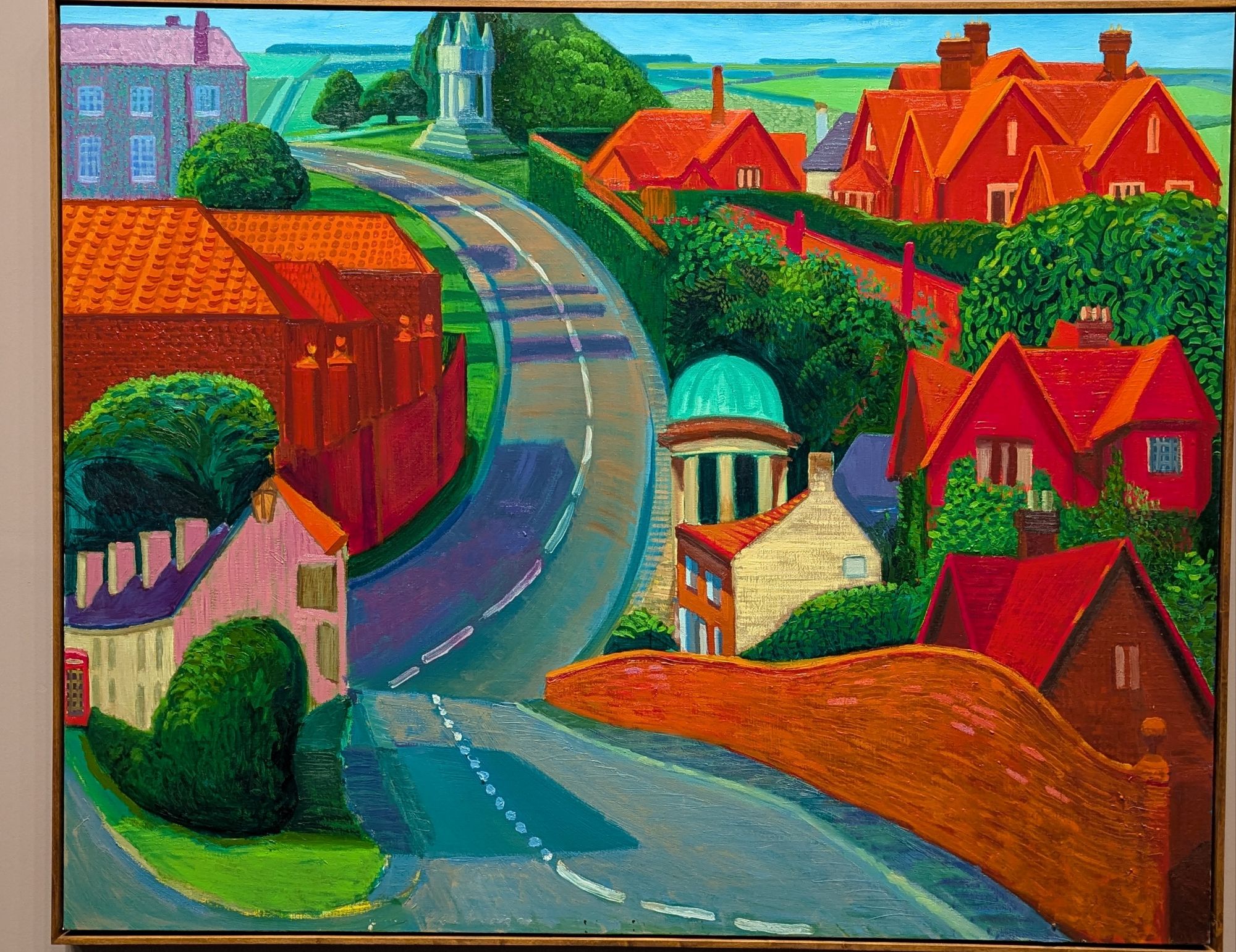
Onwards – Hockney came back to the UK and moved into his deceased grandmother’s house in Bridlington, Yorkshire. In this period he produced a significant number of landscapes depicting changing seasons; for example, a spot on a farm track. Man, easel, paints, brushes. Some of the pictures are huge, made up of 40 or so panels that oddly do not quite match or line up with one another. And they all seem to be without people or, indeed, animals. I can cope without people in the countryside. But not an absence of animals.
That was enough, time for coffee. We left the building in order to find refreshments – the gallery itself has an expensive restaurant but no coffee shop from what we could see. The park has a number of delightful outlets, so no problem.
The full artist

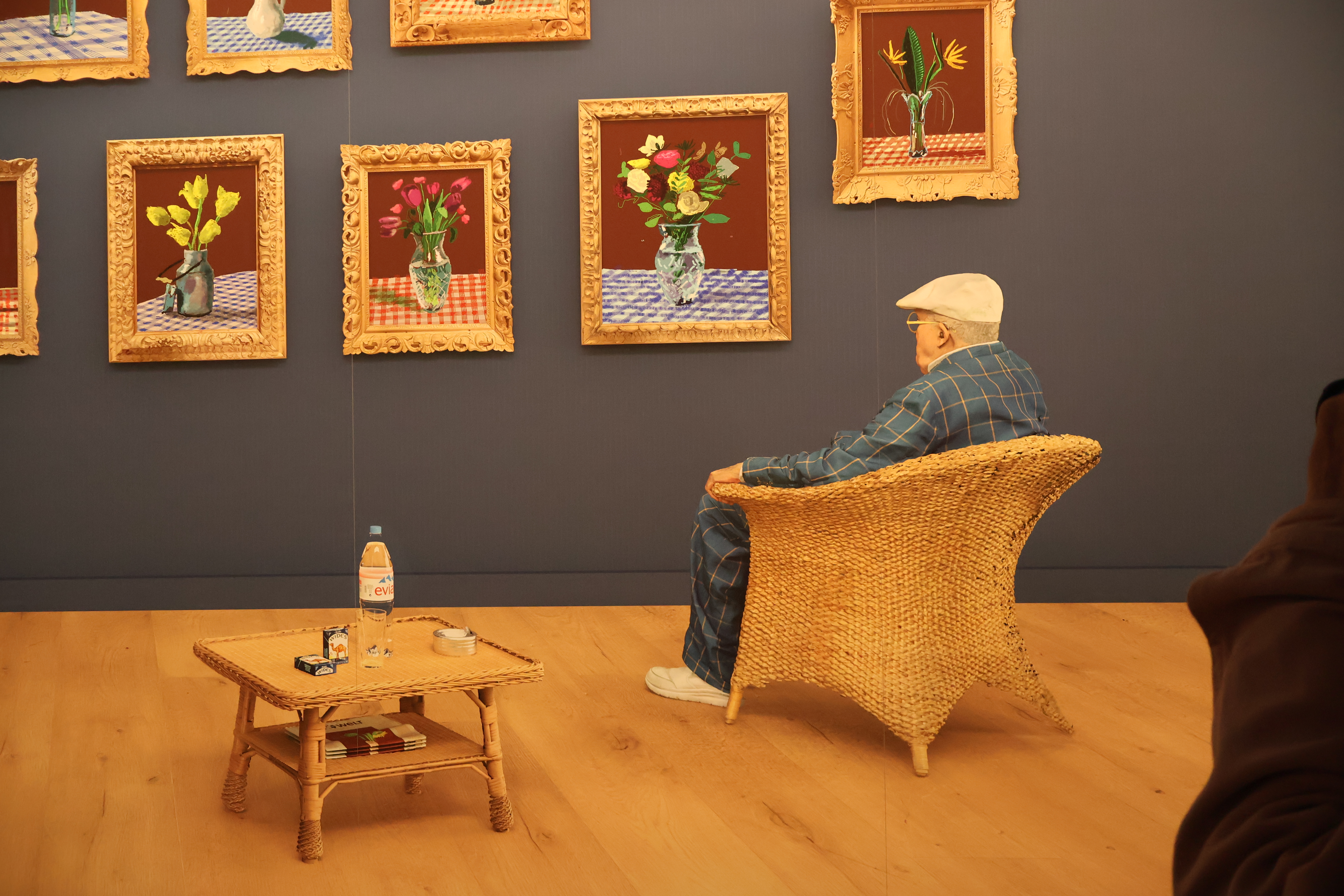
We were back within the hour to a gallery on the second floor which, frankly, we should have started in. This gallery showed what a consummate artist Hockney is and what he could have been had he wanted to be – but that is me being arrogant. I say this because Hockney himself writes on the entry panels that we might think that he has limited styles on which he can draw for his “periods” – all long-lived artists have those, I have come to realise. In this gallery were examples of Hockney aping the styles of other famous artists. There is always a nod to van Gogh, but we did not realise he was a fine cubist artist in the style of Picasso. I particularly enjoyed his take on Hogarth and the illusions generated in his picture, Kerby (After Hogarth) Useful Knowledge, 1975 (above left).
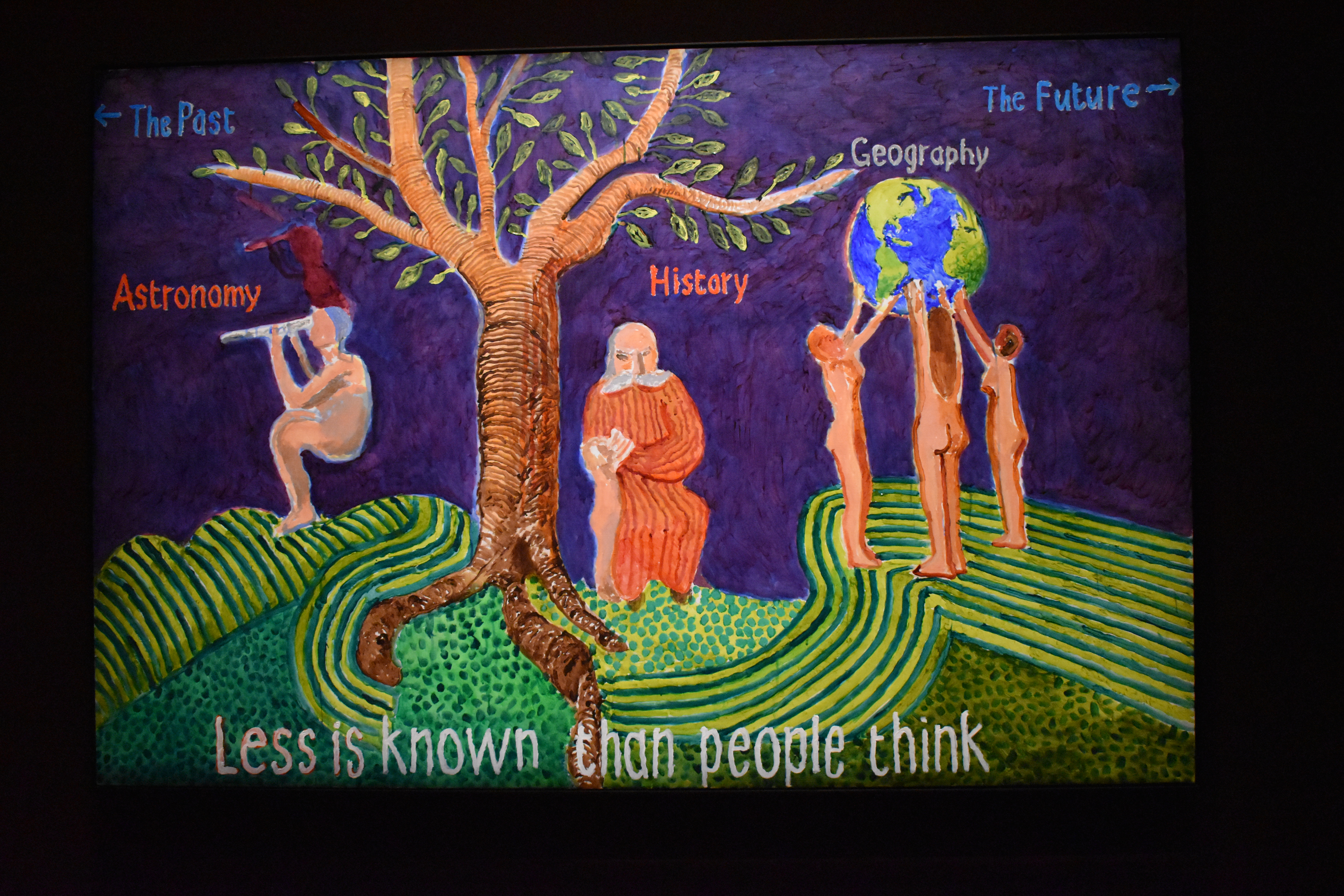
Then on to Munch and Blake (After Blake: Less is Known than People Think, 2023, left). This is the only image that alludes in any way to the welfare of the natural environment (the landscape gallery does not address any of our environmental challenges, indeed reproduces them with straightforward depictions of modern lowland farming). Blake’s painting was a representation of Dante’s Divine Comedy which, admittedly, I have never read. But here we have a holistic view of our human world – a dependence on the natural environment, the awe and fear of the galaxy and universe beyond, human history and a vulnerability (unclothed women holding up the globe) to the planetary system more generally. As we know, we have moved from the Holocene to the Anthropocene – our fate is in our hands, and we ignore the signals at our peril (increasingly decreasing temporality).
Theatre set drawing
And then there is the theatre work. Hockney was a great fan of opera and throughout his career he has been painting backdrops for some of the great opera houses worldwide. For this exhibition his work is immersive. One enters a large gallery to observe the paintings projected onto walls, with some being animated and involving motion. They are terrific. Another important aspect is Hockney’s experimentation. For example, he has created intriguing electronic pictures that track his method for drawing and painting, particularly landscapes. All credit to him for this. I spent quite a bit of time over these images.
Photo drawing

More recently Hockney has explored “photo drawing” (right – one of a series depicting the same “event from different angles). Equally in this almost recursiveness is his image of himself looking at his own pictures with subtle references to his own brilliance, such as the edition of “die Welt” underneath the small table (below left). And these, for me, sum it all up. Whilst I concede that Hockney is a versatile artist, able to work in most styles and genres and has a body of work that can fill the Fondation Louis Vuitton building in Paris. He is also just a shade too narcissistic for me really to embrace.
Exhibition ran from 9 April – 1 September 2025
Warhol and Haring together at the Brandhorst Museum, Munich, December 2024
Filed under: Art, Museums, Travel | Tags: Andy Wahol, Art, Brandhorst Museum, graffiti, Keith Haring, Munich, street-art
Leave a comment I had not realised it earlier – or not paid attention – that Keith Haring and Andy Warhol were artistic compatriots. There is a generational difference, for sure. Stylistically, too. But this superbly well curated exhibition (on until the end of January 2025) brings the two artists together – their lives, loves and work.

Haring is this curious subway graffiti artist (Haring would prefer me to drop the graffiti adjective) who became the artist he wanted to be, commercially and critically successful. In 1986 he opened Pop Shop in New York (292 Lafayette Street) to sell his designs on all sorts of artefacts – from textiles to skateboards (left).
For both of these artists I found plenty of contradictions. Haring, particularly so. Whilst both were so-called pop artists, that did not mean they were not looking to be commercially successful. Neither were bohemian in that sense. Whilst Warhol famously bought a factory in which to live, work and socialise, that came at a (financial) price. Haring wanted his work to be as accessible to as many people as possible which explains to some extent the subway art. He was often arrested for this, but seemingly his whiteness protected him from serious prosecution. Many of the works were removed (stolen evening – though whether graffiti can be stolen, I am not sure) and sold at auction as he became increasingly marketable. He moved on to free work for charities and hospitals where, presumably, his work would be a little more protected. His work was also printed onto dresses worn by Grace Jones and Madonna both of whom he met through Warhol.

But the affection the two men had for one another was the focus of my approach to the exhibition. I am not sure for myself if a friend caricatured me as Mikey Mouse (right) that I would be too chuffed. But Warhol was delighted with Haring’s effort which captured the essence of the man (for sure it is Warhol), one of his styles (repetition) and critique (Disney and dollars).

Warhol died in 1987 after some disastrous surgery. Haring was devastated and did what most artists would do, remember them through art whether it be visual, aural, written, whatever. Haring went for a curious depiction that takes some explanation. Warhol is naked. (Warhol had taken naked photographs of Haring in the past.) Warhol is sucking a banana which was a common Warhol motif. He is holding an apple that is somewhat sorf and juicy. This perhaps has a number of meanings – by this time Haring himself was ill with Aids and had a prescribed diet which included a lot of fruit. Equally, it could mean something else entirely.

Both Haring and Wahol were social activists as well. Haring’s social commentary ranged from Aids awareness to anti-apartheid statements (right). There is also an endorsement of the German Green Party.
In the true spirit of Haring’s accessibility, we visited on a Sunday when the entry fee is just 1 Euro. We had dinner in a nearby Vietnamese diner. The front-of-house was dominated by a woman who had an amazing ability to take multiple orders without writing anything down and then remembering who ordered what. Very Warhol.
Rome December 2023 – those painted ceilings
Filed under: Art, Travel | Tags: Andrea Pozzo, baroque, Chiesa di Sant'Ignatzio di Loyola, Rome
Leave a comment This post belongs with others published earlier including Bernini and Borromini and Mussolini’s Rome architecture and district.

As part of the the Baroque tradition, ceilings became as much of a canvas as walls and chapels. They were a lot harder to do, for sure. Not only are they high and inaccessible, but for them to have an impact, they need to be more than just 2D. So in commissioning the art, the artist has got to deliver. There was, it seems, no better deliverer than Jesuit Monk, Andrea Pozzo. He was given a task in the Chiesa di Sant’Ignatzio di Loyola (c1650) to paint the illusion of a dome (because there was not enough money for a real one). This he did with aplomb – the ceiling then became his (he started the major work in 1685).

When one walks into the church one joins a queue – but it is not clear why. The end of the queue is a mirror and a money box. The box has to be fed with coins to illuminate the ceiling. Most people seem to take pictures from their mobiles. But really the best option is to piggyback on those willing souls who feed the box and look at the four continents and marvel. America (above left), Wait for the light and discreetly make oneself horizontal.
Banksy’s artworks
Filed under: Art, Environment, Politics | Tags: art and climate, Banksy, Islington
Leave a comment Gio Iozzi asks, why does it take an artist to expose the assault on our urban trees? This in light of Banksy’s latest addition to his portfolio recently found in Finsbury Park, London. It is an interesting work, and slightly different from his usual work, as it requires a significant prop. A tree. The tree is special because it has been “pollarded” – severely pruned in normal parlance. It has been pollarded because, according to the Council (the owners of the land on which the tree stands) it was diseased. It is a cherry tree, and they do not, it seems, respond well to radical pruning. There is also a question of whether diseased trees need to be pruned or felled. Many of us are a little diseased, but we do not lob off all of our limbs to deal with it. Or at least not as the first option.
It seems that Banksy, whoever he is, saw the opportunity to provide this sad tree with leaves by painting them – or spray painting them – onto an adjacent side wall. Viewed from one angle, the tree looks healthy and with full plumage. And like all Banksy artwork, there’s a message.
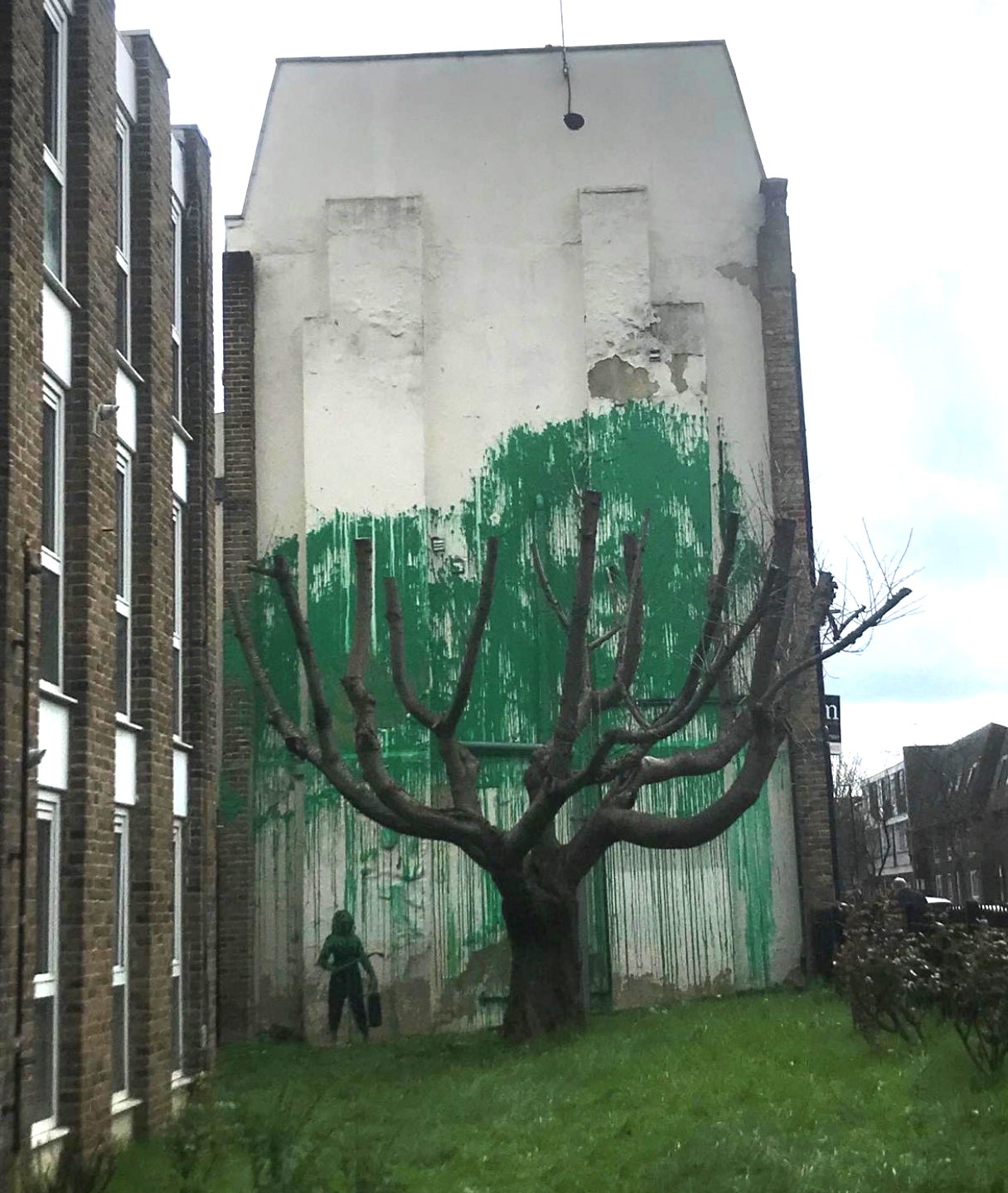
Art is there for the receiver to interpret, even if the artist provides the artwork with their own meaning. So we take liberties – rightly – with interpretations. So let us interpret this widely. This is a dual statement about the state of our urban trees and about climate change. Urban trees are under threat, just at a the time when we need them most. Our cities are getting hotter. Trees provide shade, for sure. But they also cool the air. Even diseased ones. So much urban landscape is devoid of trees. Devoid of ways of cooling and, increasingly, draining.
More broadly the onslaught against the planet’s forest ecosystems is relentless. The cutting and burning of the Amazon has slowed, but not stopped. Forests elsewhere in Indonesia and Africa are also in retreat. In Brazil particularly to provide land and feed for cattle. So not only do we lose carbon-capturing trees, we also increase our emissions through bovines, notorious methane producers. All because we want to eat large quantities of beef.
In response to Iozzi’s opening question about artists, I respond simply by saying, it is what artists do. It is why they are an essential part of the democratic process. Throughout history artists (not all, for sure) have made statements about society, power and morals. Degenerate art in Nazi Germany was degenerate for a reason. Artists have been subtle sometimes in their representations. Messages that eluded the censors because they were unable adequately to understand what they were actually looking at. Even Picasso, not known for his political statements, produced his masterpiece, Guernica, to say something to the perpetrators of the destruction of the Spanish town in 1937. Famously when asked by a Nazi Officer at his Paris studio whether he had “done” this painting, his reply was “no, you did this”.
To add value to the picture and to the metaphor, Islington Council put a protective fence around the work, but within 48 hours it had been defaced. I am pretty sure that Banksky was smiling. I rest my case.
Original picture source: https://twitter.com/IslingtonBC/status/1769722470355828821/photo/1
One Gallery, climate messages
Filed under: Art, Environment | Tags: David Hockney, LS Lowry, Paul Nash
Leave a comment I recently went to Tate Britain in London. The gallery is home to many of my “friends” – a strange idea, but I always relax when I see the images in the flesh, as it were. In recent times, however, I have visited galleries with very different intentions. I want to know how – and if – art delivers a climate message, either by chronicling environmental decline or in championing its salvation. Both are true, of course.
On this visit, March 2023, I set myself the challenge of cataloguing one gallery (one gallery and bit, to be honest) for its climate message. Here is what I found.
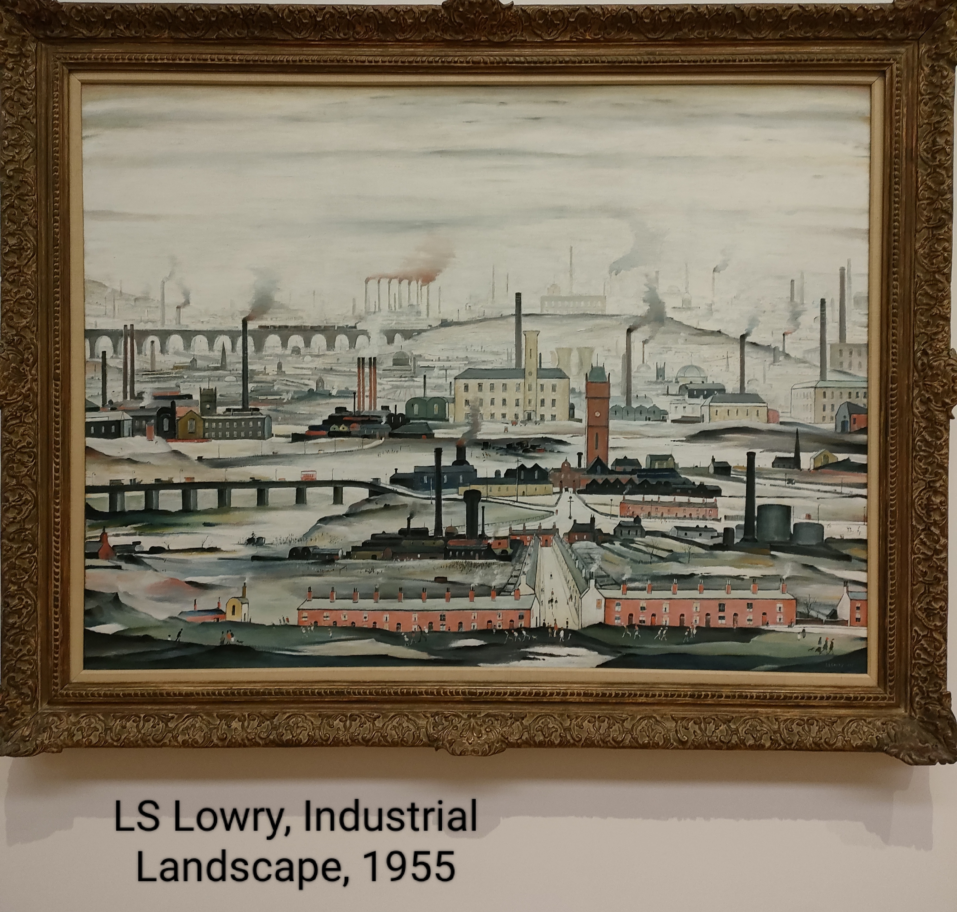
Of course, LS Lowry has a story to tell. I always remember Brian and Michael’s song, Matchstalk Men and Matchstalk Cats and Dogs (no women for some reason). I even bought that record. But revisiting Industrial Landscape (left) I noticed other things in the picture not seen before (that is the beauty of art, there is always something new in the familiar to see. There are not too many people in this image – a few in front of the houses and along the central street leading to the factories. I see the trains on the viaduct and the barges on the aqueduct (if I see it correctly). What was new was the colour of the chimney emissions. They are not just sooty, they are toxic red, particularly those in the background. I wonder!
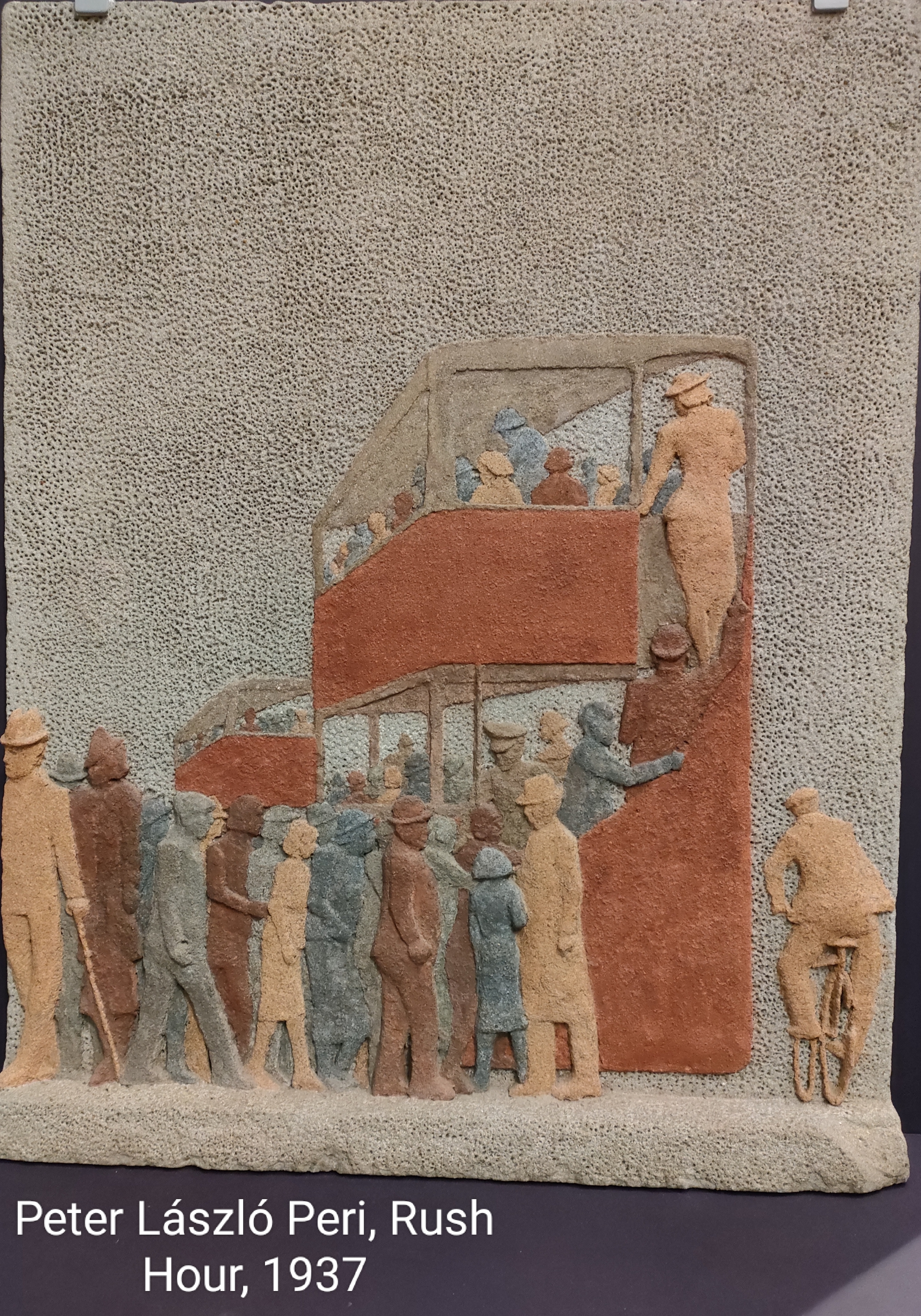
Slightly earlier (1937) the work of Peter László Peri. Peri does not paint, he uses stone to represent urban life. His rush hour incorporates one of my favourite images, that of the double-decker London bus. The image is effectively carved from a block of stone coloured in a rudimentary way; for example, copper red and earth brown. It is orderly and very English. On the one hand it looks like a depiction of the daily drudge of travel to-and-from work. But Peri sought to represent positively industrial society, so perhaps the woman climbing to the top deck of the bus represents progressive views about woman and work? There is also the cyclist taking on the diesel bus and wider traffic.
It is perhaps not surprising that Peri chose stone – he had been a apprenticed brick layer as well as a student of architecture in his birth city of Budapest, Hungary. Moreover, he was associated with the Constructivist movement dedicated to representing modern industrial society formed in Germany in 1915.
Peri arrived in England in 1933 – he was not in any way popular with the Nazis being both Jewish and a Communist.

Cliffe Rowe’s picture, Street Scene (left) depicts a pram (presumably for the health benefit of the baby inside) outside a terraced house. There is a woman sat of the step knitting (oddly revealing her underwear) and a man in shorts reading a newspaper. How typical this was, I do not know, but it seems to be a scene of aspiration. There is street lighting. Net curtains. In 1930, Rowe travelled to the Soviet Union and stayed for 18 months. He was impressed with the Soviets’ use of art to support the working class struggle; though he may have been taken in simply by propaganda. That said, on his return to England he became a founder member of the Artists’ International Association (along with Peri) which used art to oppose fascism.
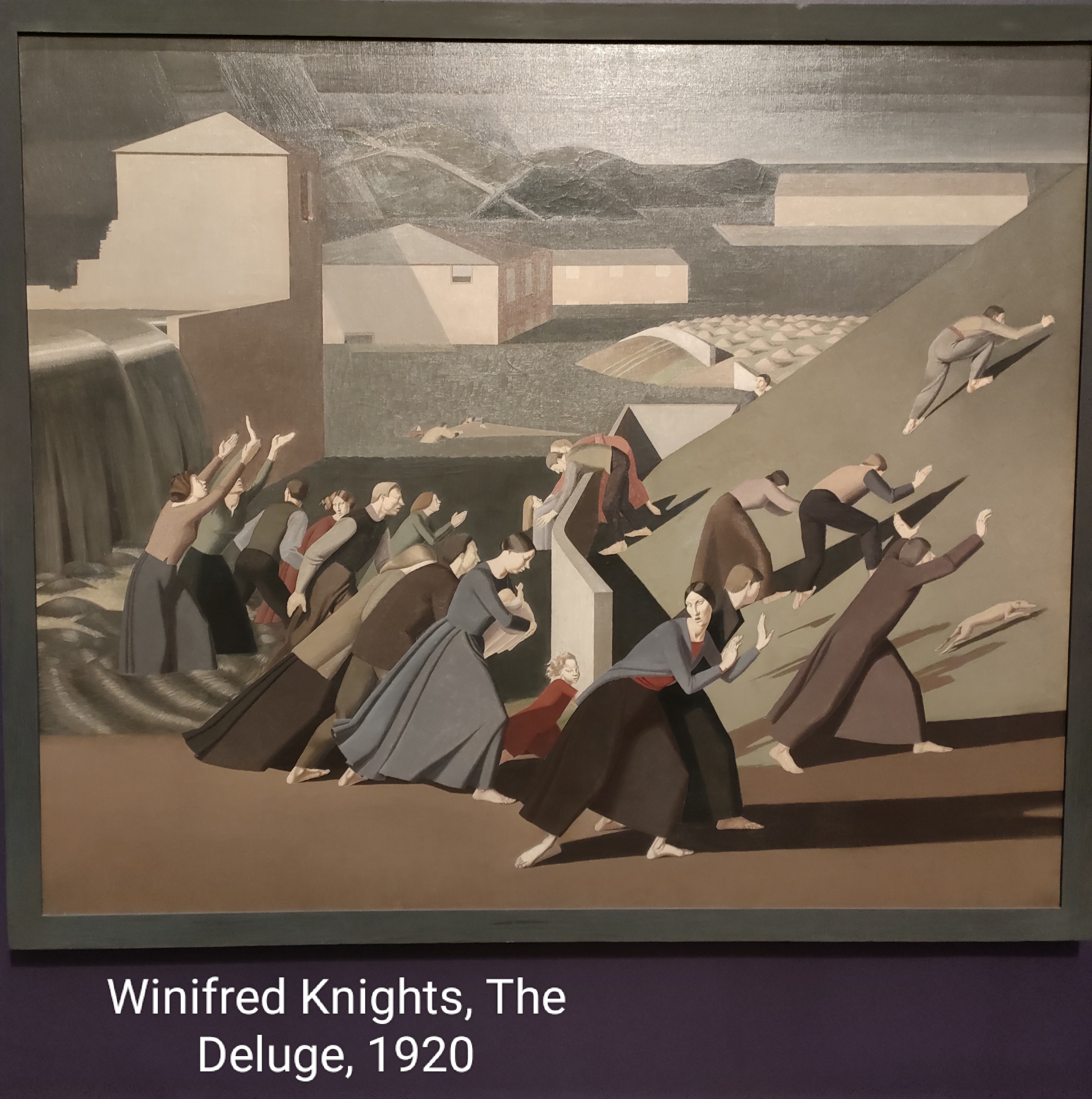
Predating both of these artists was Winnifred Knights. Her picture The Deluge (1920, right) has a very contemporary interpretation. Men and woman either flee or resist rising water in a representation of the Biblical flood in Genesis. Clearly a contemporary interpretation – or translation – is climate change and rising sea levels. Not an act of God, but an act of humanity against itself (and all other inhabitants of the planet).

To see what we forfeit in the industrialisation of economies, we can draw on some of the more conservative images of the period. Frederick Cayley Robinson’s Pastoral (left) is a good example from the gallery. It depicts a family and a flock of sheep by the waterside. A child holds a lamb as a symbol of rebirth. It is rural idyll in the post WWI world. It is rural, but not idyllic. There is only a windmill as a concession to technology – enough to enable this simple life. Of course, it is not where we ended up.
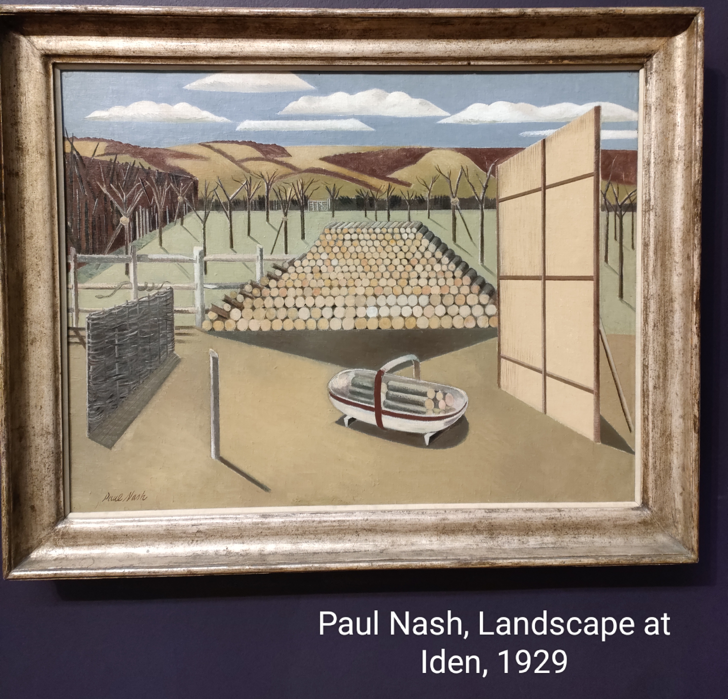
My penultimate choice is work by probably my favourite artist, Paul Nash. Nash was greatly affected by his experience of WWI. On my visit for the first time I saw Landscape at Iden (1929). His geometric shapes “blend” with the landscape, and in this case with felled trees. The felled trees are interpreted to mean lost souls in the war. The snake on the fence is easy to miss. It can represent evil, for sure (it was a serpent that tempted Eve to eat the apple), but pharmacies use the symbol of the serpent to represent healing. In Nash’s work it could go either or both ways, I sense. Whatever they are meant to represent, war, through history, has impacted on the natural environment. Despoiling it with armaments, clearings and extraction. I have not entirely convinced myself that this picture is translatable, but his pictures always leave me feeling understood.
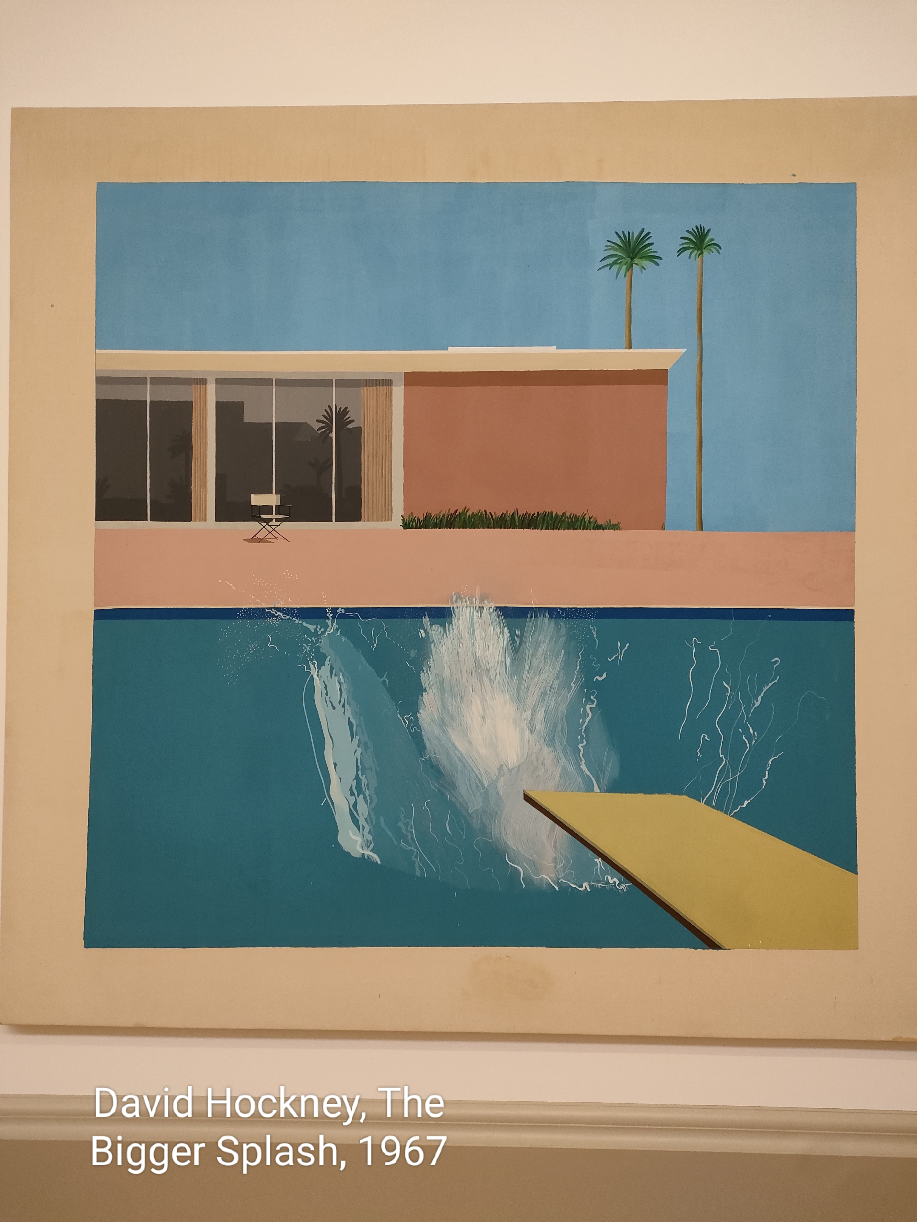
I’m going to take a liberty with my next choice – reinterpreting a living artist, David Hockney. His picture The Bigger Splash (1967) is a representation of the water’s response to a dive into a pool. I have always seen Hockney’s California period as a reflection of unreality (Hockney admits his splash is not realistic) – the good life that comes from industrial society that is endured by others, particularly in the industrial Eastern USA. I feel vindicated inasmuch as when Hockney returned to the UK he bought a house close to where I was brought up in East Yorkshire. Those images are most certainly about the land, its plants and change.
Book Review – Barnabas Calder, Architecture From Prehistory to Climate Emergency
Filed under: Art, Environment, History, Housing, Religion | Tags: architecture, Barnabas Calder
Leave a comment Regular readers will know that I have much regard for the work of Andreas Malm. His book Fossil Capital was influential in my thinking about how to reframe my teaching of business strategy at my university. It tells the story of our addiction to fossil fuels. It posits the idea that it did not need to be so; the addiction arose primarily from the owners of capital using technology to outflank organised labour on the one hand, and competitors on the other. Organised labour was quite powerful in the British mill towns of the 18/19 Centuries because of the static nature or source of motive power – flowing rivers. Steam, generated by burning coal and heating water was so much more flexible and, what’s more, the owners could be confident the government would intervene to crush organised labour when called on. But equally, water was a shared resource and the owners proved themselves to be unable to agree how to share it.
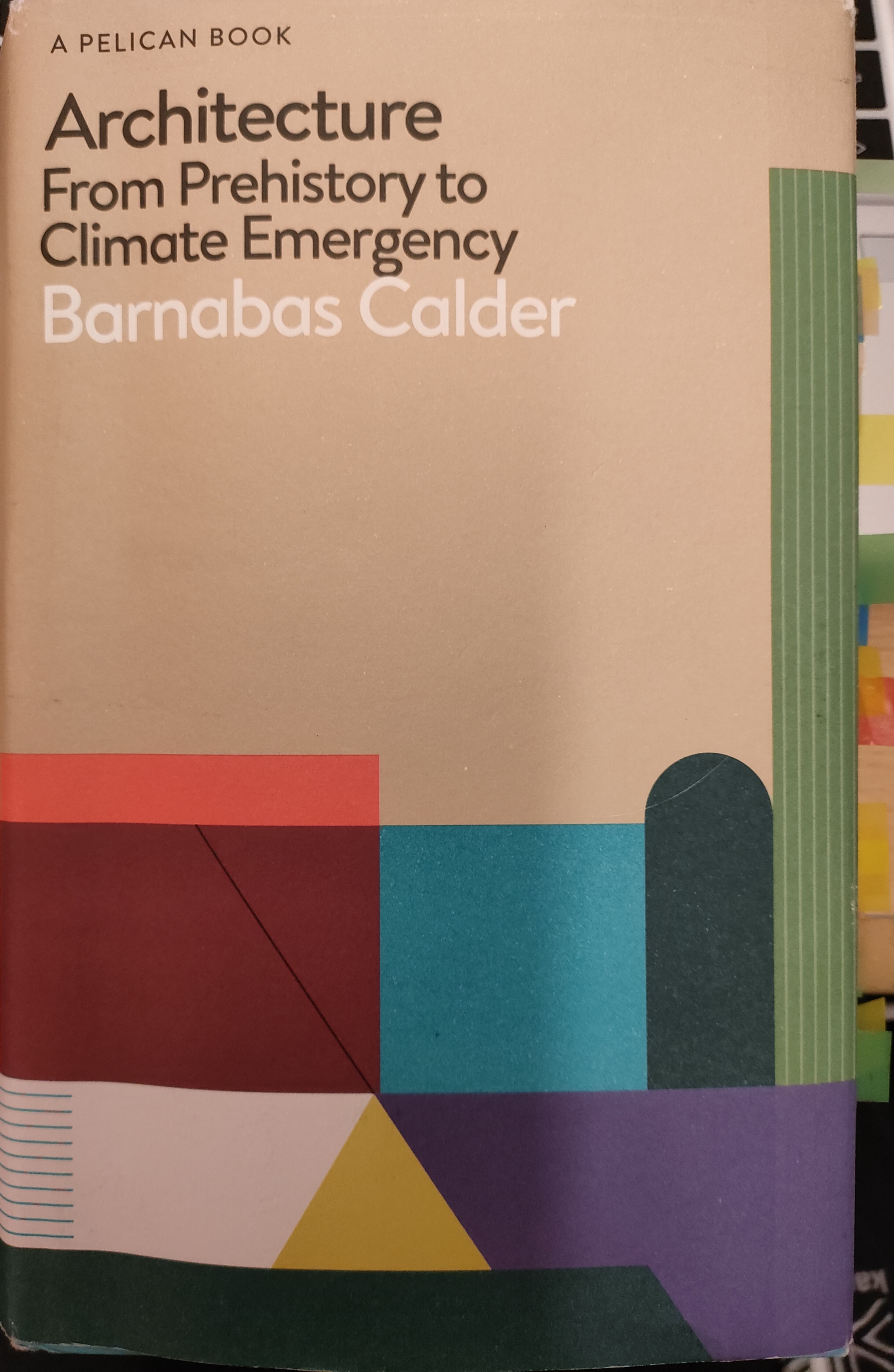
Calder has made me think again in his extraordinary book (right). Calder is a historian of architecture, but very particular kind. In every building he sees energy. In the prehistory it is in the food that provides the energy to build shelter. In later periods of human advancement – particularly in respect of agricultural efficiency and yields – excesses meant that labour could be siphoned off by kings and emperors to build the great vanity projects of history such as the pyramids, the Parthenon, etc. With the advent of fossil fuels, not only was more labour displaceable from the land, but the building materials themselves were innovated as well as construction techniques. That bundle of stored energy found in coal and oil liberated architects, builders and clients. Later they were aided and abetted by information technologies that were able to do the calculations that legions of humans could not realistically handle (Calder offers the example of the challenge to realise Jørn Oberg Utzon’s vision for the Sydney Opera House and the pioneering work of Ove Arup crunching the necessary numbers).
The first part of the book examines culture, energy and architecture interesting pairings. Greeks and Persians; Rome and the Song Dynasty – different places, different times. Though he also uses this technique for the 20th Century in comparing New York and Chicago (chapter 9 – good value even if one does not read the rest of the book – difficult to keep Donald Trump out of the mind, however). In all cases through history, powerful men are deliberately trying to outdo one another. Rightly, we are constantly reminded about infrastructure, bridges, water supply and sewerage.
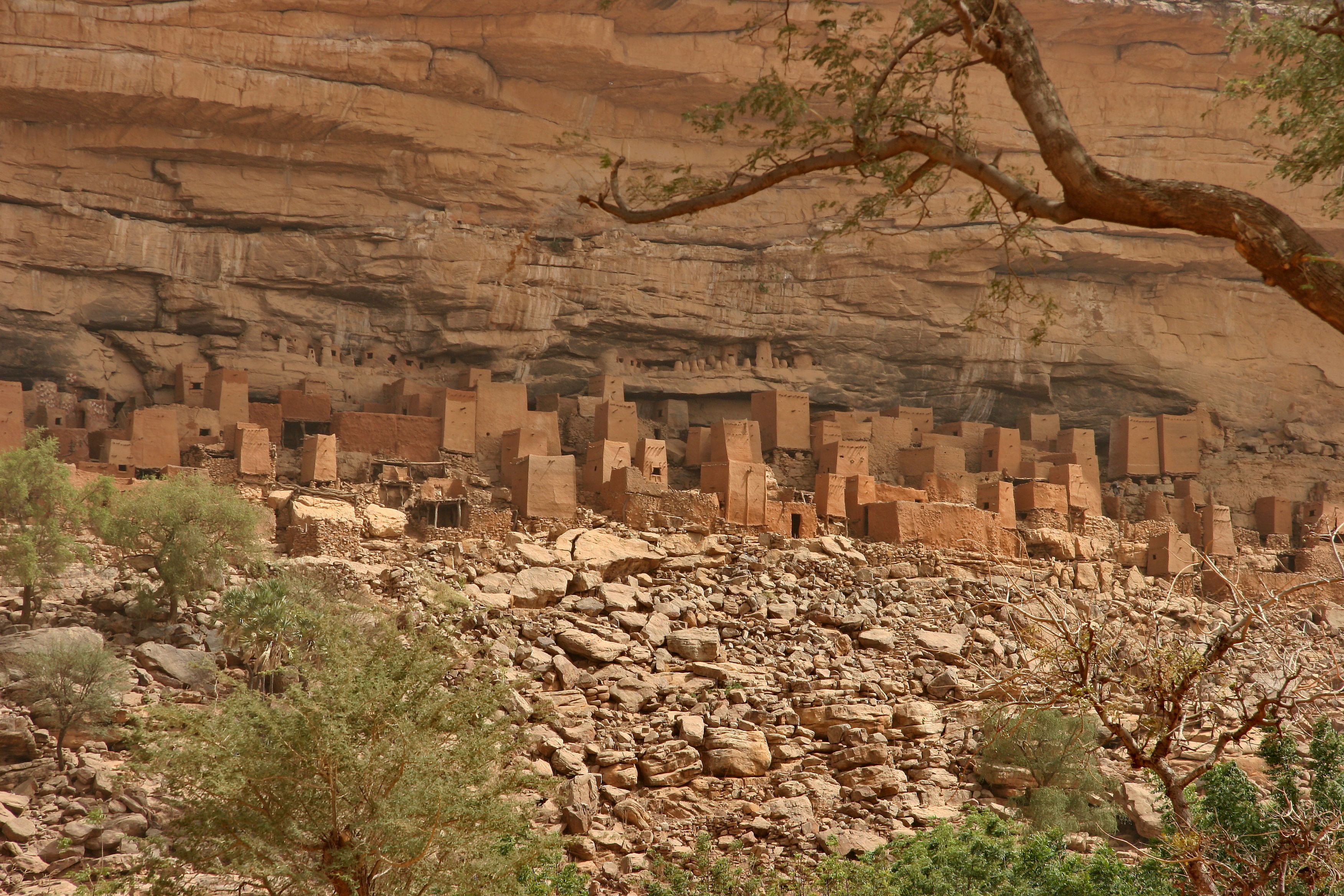
What are some of the curiosities? I learned (always a good indicator of a worthwhile read) from prehistory, Dogon village houses (Mali, left) have low height forcing occupants to sit. This specifically prevents men from fighting one another. Uruk (in modern-day Iraq) is perhaps humanity’s first city. Not everyone worked the land and hence specialisms developed – bronze casting, currency and writing. The transformative agricultural technology was animal-drawn ploughs and, of course, irrigation. We are talking 5000 years ago. 2000 years ago, 172 men pulled crafted stones of 58 tonnes with a lone individual throwing water to keep down the friction. Though 200 tonnes was not unheard of as manageable by human strength – though the men needed to be fit and, crucially, well fed.
For the Parthenon, Calder tells us why the columns are not evenly spaced (of course, Doric order!), reveals that it bends upwards to the middle, there are other distortions too (entasis) and that these are a deliberate manifestation of intellectual debate and democracy prevalent in Athenian society.
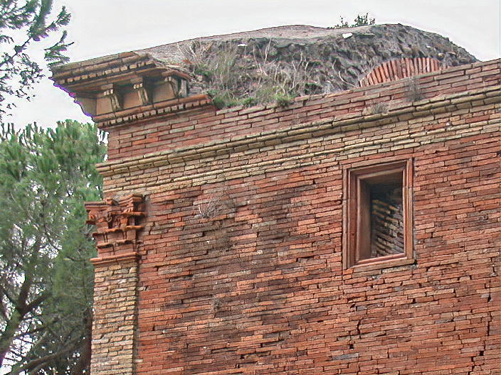
I learned about opus incertum (random), Opus recitulatum (standard square bricks), opus latericium (like a brick wall – rectangular fired bricks that overlap, right). I did not know about Roman concrete and that the Pantheon’s dome is made of it and that it gets lighter as the dome extends so that the whole structure does not collapse. It is impressive, notes Calder, that it has survived 1900 years!

Not surprisingly, religious buildings feature highly in the prose. There is a chapter on mosques and some insights on the architecture of what is now Istanbul (the text is not limited to Istanbul, there is an extensive section on the Great Mosque of Damascus – the initiative of Caliph al-Walid I c705-15 and the mosque in Timbuktu c1320, the product of Mansa Musa’s great wealth as emperor of Mali). I have visited the Hagia Sophia in Istanbul, as well as the near-adjacent Sultanahmet Mosque (also known as the Blue Mosque), a private enterprise that, on cost grounds, sourced materials much closer to home than the builders of its neighbour. For Christian buildings (notwithstanding the Hagia Sophia’s regular changes of denomination), Calder discusses the 13th Century cathedral in Bourges, so big that it breached the city walls and so tall it reached to what we would now identify as 10 storeys high. To the locals living in tiny dwellings shared with animals the internal cleanliness, order and light, Calder says, would have seemed astonishing. But Cathedral building was not immune to ego – the next one needed to be bigger: Notre Dame, Reims, Amiens and Beauvais (left) all bigger than the rest. Though there were limits, Beauvais repeatedly collapsed under its own weight.
Next on Calder’s list is the impact of plague on European civilisations. Bubonic plague devastated populations in the 5th and 6th centuries leading to reduced cultivation and construction. With no surplus, building returned to basics and bricks were no longer fired. The Black Death did wonders for pay rates and educational opportunities. There is room, too, for the Renaissance, the Vatican and the Reformation. These are gems for readers of this blog to explore without my help.

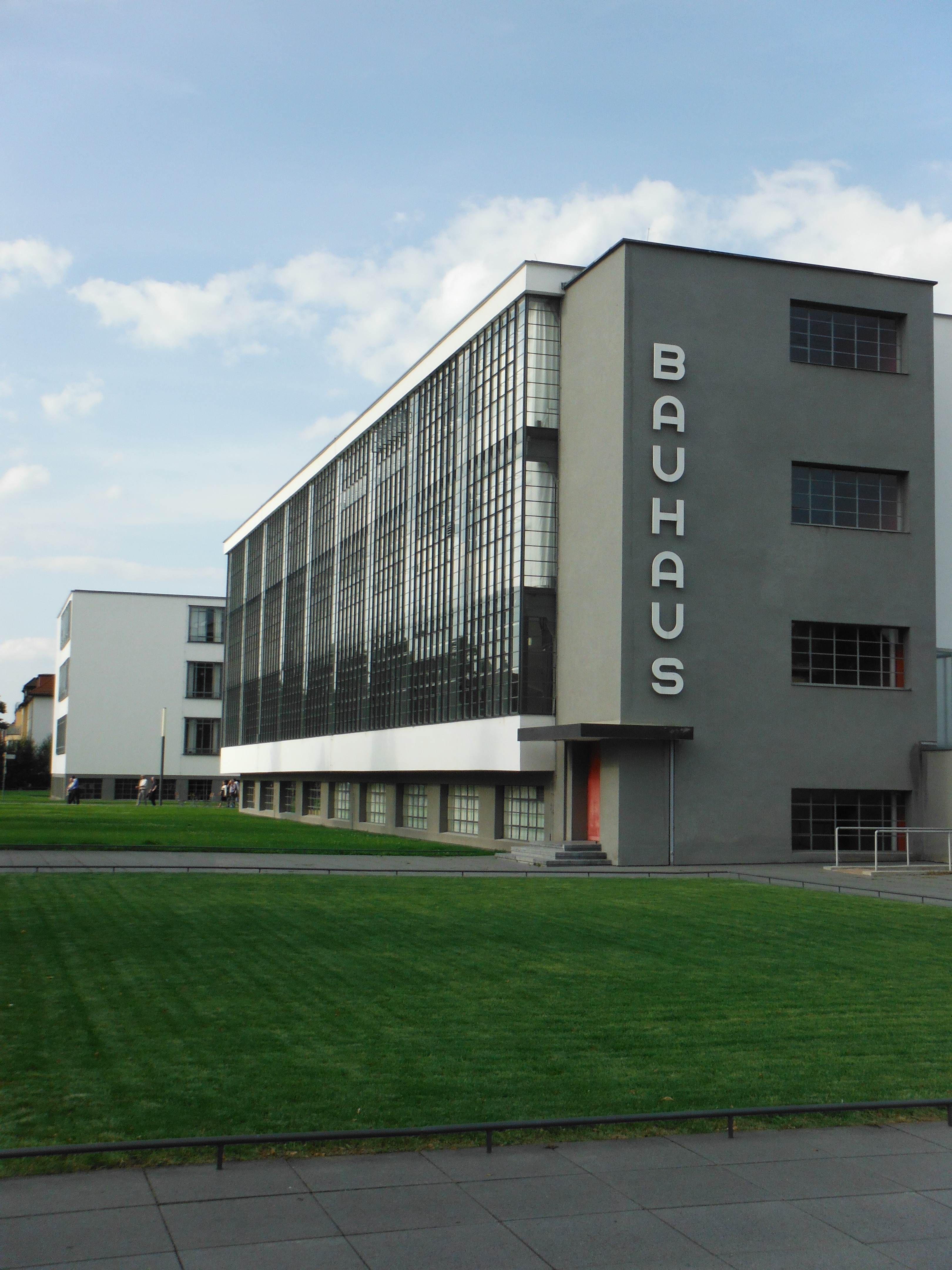
Into modern times, and into territory that is really Calder’s heartland, modernism and concrete. There is rightly an extensive review of the work and life of Le Corbusier (asa Edouard Jeanneret). His influences included Giacomo Matté-Trucco’s Lingotto factory (Fiat’s manufacturing plant in Turin with its roof racing track, right). Le Corbusier was quite a self-publicist, it seems like he sold more books about his architecture and the attendant vision for concrete, steel, glass and electricity), as he did design buildings. I certainly did not know how awful the buildings were to occupy. Concrete and glass enabled a very particular spacious and well-lit living and work spaces, but with no insulation and relatively poor heating, the houses had serious condensation problems. It is not surprising that one famous building – Villa Savoye – ended up as a barn after its occupant-family fled the Nazis. Nor was I aware that the beautiful Bauhaus building in Dessau was similarly afflicted by intense heat loss rendering it totally unsuitable for its use as a workshop. Le Corbusier is, however, celebrated for his Unitè d’Habitation in Marseille – a huge block of 337 flats with a row of shops half way up. It’s founding principles as a community with its roof garden for children is visionary and only possible because of new building materials and the fossil fuels that generate the energy to make cement from limestone and steel from iron ore (Calder gives us the figures to demonstrate their consumption). The Barbican in London was a later manifestation of this principle.

My own alma mater – the University of East Anglia – gets a mention for its Ziggurat-shaped student accommodation (which was my home for some of my university career) for its modular design and manufacture. Concrete remained in the 60s the building material of choice for the new inclusiveness captured in school and university buildings. It is true, the building I studied in was one continuous block of concrete. Magnificent it was, too.
And so to conclusions. Calder is clear, we need more renovation of failing properties. Demolition might be a viable business proposition using current measures, but the energy needed cannot be justified in a carbon-reducing world. Calder does not find too many exemplars. Even buildings like the Blomberg HQ in London falls far short of being sustainable. Calder introduces us to the Cork House in London. Built from cork as the name suggests. But its limitations are such that it cannot accommodate current and future needs for buildings.
On his own sustainability, Calder tells us early on that some of the buildings he writes about he has not actually visited, to do so would have been to make the carbon problem worse. This is a brave statement and one that sets a standard. Modern technology gives us unprecedented virtual access to so many cultural artefacts, sufficient to be a scholar and produce work of this quality. If your summer is short of reading, this is 20 GBPs well spent.
