Archive for the ‘Design’ Category
My last Samsung
Filed under: Book reviews, Design, Finance and Economics, History, Reviews |
 Leave a comment
 A few years’ ago, I watched a documentary about corruption at Olympus (the Japanese camera/optics firm). I was rather disturbed by it. To the western viewer, there was unacceptable fraud being perpetrated by Japanese executives. The British-company president at the time, Michael Woodford, found that dealing with it was not straightforward and could be dangerous. What he could not understand with his capitalist mindset was that losses were not only about honour in Japanese society, but also about social welfare – the interests of generations of employees (Olympus people) were intertwined with the fortunes of the company. The Japanese executives did what they could to avoid the collapse of the company for that reason – something that is difficult for a western mindset to embrace.
 So in reading Geoffrey Cain’s book (left) about South Korea’s Samsung corporation, packed full of examples of fraudulent business activities, should I try to understand the cultural imperatives and conclude the book was a good read? Which it is, though the style as a thriller is annoying, but that is just me again. Samsung is a family business traded on foreign stock markets. It is the cornerstone of the South Korean economy, run as a business empire with a patriarch who can be convicted numerous times for services to the ruling family and somehow evade the full force of the criminal justice system. The book concludes just at the point where the current patriarch, Lee Jae-yong (Jay Lee), was facing a re-trial on bribery charges after a successful appeal by prosecutors to the Supreme Court.
The charges are intimately linked to Lee Jae-yong’s attempts to retain control over the company and not pay much inheritance tax in the process. Although Samsung is traded on stock markets,

1999 Samsung SQ5, later called SM5
investors do not buy a stake in the parent; there is a lot of cross-shareholding that does two things. It blurs the precise nature of who owns what whilst ensuring a controlling role for family members. It is a conglomerate, but at the same time not. Family members control the affiliate businesses including a theme park, a hospital, shipbuilding, fashion and chipsets. It made motor cars in my lifetime (right) The cross-shareholding allows the family to retain control with relatively small shareholding. The structure is frequently adjusted in the interests of the Lee family.
In 2015 one of these adjustments involved two affiliates merging to the considerable detriment of the financial interests of the existing shareholders of one of those affiliates, C&T such that it was being valued at less-than zero. As Cain notes: “Samsung argued that this was an attempt to consolidate business units…Jay Lee owned a 23 percent stake in Cheil Industries, the company acquiring Samsung C&T [Construction and Trading], which in turn owned a 4 percent stake in Samsung Electronics, the crown jewel. The merger would simplify and solidify Jay Lee’s control of Samsung Electronics through this shareholding web, starting with Cheil at the top” (p245). To make matters worse, the family managed to convince one of the largest institutional investors, The National Pension Service (NPS), to support the merger despite it not being in the interests of its own stakeholders; namely, South Korean pensioners and those hoping to retire on a pension. In the end, a combination of the devaluing of the NPS’s shareholding and the stock market’s response, it lost $500m – a straight transfer from the people to an industrial elite!
Even a US hedge fund, Elliott Management, led by Paul Elliott Singer, failed to stop it. Singer himself was described by Bloomberg as “The World’s Most Feared Investor”. Samsung engaged in some pretty unsavoury propaganda to discredit him. Singer is Jewish and Samsung went full-on antisemitism even going to the point of setting up a website called “Vulture Man” with a slide show depicting a vulture, thought to be a caricature of Singer, “whose sadistic practices consisted of plotting and preying on the poor and disenfranchised around the world” (p250).
Samsung’s origins are uncomfortable from a 21st Century context. Its founder, BC Lee, was educated in Japan and was enamoured to say the least by Japanese Zaibatsu, powerful family-dominated industrial and financial business empires, which fell victim to post-war reconstruction. Lee’s first business operation was in supplying vegetables to Japanese soldiers in Manchuria. That story itself has unsavoury implications, though from a business perspective, perfectly reasonable. A man familiar with Japanese cuisine supplies vegetables to customers in Manchuria. The fact that they were an occupying force is neither here nor there.
After WWII, the South was invaded by the North; 3 years’ of war saw most of Lee’s assets taken or looted. Lee then entered sugar refining and wool spinning, banking, insurance and chemicals. Samsung was intimately involved in the economic transformation of the country arising from the military coup in 1961 led by General Park Chung-hee after some horsetrading over the scope of Samsung business interests. Actually, the state wanted the banks.
 The transformation into an electronics firm started to take shape with the acquisition of a semi-conductor firm in 1974. Always a supplier, Samsung powered the first iPhone. In fact without very close collaboration between the two firms the iPhone would not have made it to the market and that infamous 2007 presentation by Steve Jobs at the Macworld convention would not have happened. That event is itself a tale of trade-off and compromise.
Samsung seems to have been obsessed with beating competitors. First, Sony in terms of design and LCD screens/televisions. More famously, beating Apple, particularly in the American market for which Samsung employed a crack team of marketers led by Todd Pendleton. Their White Glove project culminated in one of the most famous non-selfies when Ellen deGeneres tried to make a selfie with Meryl Streep using a Galaxy mobile at the Oscars ceremony in 2014. It ended up being the most-retweeted Tweet (right) featuring other stars such as Julia Roberts, Channing Tatum, Jennifer Lawrence, Bradley Cooper, Brad Pitt, Lupita Nyong’o, Jared Leto. And Kevin Spacey.
It is at this point in the book that I realise how meaningless life is.
The politics are much more interesting than the marketing; and much more unsavoury. Further words are expended on the PR disaster of the Galaxy Note 7 and the company’s insufficient recall policy and unwillingness to come clean about the cause, or indeed the danger. Readers will not be surprised to learn that there turns out to be considerable institutional causes over-and-above the design flaws. And then there is the premature release of the folding-screen phone that was so delicate that it broke by looking at it. Cain concludes, however, that we, the consumers, are just seduced by good products in nice cases. We will overlook the behaviour of the manufacturer in pursuit of consumption. My Samsung S8+ is now into its fourth year. That is a testament to the product (and a bit to my care and attention to it). My next mobile will not be a Samsung.
25 October 2020 – death of Lee Kun-hee announced: https://www.theguardian.com/technology/2020/oct/25/lee-kun-hee-samsung-electronics-chairman-dies-aged-78
Pics: Samsung SQ5: raul • CC BY-SA 3.0
Vienna’s washrooms
 So there we are looking for breakfast. We end up at Schwedenplatz. We cross the Donau Kanal using the Schwedenbrücke and stumble into Spelunke on Taborstraße. It is one of those cafés that doubles as a nightclub. Versatile. But as we have found over the years, the proof is in the toilet, and Spelunke is special. The breakfast was ok, too.
So, the first challenge is to get in. Because one does not expect to find instructions on the floor, the tantalising glass door just refuses to open. It takes a couple of helpful women to point out the floor sensor (above left).
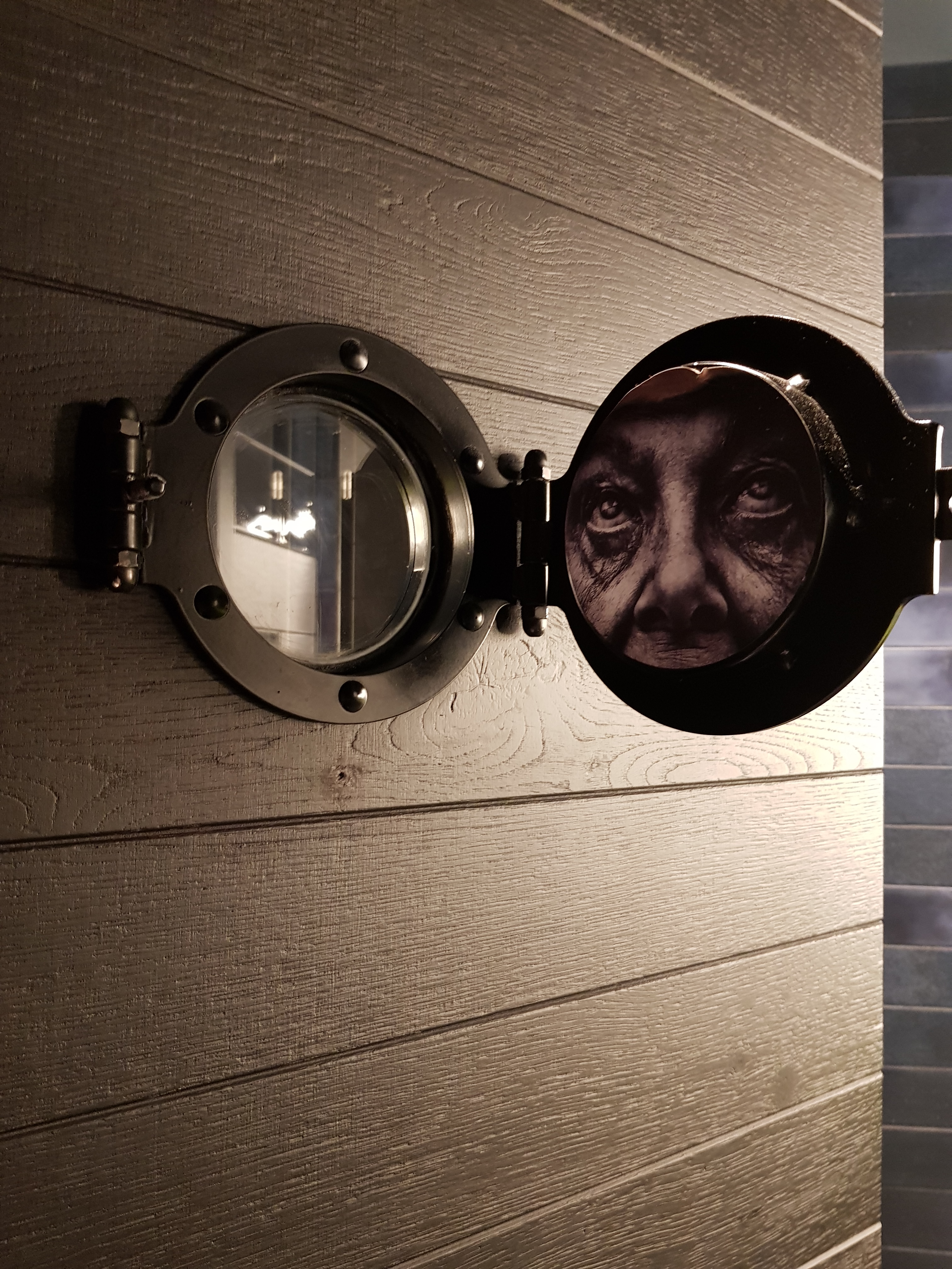 Once in, there’s more going on. Now I did not go into the women’s toilet, but my partner came out with a couple of interesting shots from inside a cubicle where the portal window has a couple of surprises (left and right).
And just in case you cannot find the loo roll, it is illuminated.
So the next day, we are after breakfast again. We concede Stadtcafé adjacent to Freyung, a rather central location. The café is pretty regular. The porridge was good. Then in the toilet one finds another mysterious piece of equipment, albeit designed by Dyson (right). These three-in-one contraptions never seem satisfactory and always challenge. The wash basin itself is a bit of a mystery. It is more of a drainage channel.
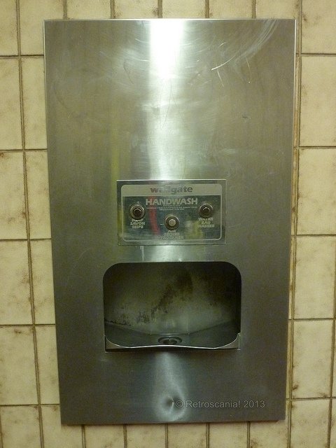 As a design idea, this borrows directly, I think, from the old ghastly Wallgate three-in-ones that seemed very popular with English public authorities either building or refurbishing their public conveniences (left).
Wallgate picture by Retroscania (Flickr) from Dudley bus station
Tilman Riemenschneider
Filed under: Art, Design, Travel | Tags: Großlangheim, Rothenburg ob der Tauber, Tilman Riemenschneider, Würzburg
Comments (1) 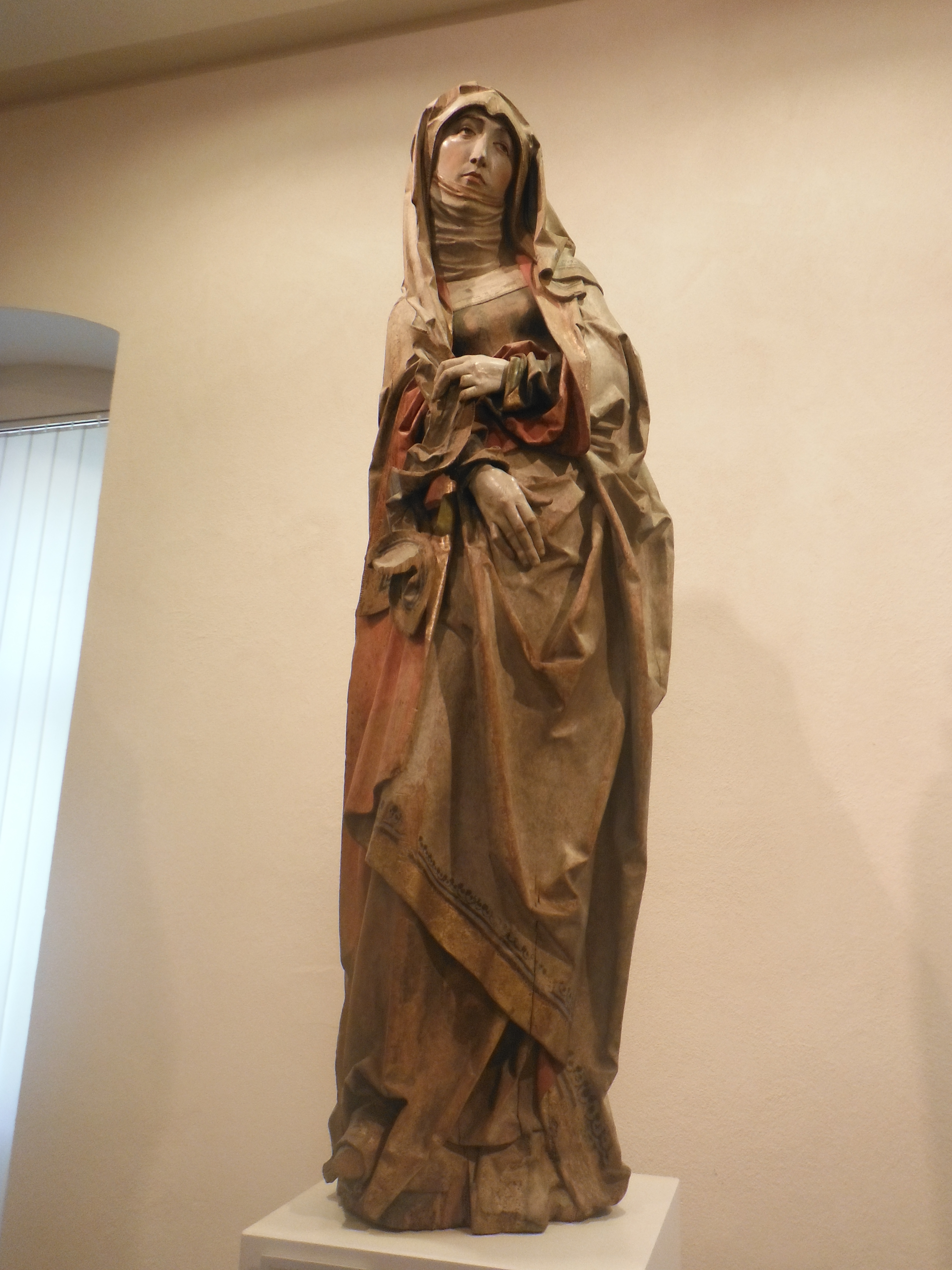 We were introduced to Tilman Riemenschneider by one of our favourite art historians (AGD) on his BBC series, “Art of Germany“. Riemenschneider was a very fine carver and sculptor working in the 15/16 Century, largely in the Franconian region of northern Bavaria. Würzburg is the region’s capital; it was there that Riemenschneider had his studio (a prolific producer of largely religious icons, popular at the time with the wealthy Bavarians and staffed by a series of journeyman carvers). He utilised property that came his way through (four) marriages to set up the study (at least three of his wives died – he was not a mass murder as was my original concern). He was also a political figure in the region, holding a number of official posts, including Bürgermeister in 1520. However, when in 1525 the peasants revolt reached Würzburg, he found himself on the wrong side of the victorious Prince Bishop. He was briefly imprisoned. He died in 1531 and was quickly forgotten. It was not until his tombstone was found in 1822 that his work was re-evaluated by Carl Gottfried Scharold, a significant local historian.
He worked using regional materials, in particular lime wood and sandstone. It is for that reason that it is amazing that so many pieces have survived these years. Take, for example, the “Sad Mary” (above left) who can be found amongst the largest single collection of his work in the Mainfrankisches Museum in Würzburg. Dating from 1510, she belonged to a f amily in Ochsenfurt, a significant town on the Main river. She hung from a hook around shoulder level; but seemingly she was not well loved. In fact, she was feared. She was also rather black having some sort of fire damage (she was stored in the attic near to the chimney). Her maker was recognised by Johann Valentin Markert as part of Riemenschneider’s rehabilitation. Her robes are just exquisite. The representation of folds, creases, seams, hands etc. are carved out of a tree and are trademark Riemenschneider. The carver’s faces are distinct, something that helps scholars and amateurs alike identify his own work from that of the journeymen in his studio.
St. Antonius Kapelle and St Jakobus, Großlangheim
The carving of “Holy Nickolas” dates also from 1510. This piece came from the “Chapel of Marriage” in Würzburg. Nickolas’s face carries the features of a sage; however, one assumes that most senior clergy at that time were sages? This look with oval eyes, ageing lines and long noses is repeated endlessly.
AGD told us that some of the best pieces are to be found in small churches dotted around the Bavarian countryside. In particular he said that there were a couple of seemingly forlorn pieces in a small chapel (St.-Antonius-Kapelle) in Großlangheim. To enter one needed to get the key from Frau Sterk, the owner of the nearby liquor store. Actually, the chapel was open when we investigated (Frau Sterk still looks after it, though). Moreover, there were four pieces in the Chapel, not the two featured in the documentary. St. Antonius, depicted above left, is signature Riemenscheider. We were directed in particular to the belt around his waist! The light in the chapel was not really conducive to photography, unfortunately.
AGD did not tell us, however, that Großlangheim had two places of worship, both of which boast Riemenscheider sculptures. The Catholic church, St. Jakobus, is brimming with Riemenschneiders. For example, the sculpture of St. Anna with child and Mary (Selbstdritte) is beguiling, full of colour and symbolism. 
Another common subject is Mary and the dead Jesus (left). The Virgin’s clothes contrast absolutely with the dead Christ’s grey skin. A reminder, presumably, of the horror of the crucifixion and mortality, at least for the body.
There are professional reasons for this approach to colour. At that time such many works were
church commissions. If the commission was given to a painter, naturally any sculpture subcontracted as part of the commission would be painted. Carvers were not allowed to paint their own sculptures (or not). Where altarpieces were involved, there were also cabinet makers who could actually earn more than the carver for creating a hinged box (see St Jakob, Rothenburg, below).
Maria im Weingarten, Volkach
AGD had advised us to visit the Riemenschneider sculpture hanging in the Church, Maria im Weingarten, in Volkach. In his TV documentary he spent quite a bit of time discussing this carving dating from 1522  (right). It is certainly impressive, hanging as it does from the ceiling of the church. It depicts Mary standing on a crescent moon with the child, Jesus. The five roundels depict events in her life (the Annunciation, Visitation, Nativity, Adoration and Death). The child is enthroned on the virgin’s left hip. It was stolen in 1962 and returned only after the payment of a ransom. But there is some doubt about how much of it was carved by Riemenschneider himself, rather than one of his journeyman carvers. Like many carvings and sculptures that are likely to be difficult for people to inspect closely, fine detail is not required.
Altarpiece of the Holy, the parish church of St Jakob in Rothenburg ob der Tauber dating from 1505.
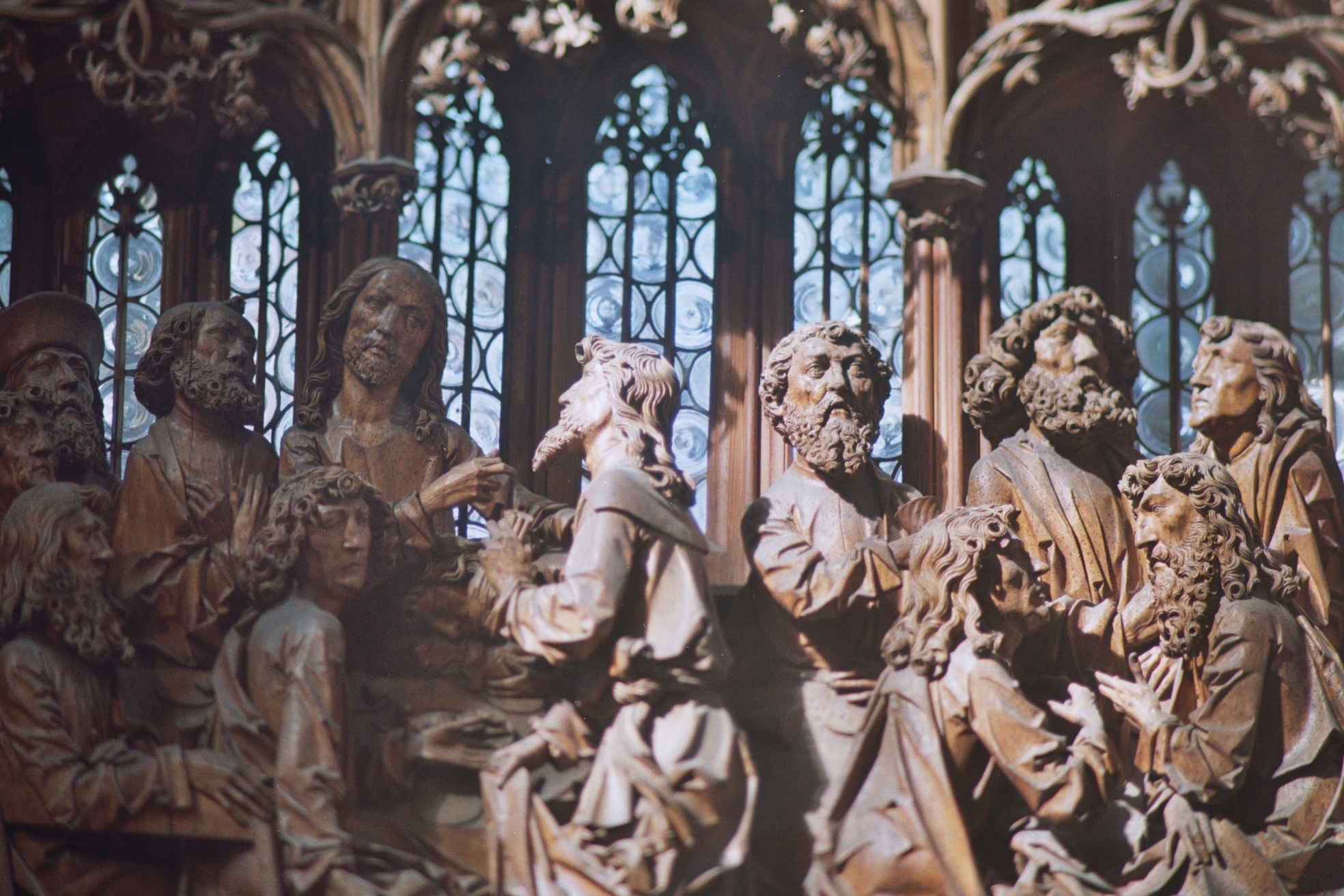 The centrepiece of this fine altar (pictured left) depicts the Last Supper. In the centre is Jesus and next to him to the right is Judas (bearded and about to receive bread, a symbol of sin, from Jesus) being exposed as a traitor. Pilgrims enter the space in the west
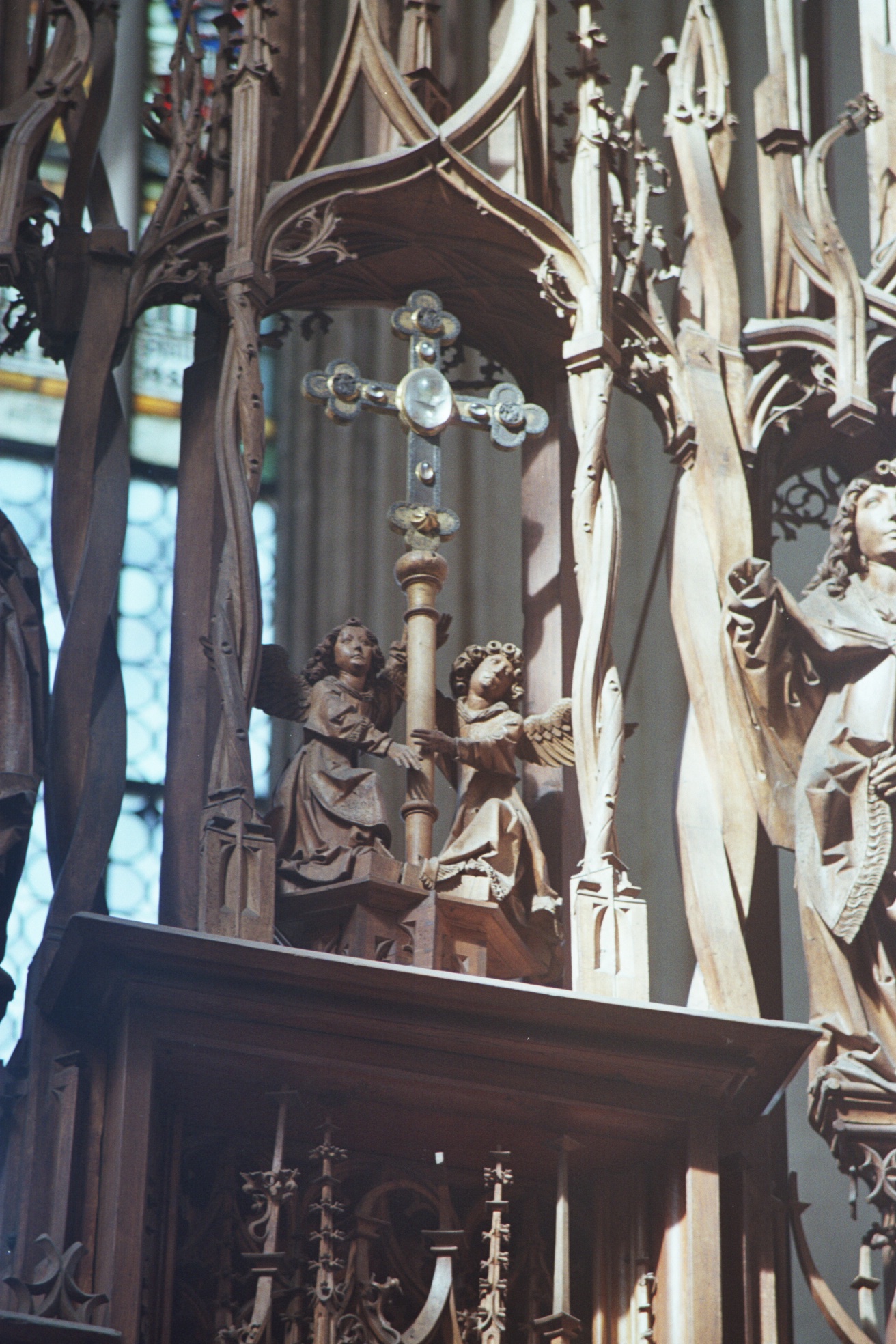 choir of the church from the right, just like Judas, the sinner. Forgiveness is possible for pilgrims. St. Philip (left of Judas) points to the alter base where sinners should kneel and confess sins to receive redemption. One has to step back to see the real point of the altar – the relic of the holy blood encased in a glass cross (right).
It seems that this wonderful piece – we spent at least an hour with it – had to be done relatively cheaply. The master, concentrated his attention on the cluster of figures aroun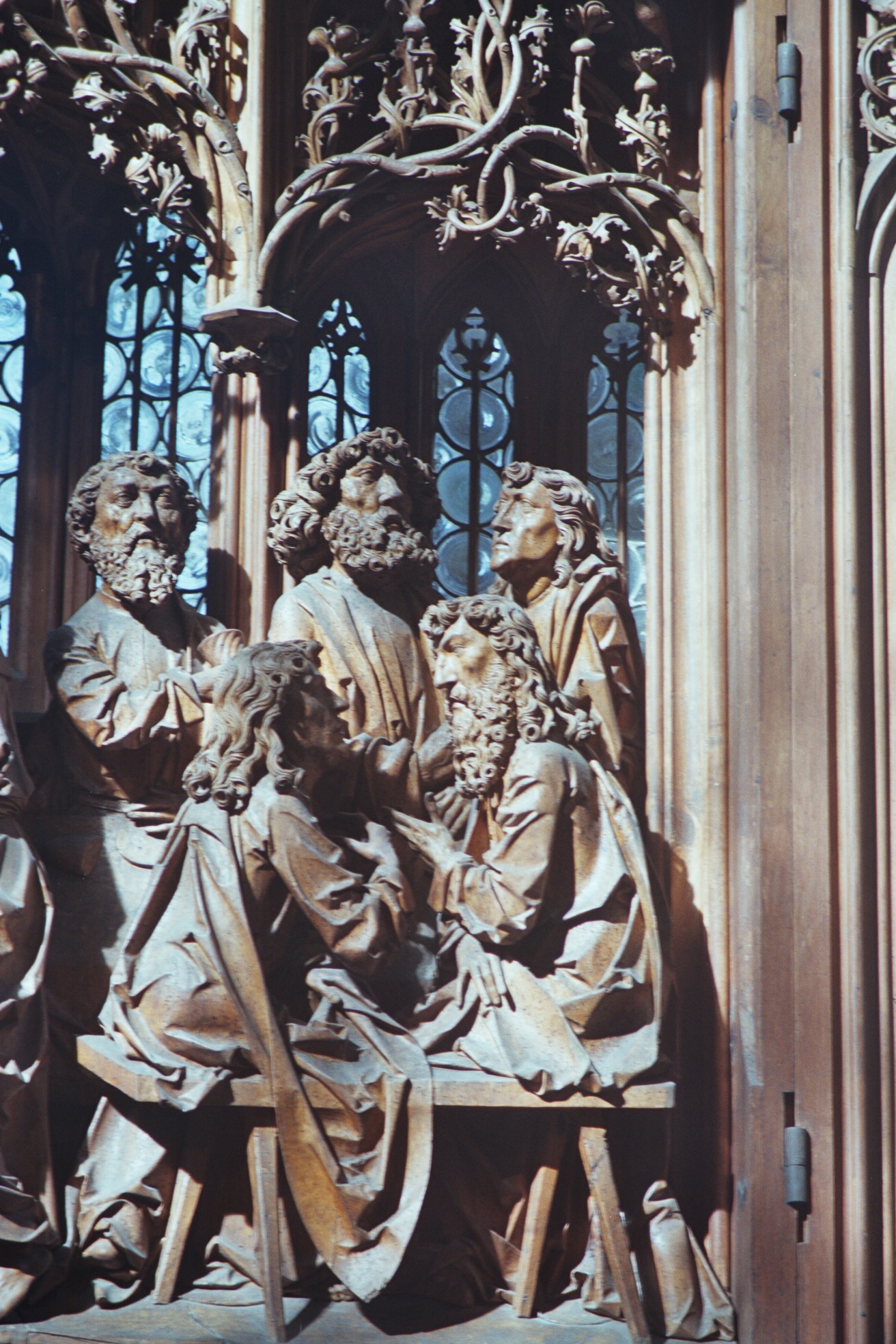 d Jesus, whilst his journeyman worked on the five apostles to the right of Judas (pictured left) seemingly trying to work out who the traitor was. The relief on the left of the central shrine of the altarpiece depicting Christ’s entry into Jerusalem does not seem to be Riemenscheider. In particular, the figure of Christ himself is insufficiently proportioned and the faces of the figures are stylistically different.
Altarpiece of Parish Church of St Peter and St Paul, Detwang – 1505-8
By way of contrast, this altarpiece (right) is thought to be wholly by Riemenschneider, although it was not originally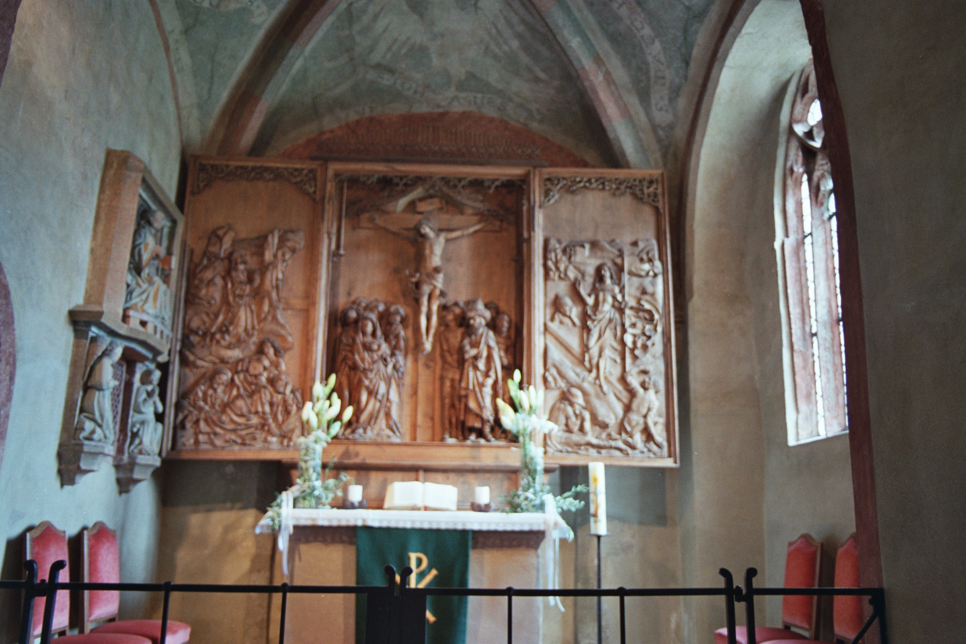 designed for this church (it had to be narrowed fit in the space). The central section is a classic crucifixion scene with mourning women and St John to the left and the soldiers around Caiaphas to the right. The panel on the left depicts the agony in the garden, the one on the right, the resurrection. All are deemed to be stylistically coherent apart from some of the bodies in the resurrection scene.
Würzburg Cathedral
 Würzburg Cathedral is a wonderful space in the centre of the city. Riemenschneider was commissioned to carve a couple of tombs for former bishops. The founding bishop, Rudolf von Scherenberg, is celebrated in the stone carving (left) which is a masterwork in ageing human form. The Bishop gets the old-man treatment – though the contract specifies precisely how he was to be presented, with artefacts (swords, etc.), coats of arms and attire.
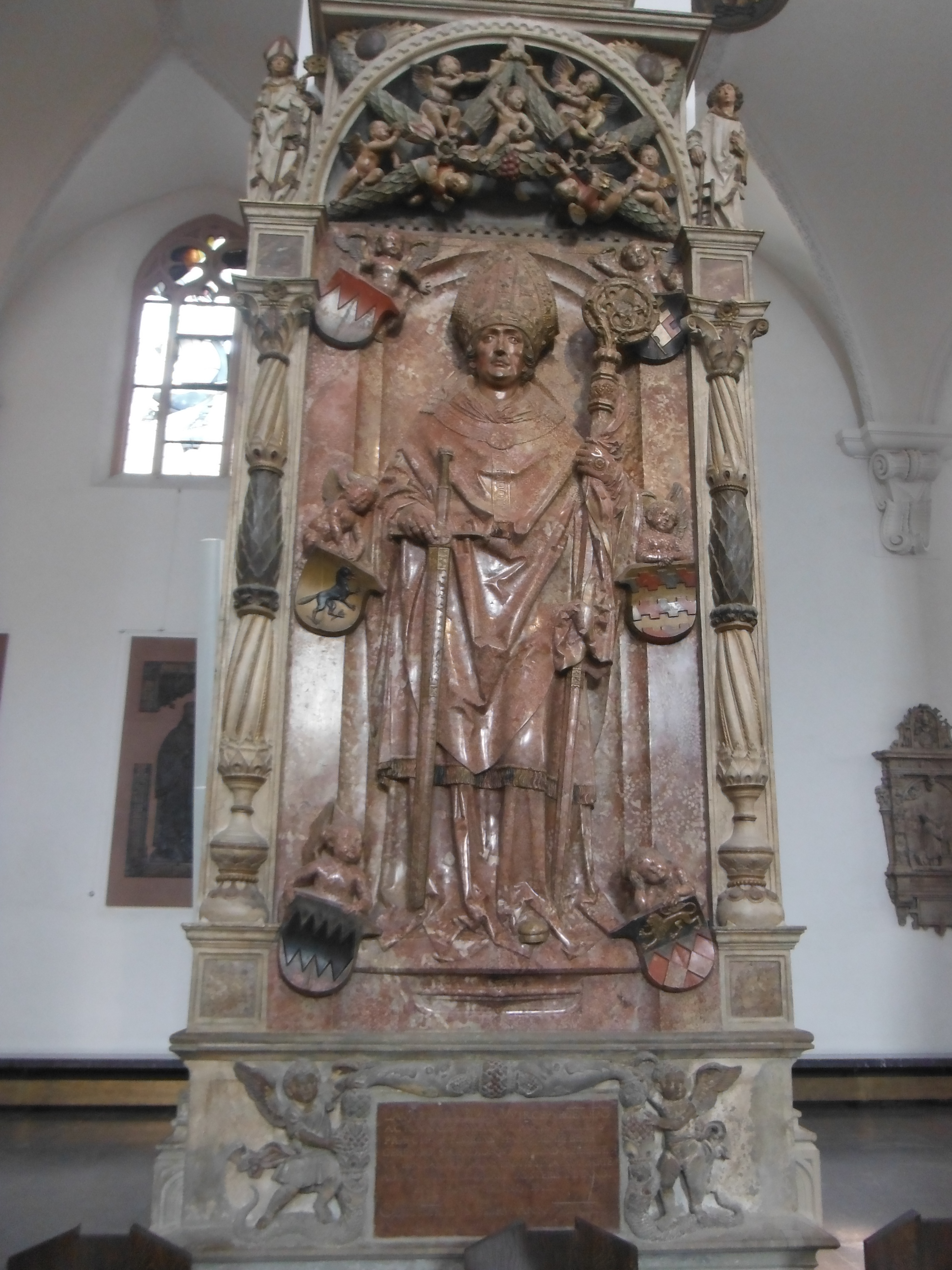
Later, Riemenschneider did the same for Bishop Lorenz von Bibra (right). This depicts a younger, age-indeterminate man, but is a mis-mash of styles. Riemenschneider is credited with the figure, puttis (something that he liked doing, seemingly) and the lion vanquishing the dragon (at the base).

Walk down the knave and one comes across yet another Mary and child (left). Again, she stands on a crescent moon. The child is cradled on her right side (in contrast to the depiction in Volkach, above) and her leg protrudes forward. She stands on a plinth ahead of the altar.
The cathedral used, also, to be the home of Riemenschneider’s stone Adam and Eve sculptures (1493). Go there now and replicas flank the south portal of the Lady Chapel. The originals are now in the Mainfrankisches Museum in Würzburg (see above). They ended up there because the provost of the cathedral in 1894 was offended by the nudity and had them removed. The replicas were installed in 1975.
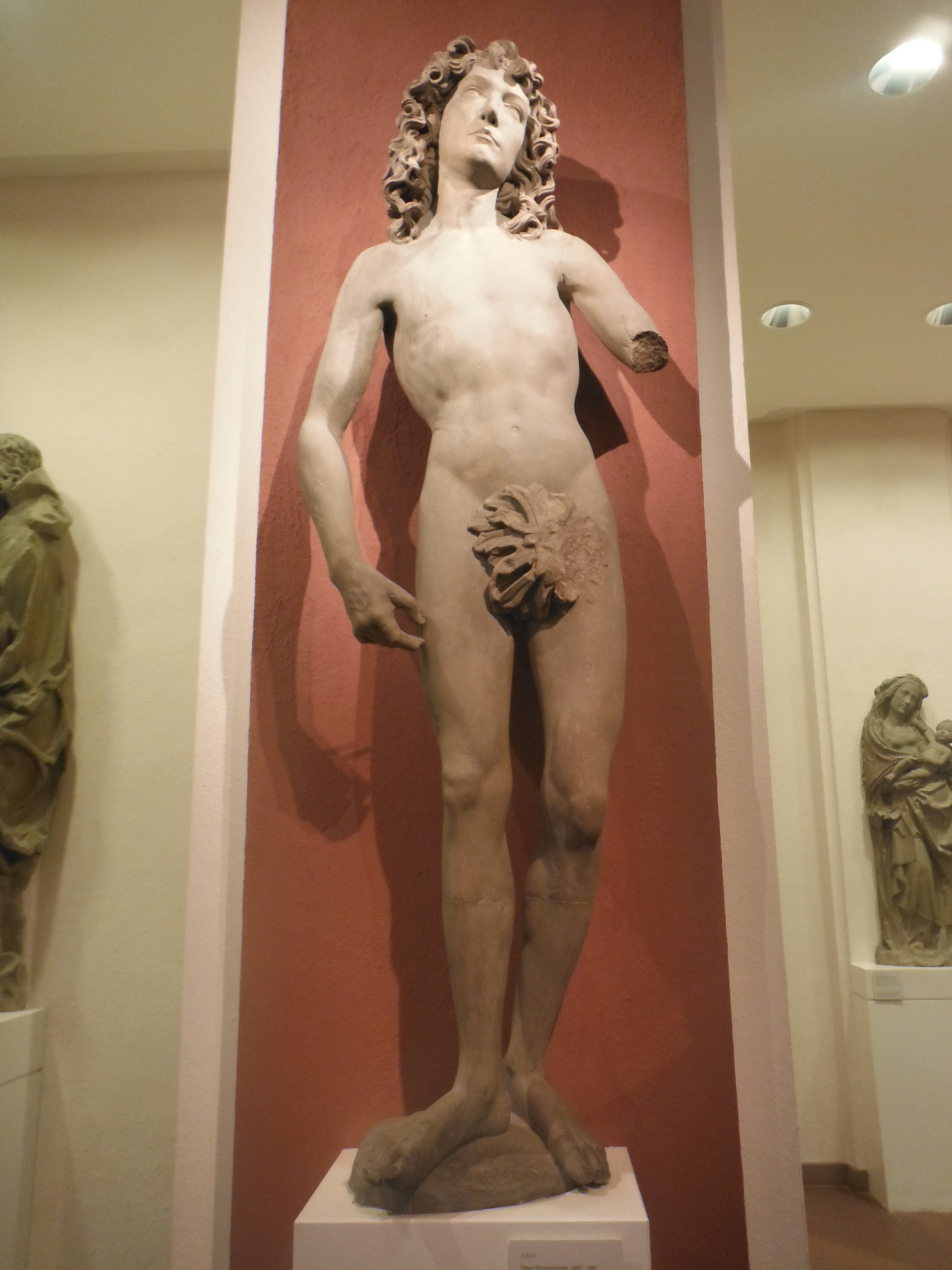
Bot h have missing arms. Eve is depicted as round and earthy in a renaissance style. She has the apple in her remaining hand and a serpent at her feet. Her hair confidently drapes her back. Art historians, however, have been a shade confused about the figure of Adam. Traditionally he is depicted as being mature and, naturally, bearded. This one is youthful, innocent – and a victim of female wiles. He’s late gothic in depiction; hence he is not particularly endowed with muscles (renaissance Adams often have six-packs). Adam’s face and hair are similar to Riemeschneider’s St Johns in altarpieces (for example, Münnerstadt, not discussed here).
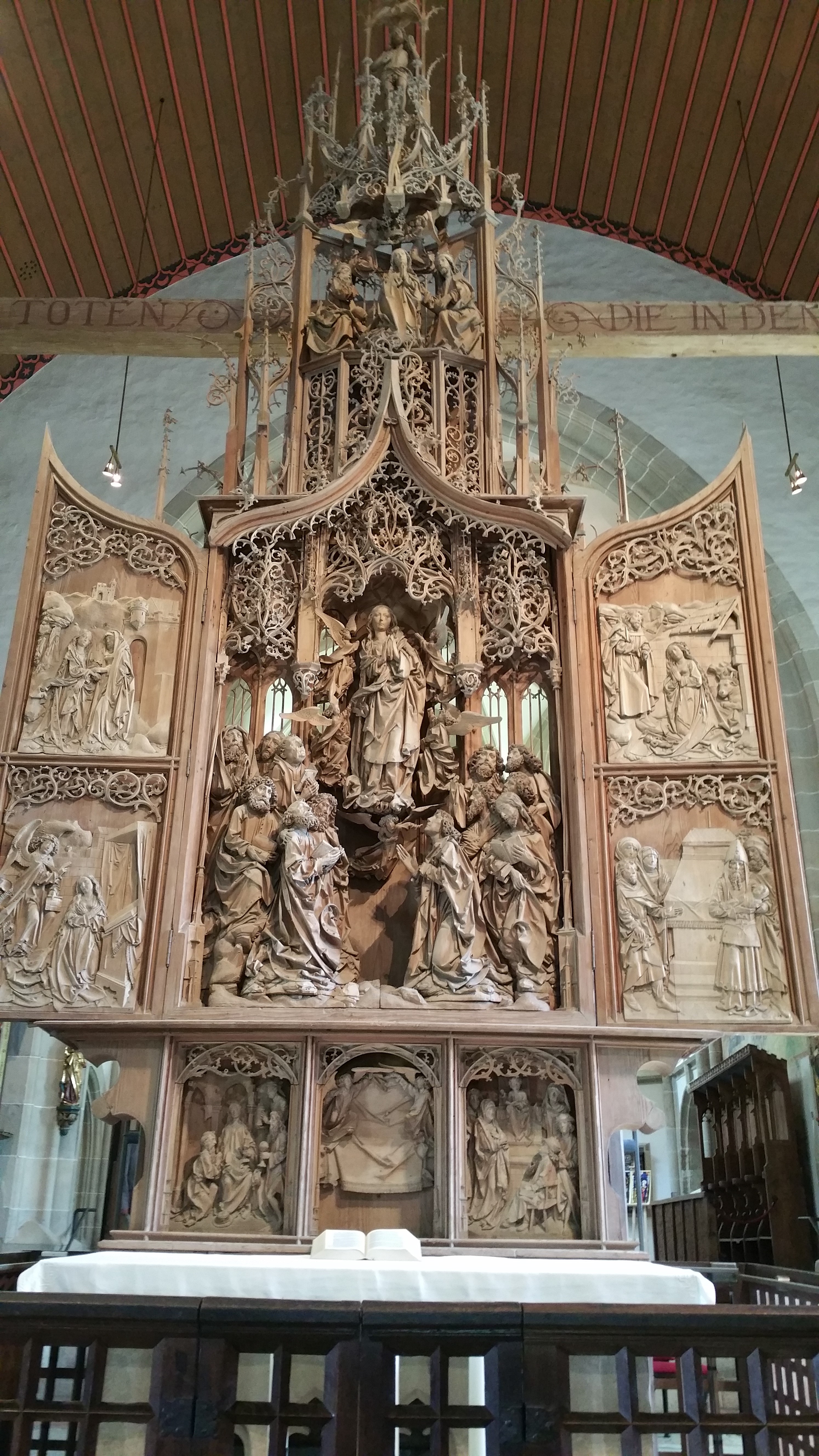
Our tour was not complete. Münnerstadt, for example. But equally, the masterpiece at Creglingen 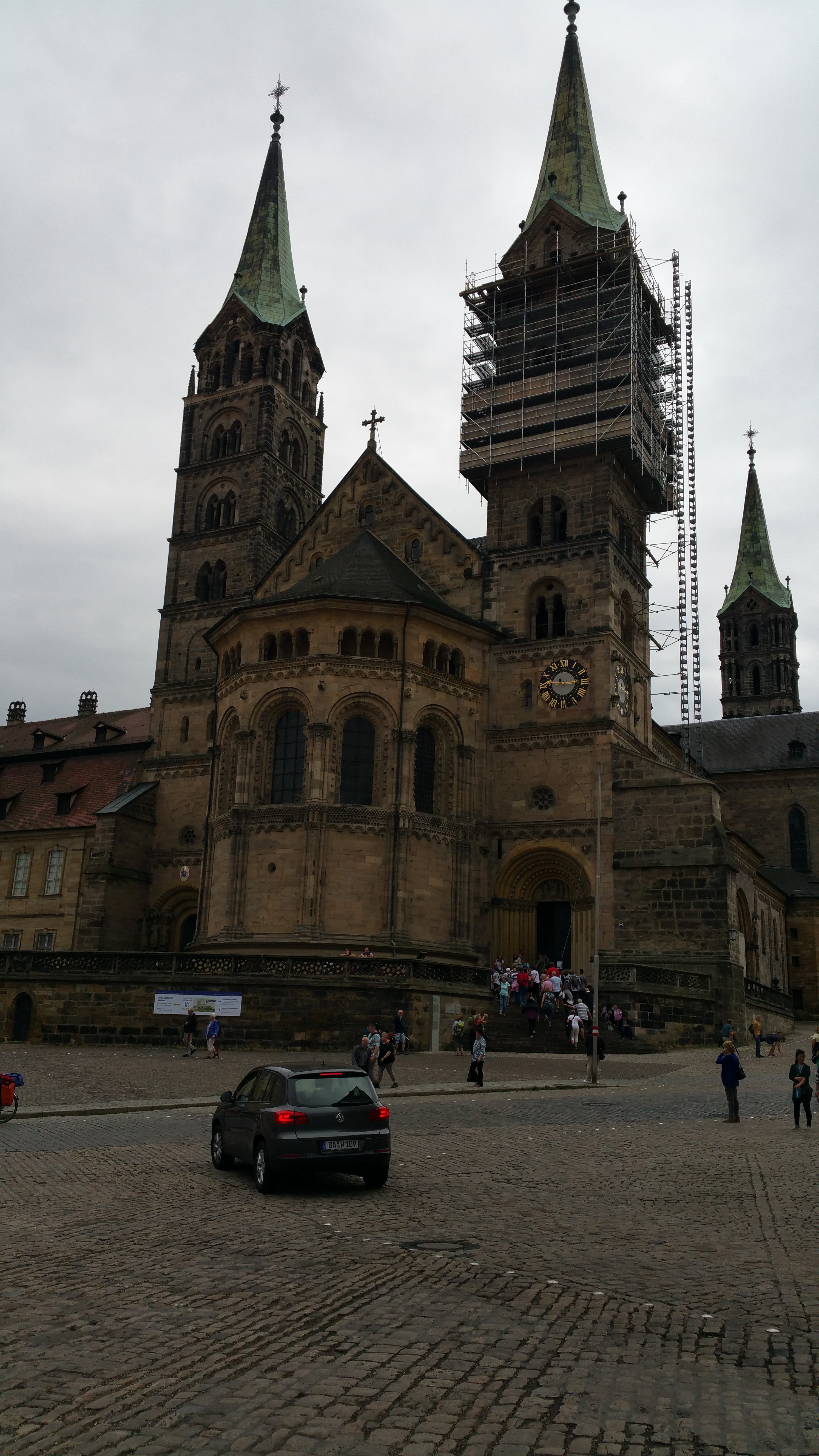 Herrgottskirche (right) and Bamberg cathedral (left). Unfortunately, there is a lot of geography involved and not enough time.
What I have tried to do is give a flavour of the life and work of Riemenschneider. Not only was he a fine carver, but also a politician -clearly with some morals – a husband – though accrued much property by this means – and a businessman. He worked to specification and gave, usually, what was asked at the requisite quality. For tourists, focusing on a single artist can be an exciting and meaningful way of exploring a region. And if you have access to the language, there are lots of people to fill in the gaps for you. We are indebted to the attendant in the Mainfrankisches Museum for extra info about artefacts, and the woman in Großlangheim who told us about both churches and their treasures.
Additional source for text: Kalden-Rosenfeld, Iris (2004) Tilman Riemenschneider: The Sculptor and his Workshop. Translation by Heide Grieve. Karl Robert Langewiesche Nachfolger Hans Köster Veerlagsbuchhandlung KG . Konigstein im Taunus.
Design Museum, London. Camper Shoes exhibition
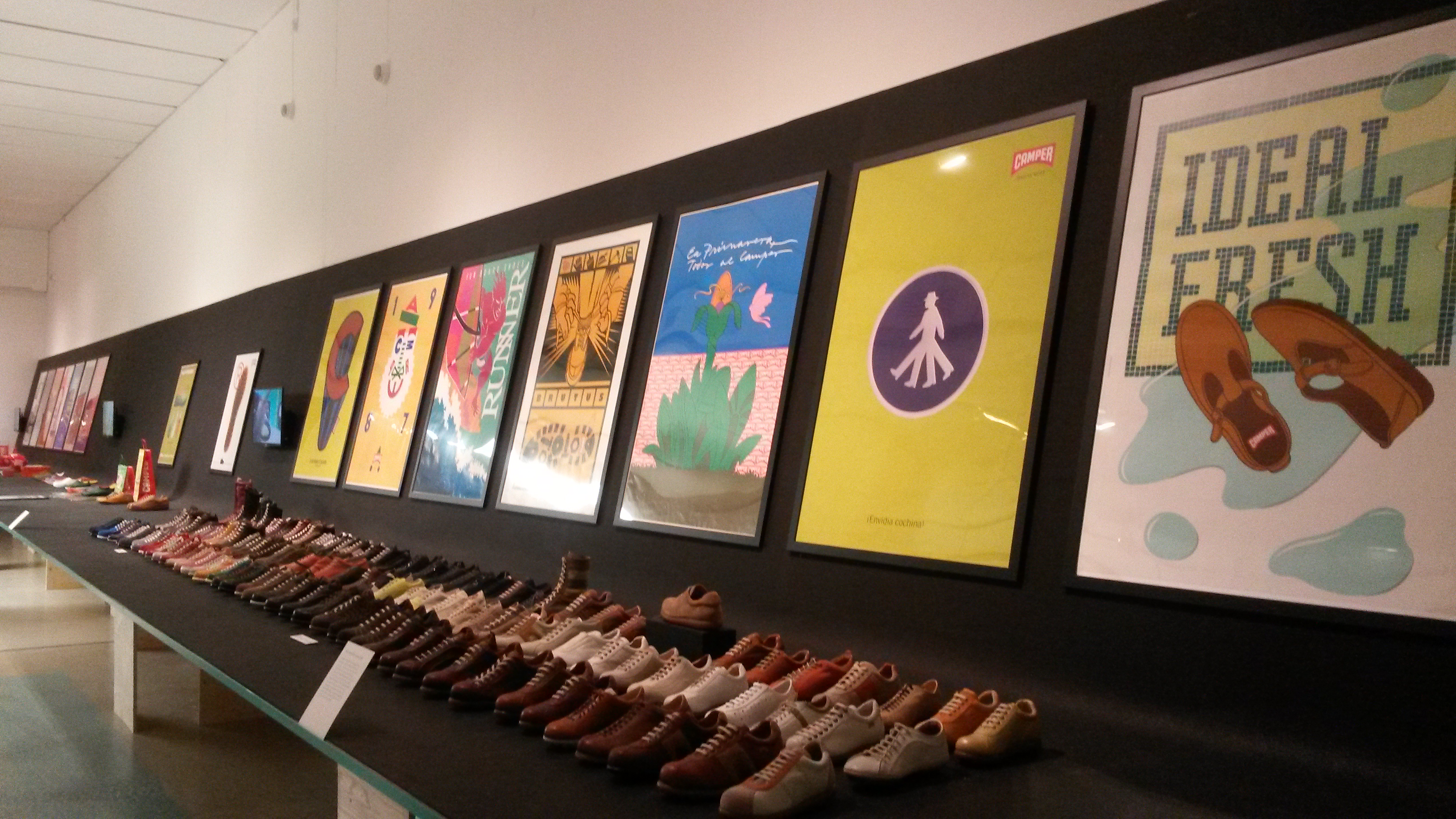 The Design Museum in London is currently offering an exhibition of history of the Spanish family-owned shoe maker, Camper. I’m not a particular fan of the style of the shoes, iconic though they are (left).
For those unfamiliar with Catalan, Camper means peasant or farmer, suitably betraying the origins of the company. They are a hybrid work-leasure-sport shoe. The company tells its own history here.
The exhibition itself does three things excellently. First, it shows the core artefact, the shoes. Second, the process of design and manufacture is explained, not just for Campers, but for shoes more generally, complete with tools and demonstrations using video screens.
 Finally, there is a business element. Camper has a rich marketing heritage (even though the firm dates only from 1975). The advertising (left and above left) has a 1930s feel about it. The brand itself is simple and distinctive.
The exhibition runs until 1 November 2015.
Design Museum exhibition – Designs of the Year 2015
I’ve said this before, the people at the Design Museum in London know how to present artefacts. One of the current exhibitions, Designs of the Year 2015 is a case in point. Conceptually, it is very simple: present 60 or so design ideas to demonstrate the scope for design in modern times. Scope is everything from fashion to ways to save the planet. Here is a selection of what I deemed to be the best after my visit on 29 July.
 The evolution of chairs is a perennial design discussion. This one (left), I like the most as it takes inspiration and scientific validation from nature. It is by the Italian designer Odo Fioravanti, and is called Dragonfly. Seemingly dragonflies have an imbalance between the weight distribution between their front legs and tail. The chair deals with this with ribbing (which can be seen underneath). Equally interesting, however, is the process involved. In order to validate the design, computer aided structural tests were undertaken and plastic mudflow analysis conducted before the injection moulding process started.
Next, is an example as design for safety. 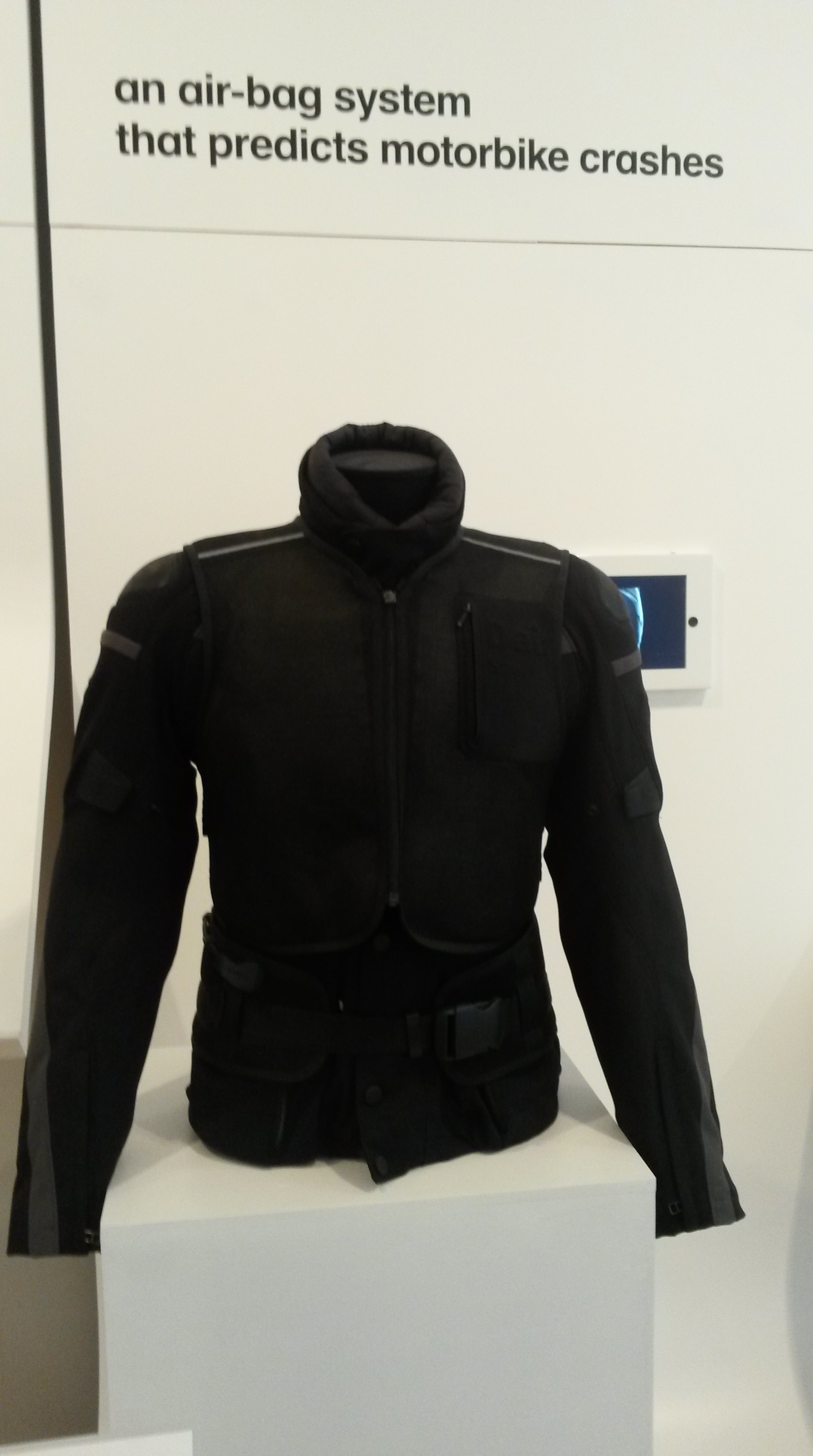 It is a jacket that anticipates a body-damaging accident or fall from a motorbike. There are sensors in the front fork (to detect a collision) and on the side (in anticipation of a non-collision-caused fall). A wireless signal is sent to the jacket which then inflates and protects the vital organs and bones. The designer is Vittorio Cafaggi.
 As a cyclist, the development of bicycle lights over the years has been welcome. In the old days they were big, unreliable and often invisible to other road users. I currently have a set of Brainy Bikelights which I am delighted with. However, these (left) by the Paul Cocksedge Studio, are great for urban riders prone to having their lights stolen. The idea is that when the rider locks the bicycle with a D-lock, the lights can be locked at the same time as they have a suitable hole in the middle. Neat.
Next up is the electricity-generating table (right) by Marijam van Aubel.  The table is for home or library use and can, without direct sunlight, generate enough electricity to charge a mobile phone, tablet, etc. This is another good example of borrowing from nature as the 8 dye sensitized solar cells replicate the process of photosynthesis used by plants. The dye replaces chlorophyll. Stylish, too.
 Continuing on the energy theme (left) is the kinetic floor system. Essentially these are slabs that absorb the energy injected into them when one walks over them and converts it into electricity. Each slab flexes by 5mm – enough to create 5w of power. Seemingly, slabs on a highly walked-over area at peak time – say in the morning – can generate sufficient electricity to provide the street lighting in the evening for the walk back.
Moving on to the humble kettle. Normally we overfill them  and waste energy in the process. This device, called Milto (right), is by Nils Chudy and Jasimina Grase which ‘re-imagines’ the kettle. This is a common ruse of designers, the ‘re-imagination’. It uses ‘induction technology’ similar to that employed in hobs on domestic cookers. The cup, teapot, or whatever is placed on the base and the rod inserted. It then heats the liquid and turns off when boiled. Extraordinary.
Three more designs are of note. First – and certainly one that is for me special if it reduces the use of animals in medical research – is the so-called, human-organs-on-chips experimental technology. It is the work of Donald Ingber and Dan Dangeun Huh. Ingber is a biologist at the Wyss Institute for Biologically Inspired Engineering at Harvard in the USA. Essentially they are computer chips with a piece of polymer lined with living human cells that mimic the tissue structure, function and mechanical motions of whole human organs. It seems perfectly feasible that this technology could be far superior to the animal models in its predictability and efficacy.
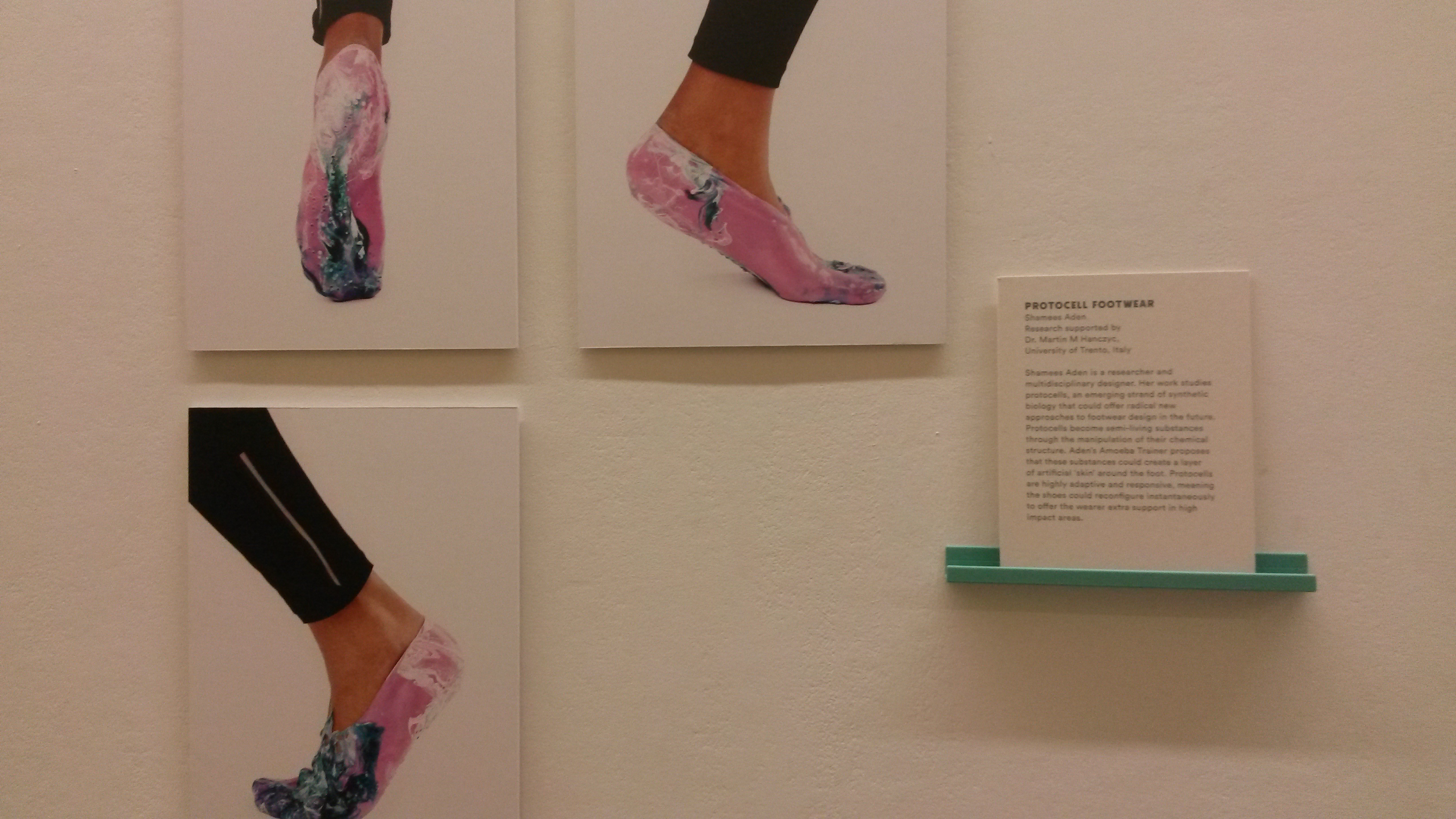 Second, is protocel footwear. The idea here is to create footwear that changes depending on the level of impact generated by different surfaces. Seemingly, protocels become semi-living substances through the manipulation of their chemical structure. It is the work of Shamees Aden who thinks that it could be possible for the shoes to create a layer of skin on the foot. Not yet the height of fashion, even in training shoes, but I can see the benefits.
And finally, the exhibition hall has a big board on which to display the votes of visitors for the best design. Leading by a country mile, and deservedly so, is the Daniel Project (right). It is what is says on the can – 3-D printing of prosthetics for people affected by conflict. It is the brainchild of Nick Abeling of a design studio called, appropriately, Not Impossible. Daniel lost both arms in an explosion when he was tending his cattle in South Sudan. They are now producing one arm a week and transforming the lives of amputees as a result. Though of course, getting rid of the munitions that cause the problem in the first place needs to be done as well.
I recommend this exhibition to all. And these are only a sample of the ideas.
Women Fashion Power – Design Museum, London (part 2)
 The second part of the show continues the chronology but also introduces biography. So for example, various designers are introduced; notably Coco Chanel on the one hand, and Vivienne Westwood on the other. Chanel drew her inspiration from the functional male wardrobe including cardigans, waistcoats, tweeds, trousers, cufflinks, etc. Not forgetting her iconic Little Black Dress of 1926 (left is a version of the LBD from Chanel’s chief designer, Karl Lagerfeld of 1991).
There are some lovely garments capturing the ‘flapper’ period in the 1920s. This seems to have been a opportunity to work shoes into the story. Even I was taken by some of them (see right) .
.
 Elsa Schiaparelli, a name with which I was not familiar before the exhibition, designed on the basis that clothes had to be architectural. The body should never be forgotten and must be used as a frame as used in a building. Whilst I am not entirely sure what this means, and hence convinced, she had a most exquisite jewellery box (left).
Zips arrived in the 1930s along with Rayon, a cheap alternative to silk. There is a whole section on nylon stockings, naturally! And then on to Dior’s so-called New Look. This was, of course, an old look and reverted back to hour-glass figures and generated a market for ‘waspie’ corsets, with Triumph International leading the market.
The 1930s also saw the influence of Hollywood. Female stars were becoming important figures for designers to be associated with. Their ability to popularise designs is familiar to us today. Madeleine Vionnet is credited in the exhibition for introducing the bias cut enabling a flattering cling of clothes to the body and a further release from strict undergarments enabling ever-more revealing evening wear to be worn by the stars. Marlene Dietrich, Ginger Rogers and Bette Davis are three of the stars featured.
 However, these clothes were still out-of-reach for many women. Publishing houses like Condé Nast guided women in the art of dressmaking and the Hollywood Pattern Company sold patterns to make the stars’ dresses at home (left). All that was needed was a sewing machine.
This link with fashion, entertainment, industry and machines is fascinating. The power, element, however, short of progressive loosening of undergarments, is less well articulated. The re-emergence of the corset in the 1940s indicates how fashion has power over women rather than the other way around. One way of getting round this for the curators of the  exhibition is to dedicate a large section to the dress selection of modern powerful women. A couple of dozen women – for example, designers Zandra Rhodes and Vivienne Westwood, lawyer Shami Chakrabarti, journalist Kirsty Walk, children’s campaigner Camila Batmangehlidjh – donate a garment and explain why it is important to them. This is a bit self-indulgent, a bit of a filler. That said, as the picture (right) shows, one can get up really close to the garments and look at that stitching.
I would say visitors need at least 2 hours to do the exhibition justice. There is a café in the museum, it is worth visiting half-way through to recharge. There is a lot of information to process. A break is needed.
Women Fashion Power – Design Museum, London (part 1)
 This is my second visit to the Design Museum this year. And as small museums go, this is one of the best. The exhibitions are exceptional in their content, presentation and accessibility. I have already railed against the British Museum. The contrast could not be greater. Whilst there are no opportunities to touch the artefacts (mainly items of clothing), they are all exhibited in such a way that one can view at close quarters. If you want to look carefully at the stitching, you can.
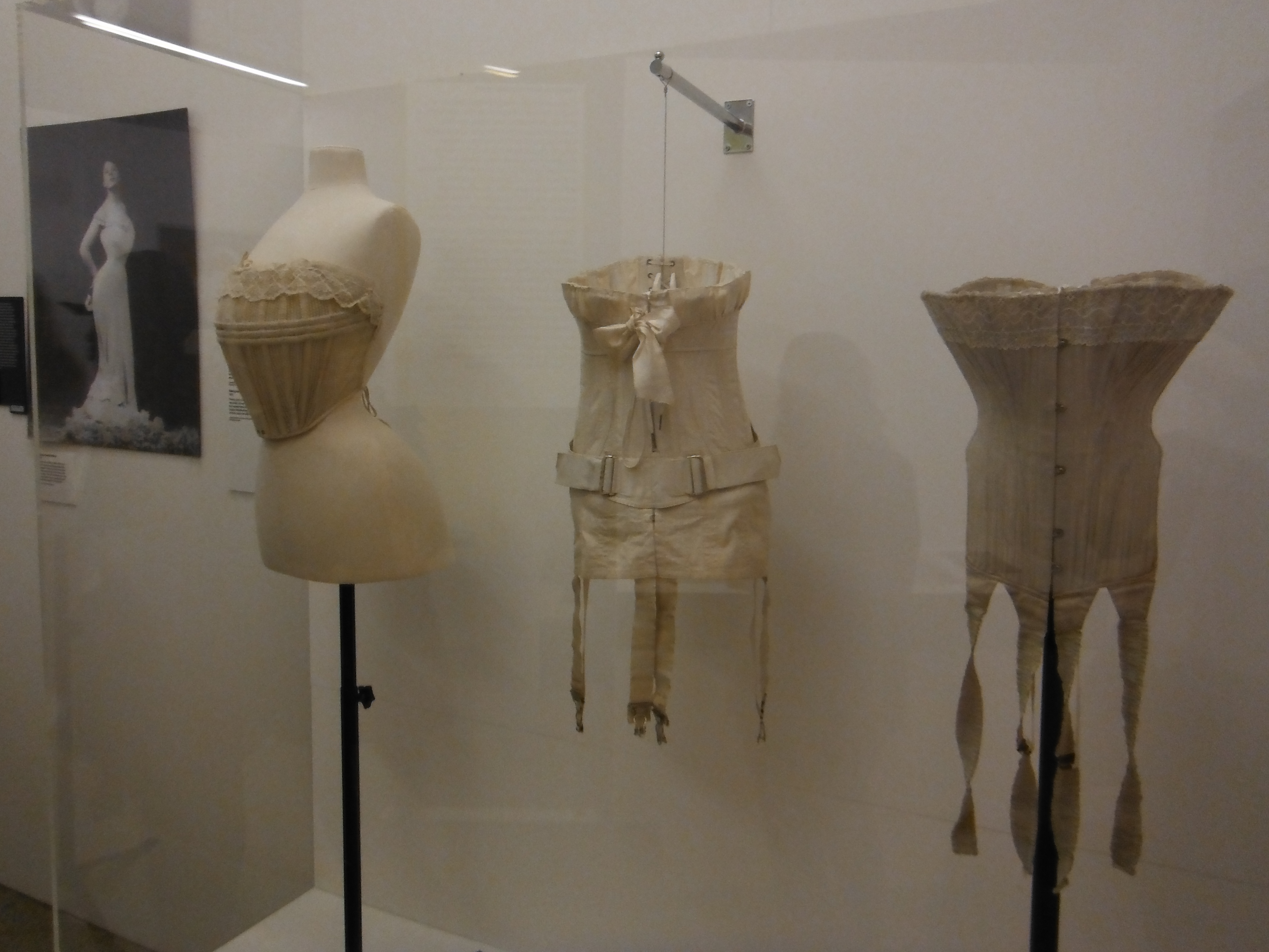
The exhibition runs until 26 April 2015. It starts, naturally, with corsets (examples above left). These were essentially garments of control with dress makers designing only for those – largely wealthy – women with hour-glass figures. Change comes with the arrival of the concept of, what seemed to me, commercial fashion. French couture became showcased bi-annually in Paris. And that many shows requires constant change. And for women, this was progressive change.
In parallel, Amelia Jenks had the audacity to offer women ‘bloomers’ (right) and the ‘shirtwaist’ – essentially, women were able to wear 2-pieces made up of a shirt and skirt.
 But then women took to sport: sea bathing could not realistically be undertaken with even Jenks’s liberated wear. The bathing costume then appears (example left) along with clothes suitable for cycling (another piece of technology eagerly adopted by women). And tennis. And motoring. The brands then emerged led by Creed, Redfearn and Burberry.
The campaigning Suffragettes in the early 20th Century deliberately dressed modestly so as not to conflate political liberation and  decency. But Suffragettes did adopt uniform colours – purple white and green. They also had accessories such as the medal (right). This is a reproduction, but it is a beautiful piece.
The next driver identified in the exhibition is the rise of the department store and mass production itself driven by the rise of the middle-classes, mass consumption and the growth in women’s disposable income.
And finally, in this section, is the patenting in the brassiere by Mary Phelps Jacob. The concept was liberating, it is argued, because it was designed to flatten breasts rather than accentuate them. It was an important de-sexualisation of women.
The landed rich fluff up their feathers
 So, a quarter of a million people turned out on a sunny bank holiday yesterday to pledge their support to their local hunts, for ten years now deprived, by law, of the right to hunt live foxes. This turnout is supposed to be a clear signal that the law should be overturned to allow the rich, again, to tyrannise the countryside in the name of fun. There are seemingly something like 60 million people in the UK. It is going to take more than 250 thousand rich people and their employees to overturn this law.
And then there is architecture. Charles Windsor (aka the Prince of Wales) has apparently come up with 10 principles of architecture that have traction only because he is rich, powerful and the heir to the throne. The principles all reflect his worldview – privilege, aesthetic, means, wealth, ownership, to name but a few. His principles have been put to the sword by architecture critic, Douglas Murphy, in the Guardian newspaper. I have to say that I enjoyed reading the demolition job which concludes with the following:
“[W]hen Charles blasts modern architecture, he is essentially blasting the historical processes set in motion by the industrial revolution, and lamenting the diminution of his royal power in the world that it brought about. His dreams of traditionally designed cities are dreams of a world where people forever know their place.”
There’s a lot of architecture that I do not like, but there is an awful lot of architecture that reflects my own origins, sense of place and aspirations. My former university, the University of East Anglia, is one big block of concrete. But I owe so much to that place and the people within it.
Pictures: Master of foxhounds leads the field from Powderham Castle in Devon, England:
Charles Windsor:
Germany: Memories of a nation exhibition at the British Museum
 Naturally, this exhibition displays an authentic VW Beetle; though you do not need to pay the £10 admission fee to see it. It merely entices visitors in.
First, let me say that I went with my German partner. Her endorsement of the exhibition is praise indeed, knowing all too well that the English, particularly, focus on the country’s Nazi past. This exhibition has something else important to say about the German Nation’s history.
Okay, now to a few quibbles. First, normally I expect to be able to take photographs in an exhibition, not least to upload to this blog. But, here, photography is not allowed. And it is enforced. One assumes this is to protect the value of the accompanying products that one can buy in the shop including Neil MacGregor’s thick tome (right).
Second, the British Museum is huge. For some reason, the powers that be at the Museum have located this exhibition in, what amounts to, a cupboard. The space is far too small not only for the numbers of visitors, but also the exhibits themselves. And for some inexplicable reason, the British Museum does not seem to have learned too much about exhibiting.
For example, in the years of German hyperinflation, German towns produced their own currencies -they being as valuable as the national currency. Such is the nature of hyperinflation. The towns printed their own bank notes. They were often colourfully printed with very particular designs. In essence, they demanded a very close scrutiny. But the museum has made it virtually impossible to scrutinise these artefacts. They are locked in a glass case set against a wall. They are three or four abreast. Unless one is 2 metres tall, inspecting the detail is impossible.
 And even those artefacts that are not in glass cases (most seem to be), they are not exhibited at the height that best suits most of us. Take, for example, the exquisite Strasbourg Clock (left). This image features Neil MacGregor, the boss of the British Museum and the author of the book and presenter of the 30-part BBC radio series accompanying the exhibition. The clock enjoys amazing detail in terms of figures and engravings over-and-above the feat of timekeeping technology that makes it work. And rest assured, it is amazing. But actually, I saw more of it on the BBC website (http://www.bbc.co.uk/programmes/p028bdxq) than I did at the exhibition. I’m just not tall enough.
What to do with an old tram shed in Berlin
Filed under: Design, Museums, Terminals, Vehicles | Tags: Berlin, Classic Remise
Leave a comment The new academic year starts in a few days’ time. The time immediately before is conference season for us journeyman academics. I’ve been to two.
 One way of judging (or being judged, if one is an organiser) is the mid-conference dinner. Last week, at a conference in London, this was held on a cruiser on the Thames. It cost extra. A nice spectacle, particularly those unfamiliar to London. A great opportunity for photographs (left), especially in balmy weather.
The food was a bit…
I’m now in Berlin, one of my favourite European cities. This is an academic corporate-sponsored conference. The venue for the dinner was inspired. The entrance to the Classic Remise on Wiebestrasse in the North West of the city is modest. Once inside, it seems like a museum, but in actual fact it is one huge second-hand car sales showroom. Everything is for sale, at a price. The VW camper (right) is so valuable, that one has to request the price. It has been beautifully restored.
Clearly, these being vintage cars, supply is limited. But it does seem that, within reason, one could buy – and presumably sell – anything here. Tucked away on a platform, I saw a Ford Capri MkI. Naturally, there are many BMWs, Porsches and Mercedes of various vintages. But American cars also feature. There were three Ford Mustangs as well as a lumping 1930s Lincoln. Magnificent and obscene in equal measure. The resource that went into building it, to meet with GM’s ‘cars as disposable fashion accessories’ industrial design and business approach, must have been huge.
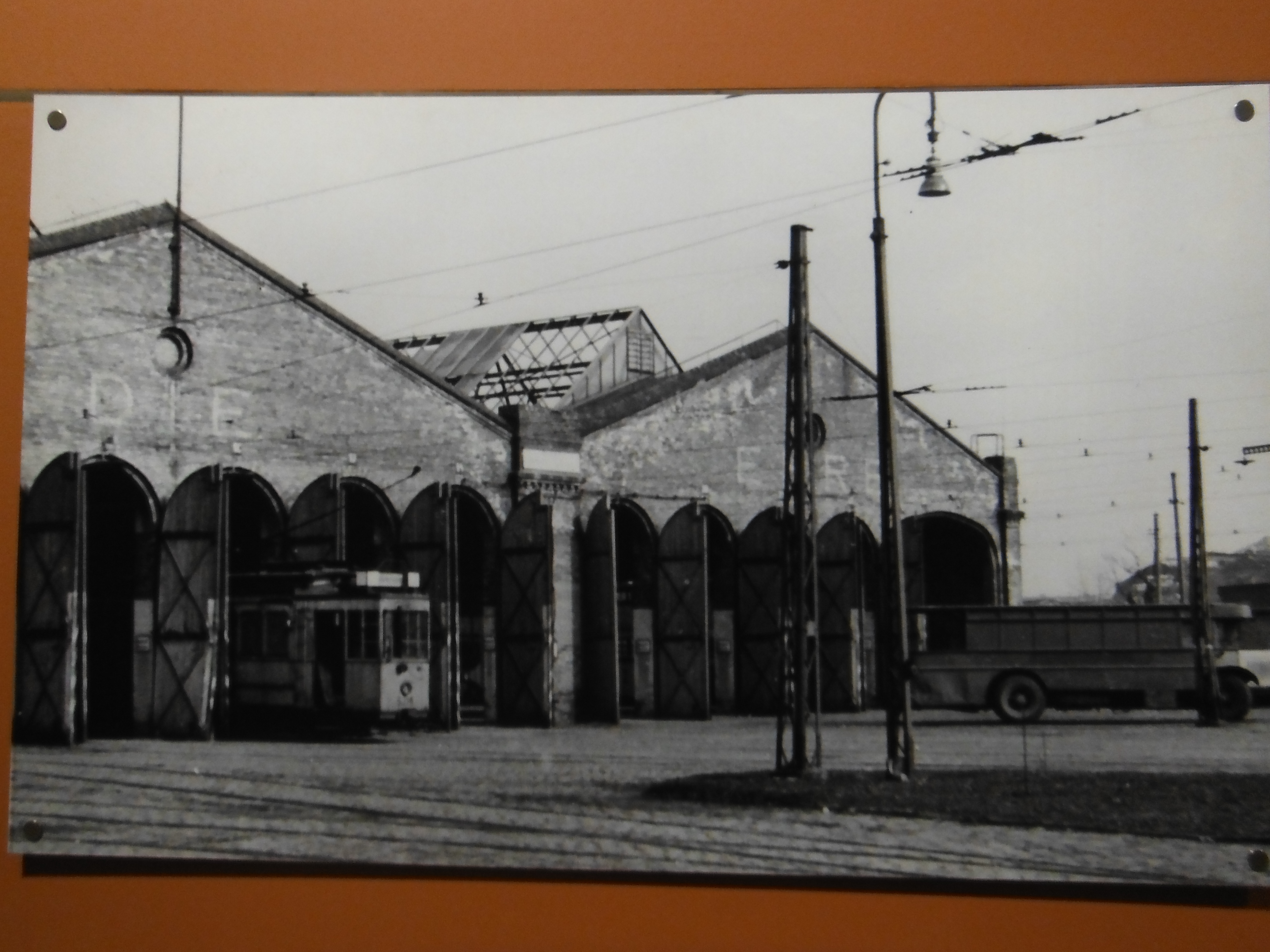 Now I am a white van man (there were a few vintage Citroen vans in various stages of refurbishment), hence prioritising an image of a VW camper over a Porsche. More interesting, however, was the building. I would not have guessed its origin without a trip to the toilet. And, there, on the wall, were some pictures of the very same building with trams peeking out like horses in a stable (left). When first built in 1901, it was Europe’s largest tram shed ‘Wiebehallen’. It is the work of the Berlin architect, Joseph Fischer Dick, who seemingly specialised in these structures. The current owners have been faithful
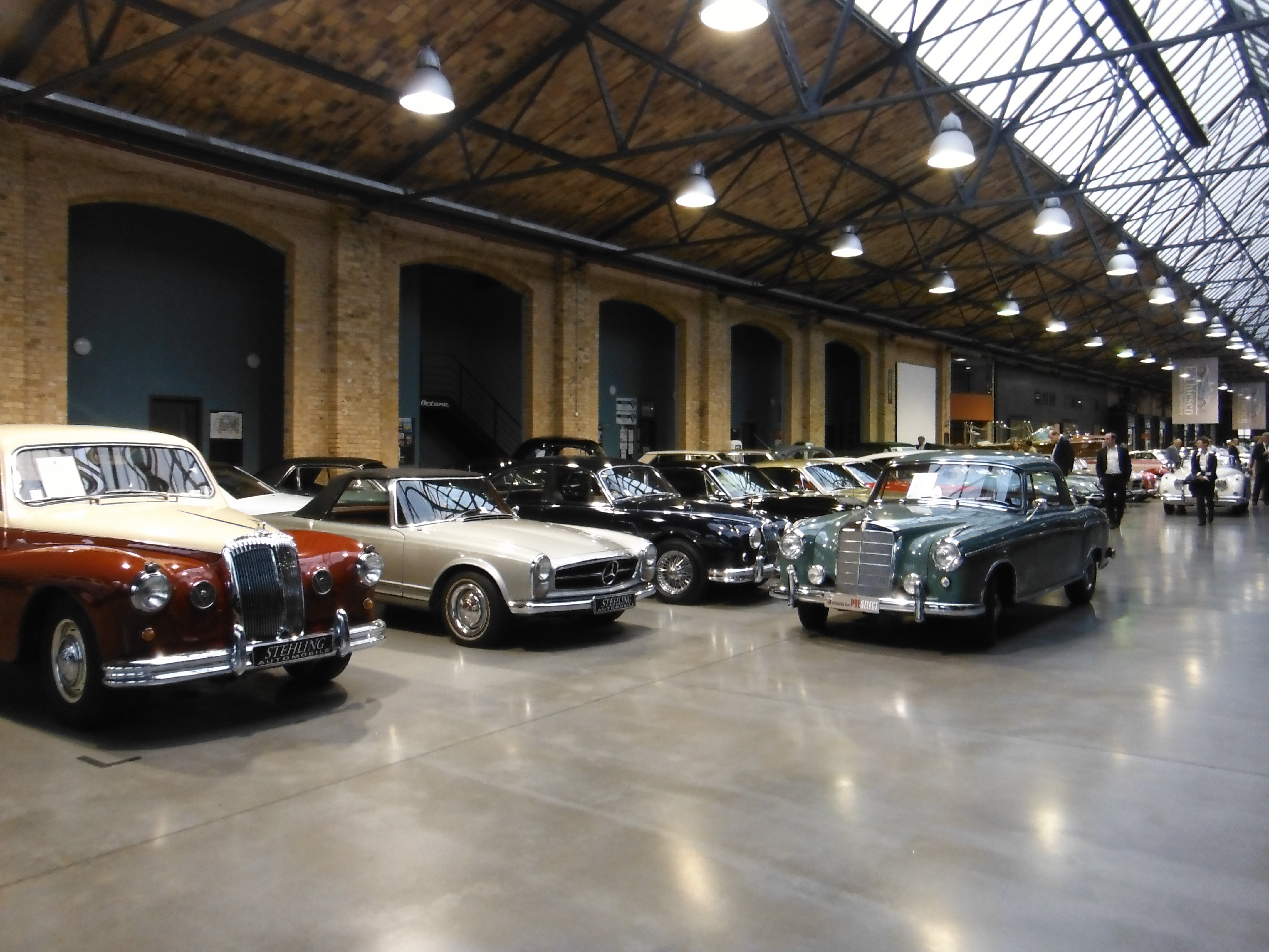 to the building. Whilst the tracks are no longer there, the entrance arches are all numbered. The roof glass and steel frame remain. As do the authentic lights (albeit with modern bulbs).
The food was also good.
