Archive for the ‘Design’ Category
Paul Smith exhibition – Design Museum, London
Filed under: Design | Tags: design museum, London, Paul Smith
 Leave a comment
 ![20140122_125739[1]](https://weiterzugehen.net/wp-content/uploads/2014/01/20140122_1257391.jpg) The Paul Smith exhibition is packed full of the man, his ideas, influences and artefacts. It runs only until 9 March 2014.
The Paul Smith exhibition is packed full of the man, his ideas, influences and artefacts. It runs only until 9 March 2014.
He is an inveterate collector of prints, a selection of which greet the visitor on arrival (see left). I tried to establish a theme for the prints; it is an eclectic mix. Bicycles are very much part of his life as is Patti Smith (unrelated). Colour (even a photo of post-it notes make it), music (particularly the Beatles and David Bowie), dogs (his wolf hound was a feature of his first shop), travel and romance (his wife, Pauline, is consistently credited). His camera goes everywhere with him. His favourite places are street markets.
Visitors are invited into a mock up of his office (right). Cluttered it might be, but he keeps a rosewood table free for work.![20140122_130509[1]](https://weiterzugehen.net/wp-content/uploads/2014/01/20140122_1305091.jpg)
There is also a studio space filled with materials – fabrics – and patterns for suits and dresses (below left). Much more ordered than the office and with a selection of Mac computers, clearly his favoured brand.
![20140122_131449[1]](https://weiterzugehen.net/wp-content/uploads/2014/01/20140122_1314491.jpg)
I am not personally convinced by his clothes – one gallery is dedicated to his clothes. He is more than a tailor. The trademark stripes have been applied to a number of familiar objects such as the mini (below right) and a teapot (Thomas Goode fine bone china, below left). He also designed the case beautiful for a limited edition Leica digital camera. Finally, to cement his British credentials, he put the stripes on to the label for HP sauce for Harrods.
![20140122_132105[1]](https://weiterzugehen.net/wp-content/uploads/2014/01/20140122_1321051.jpg?w=180&h=101)
Naturally, this exhibition is a huge marketing exercise for Paul Smith. There is a small gallery devoted to his shops. Each one is different. This potentially has the effect of turning them into tourist destinations in their own right. Unfortunately, one could clock up a huge carbon footprint visiting them. Destinations would include Tokyo, New York and Nottingham, to name but three.
![20140122_132258[1]](https://weiterzugehen.net/wp-content/uploads/2014/01/20140122_1322581.jpg) Elsewhere, there is a wonderfully produced and presented HD film of one of his Paris menswear catwalk shows. He says that he does not like shows but they are a necessary part of the business. The media and industry buyers use them. Watching the film, one gets the impression that he makes the best out of it.
Elsewhere, there is a wonderfully produced and presented HD film of one of his Paris menswear catwalk shows. He says that he does not like shows but they are a necessary part of the business. The media and industry buyers use them. Watching the film, one gets the impression that he makes the best out of it.
The artefacts are beautiful and worthy of exhibiting. However, visitors also get insights into creativity and the business of creativity. I will iron my partner’s Paul Smith blouse now with a little more care.
The photographs are all mine. Apologies for the poor quality. I was not able to use my camera because I had not charged it! I had to use my phone. The results are not so good.
Subversive design – Brighton Museum Oct 2013 – March 2014
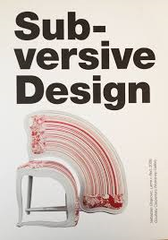 The exhibition at the beautiful Brighton Museum and Art Gallery in the Dome complex is somewhat mis-named, though no less interesting for it. It less design, more art. Nothing is functional; the output of design normally melds form and function.
Everything has a point to make. For example, Simone  Brewster’s provocative Negresse Chaise and Mammy Table (including wallpaper) remind us how recent has been our willingness to use such depictions of black people in cinema and elsewhere for commercial profit. The inclusion of female body parts just compounds this.
Also featuring in the exhibition is some work by enfant terrible, Philippe Starck. Two pieces are on display, both of which are part of the museum’s permanent collection. The stool (below left) was designed originally for film director, Wim Wenders, who wanted a stool on which he could lean rather than sit. 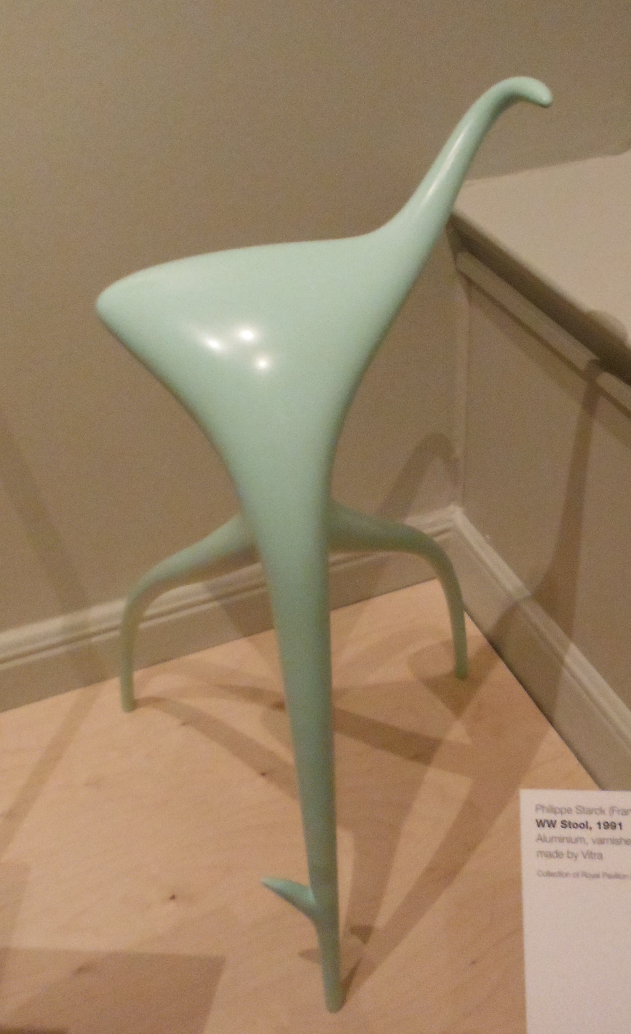
Starck has also got his hands dirty with the Italian firm, Alessi, famous for kettles, amongst other kitchen equipment. Starck’s kettle is a rather un-functional. The cone (right) that dissects the body is a handle, filler and spout. It proved not to work, despite the apparently clever internal technology; Starck himself was unrepentant: “I wanted to get myself noticed [and]  make a masterly sculptural object”. That it certainly is. Alessi did not buy that.
Ceramicist Grayson Perry, former winner of the Turner Prize, not surprisingly features in this exhibition. His vase entitled ‘Difficult Background’ (below left) has in the foreground  smiling children against a background of war – burning buildings and fleeing civilians.
There are some beautiful pieces with interesting juxtapositioning. For example, ‘Fragile Future Lamp’ by Lonneke Gordijn and Ralph Nauta (2012, below right) has an environmental theme. It represents the construction and deconstruction of dandelion clocks studded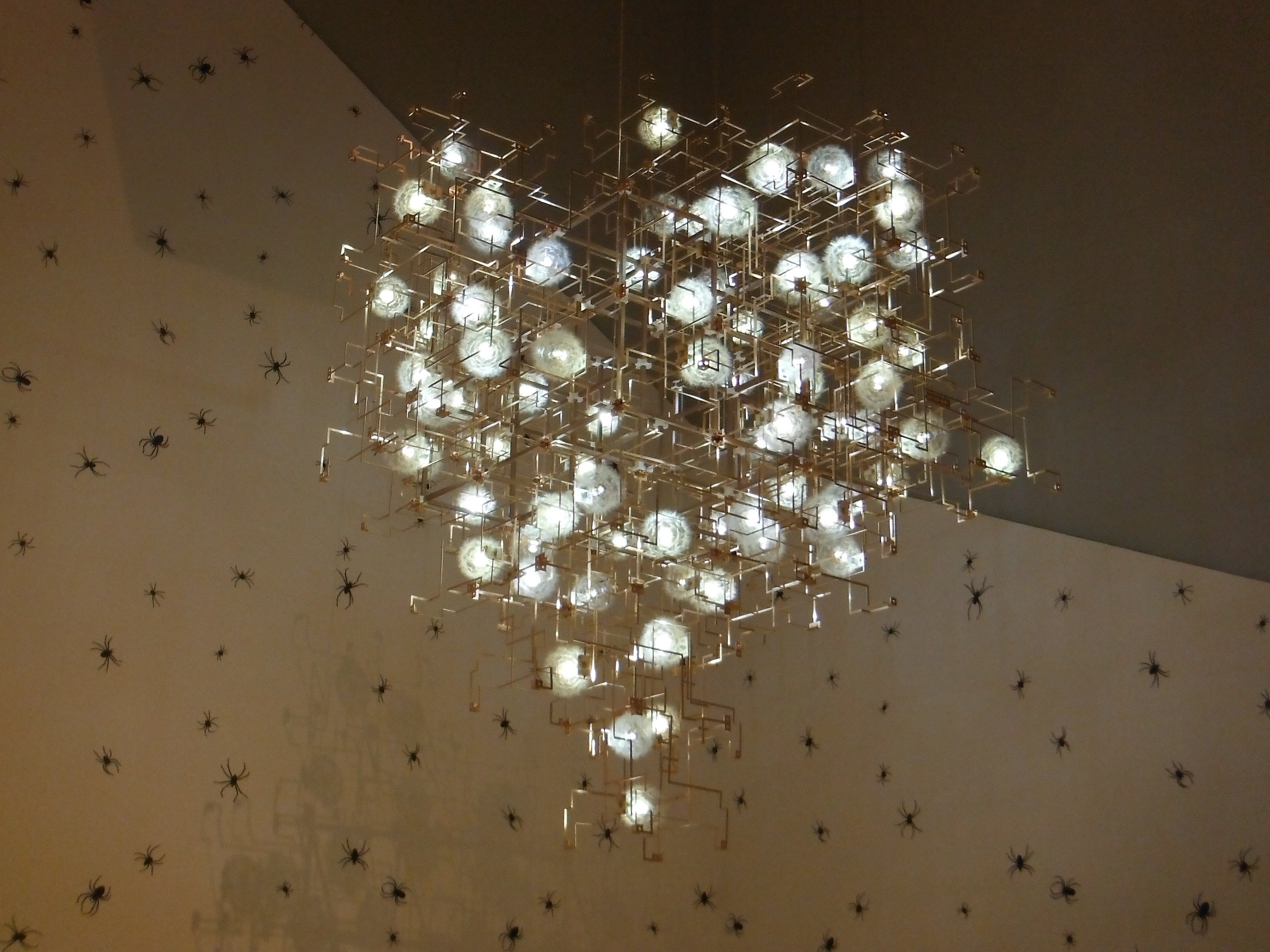 with LED lights. The fragility of the structure maps on to a fragile earth; though the lights represent hope.
Note the arachnid wallpaper behind.
 Finally, shoes. There are two challenging shoe related exhibits. Not surprising, both relate to high-heels, one a modification, the other a hybrid of human and non-human form plus weapons (left). Weapons
 are generally clichéd. Terry de Havilland’s dagger heeled shoes bear the cliché, but the hooves feel very uncomfortable. Belonging to another creature and appropriated by humans.
Other more extensive reviews can be found here:
http://scenester1964.webeden.co.uk/#/subversive-design/4580265764
http://thelatest.co.uk/brighton/2013/10/08/brighton-museum-art-gallery/
The official PR for the exhibition is handled by Lianne Jarrett Associates: http://www.lja.uk.com/index.php?page=4066
Stressed furniture
Here is a design trend that really needs dismissing before too many people are separated from too much of their money. I do not know if it has a name, but it seems comparable with ‘stressed jeans’ except for furniture. I have just replaced a pair of stressed jeans because they have worn out (afer 8 years). The knees have holes in them and I do not think that I can pull off the stressed look with any credibility.
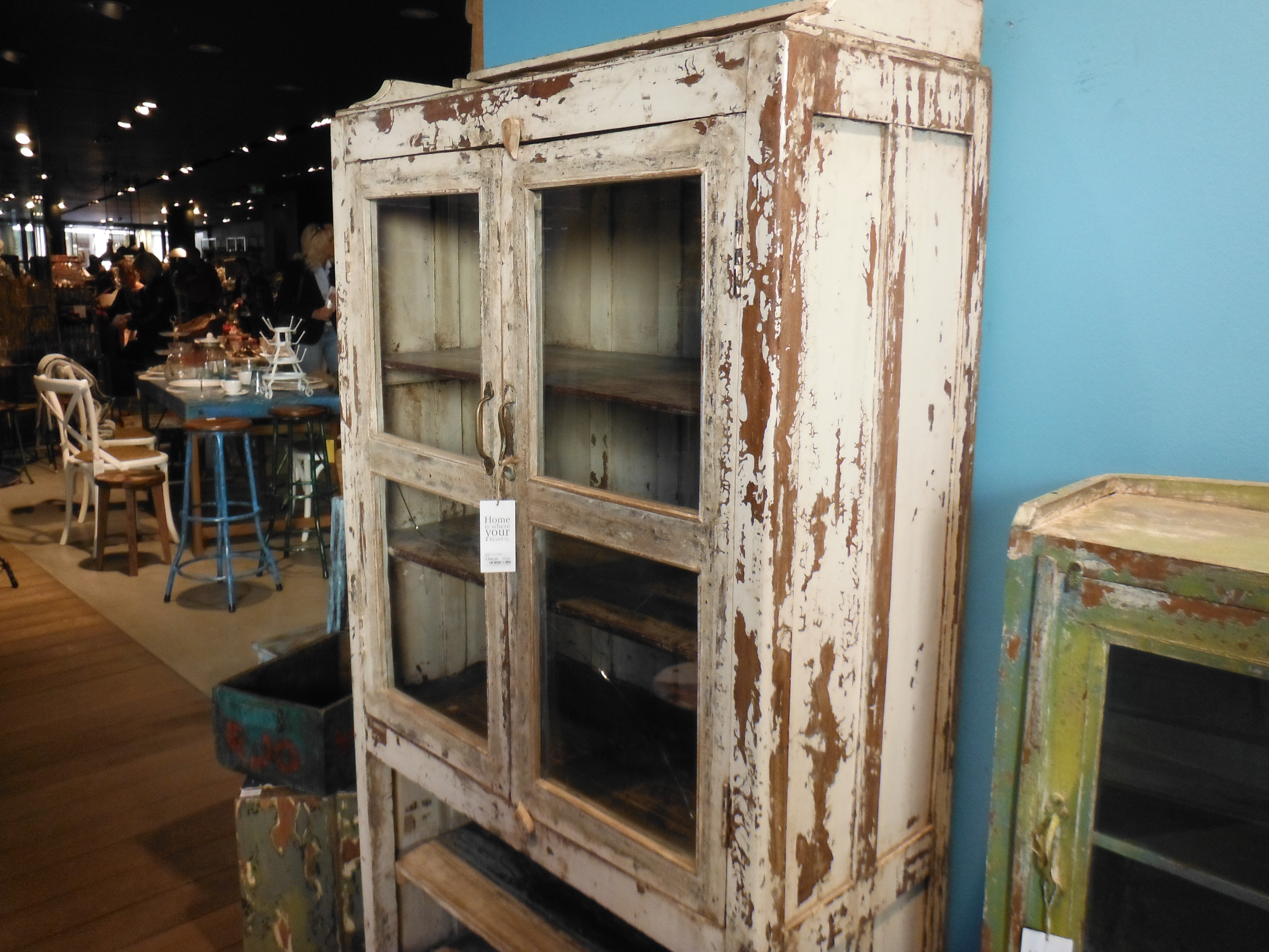 Equally, I am not that keen on filling my living space with stressed furniture. The example on the left – complete with broken glass – is on sale in a mid-range homewares retailer in Köln. Unfortunately having seen this, subsequently, I found many examples of the look ranging from beds, tables, bookshelves, indeed any wooden furniture.
No!
The long night of museums, Munich
Each year – for one Saturday evening – the museums in Munich stay open late. For 15 Euros one can purchase a ticket that gets access to the majority of museums and galleries in the city and ‘free’ travel on the buses that visit the museums split into four groups – Central, West, Schwarbing and East.
 This year – 2012 – we decided to join in. There is a certain serendipity as to where one ends up. Having tried the Max Planck Institute, we opted for the Schwarbing bus and the BMW museum. My first time.
This museum is pure marketing – or propaganda. With that in mind it can be enjoyed. The building clearly borrows from the Guggenheim in New York in its bulbous appearance and interior walkways. The artefacts inside are immaculate. These range from cars, motorbikes, engines, film footage and marketing/advertising materials.
Whilst the museum says little about the company’s history in terms of its Nazi affiliations, some of the film footage of racing success in the 1930s cooly displays the Nazi symbols and sentiments of the time.

Modern era
The museum does not try to over display. There are some fine examples of vehicles, but the displays are not exhaustive. The room on the left is a good example of the museum’s approach. It is almost a case of the designers believing – probably rightly – that the exhibits speak for themselves. They are instantly recognisable – distinctive. Unmistakably BMW.
However, some of the vehicles seem out of line – though a BMW narrative is wrapped around their  inclusion. For example, the Isetta bubble car. Far away is this vehicle from the high performance BMW products that preceded and succeeded it. Manufactured under licence from the Italian firm, Iso, which also designed and manufacturered refridgerators (see http://en.wikipedia.org/wiki/Isetta), the Isetta apparently buffered the company against hard times in the 1950s. The gallery’s walls are decorated with splendid period photographs of the German public taking their Isettas to places they presumably were not designed for; for example, the Alps. Television advertising footage is also to be seen.
 The museum goes to great lengths, however, to spell out its design philosophy. They heap it on, just in case it was missed. The panel on the left is typical – written in German and English, the design philosophy is spelled out – ‘power of innovation’; ‘strong team’, ‘professional approach’ and ‘perfection’ are used to capture its essence. There are also many references to emotion engendered by careful selection and use of materials and colour in the interior.
The museum is only one part of the complex that constitutes what one might call the BMW quarter of the city. Opposite is BMW Welt – housed in a post-modern building that successfully conveys power, influence and intent.
The bendy Daimler bus took us swiftly back into the city. BMW never got into buses, oddly. The S-Bahn had a signal failure. Being stuck in a crammed stationary train for 30 minutes in the early morning brought us back to reality.
iPad development

Source: Evan-Amos, Wikipedia
Some firms are opaque, understandably so. Apple is particularly good at keeping secrets. But when firms go head-to-head where patent infringements are concerned, a truer picture emerges. In one interesting case – Apple v Samsung – we now learn that the iPad as an idea and prototype predates the iPhone. In fact, it might be that the iPhone only exists because the touch screen technology was thought to be too expensive for the market to bear. The logic goes like this: a touch screen tablet would be a niche product because users would likely be those who already have a desktop and laptop. A tablet would be an expensive complement to these. However, a touch screen phone is viable, not least because it is smaller, and therefore requires less in the way of expensive materials.
Pictures of the prototype iPad have been released. You can view them here: http://www.guardian.co.uk/technology/2012/jul/19/ipad-prototype-ive-2002
British design exhibition at the V&A
 It is a little pricey at £12.50, but certainly interesting at a number of levels. There is the nostalgia surrounding design epochs and the objects that came to symbolise them. There is the learning – largely historical – about the objects and/or movements that encapsulate British design. And there is a great shared experience – I talked to more people at this exhibition than at any other I can remember. For example, at the balsa model of my former university, I met someone who recently visited with potential students and a former student who also went on to work at the university whilst I was there. A very nice encounter.
The exhibition is housed in three galleries. The first is a bit of a mish-mash of epochs, events and artefacts (e.g. the 60s, the Festival of Britain, transport/architecture). The second gallery revolved around popular culture – Bowie, Mary Quant, Factory records, etc. The final gallery, loosely representing innovation, had Concorde, the E-Type Jaguar, The Gherkin, Video Games and Dyson.
I thoroughly enjoyed my journey through the galleries (it took me over three hours) but I was left wondering what the point was. What was the narrative? Why these artefacts and not others? Even more disturbing, however, is the question, where to now? The innovation gallery was surprisingly uninspiring. It was rather sterile. On leaving the gallery, rather than walking into a new world of opportunity, one walks into the gift shop. Rather unfortunate, I thought.
The exhibition continues until 12 August. The exhibition’s video includes interviews with a number of designers featured, including Margaret Calvert who worked on the road signs and who admits that the little girl featured on the ‘children crossing’ road sign is her own image of herself as an eight-year old girl (with her little brother). The video can be seen from the exhibition’s website http://www.vam.ac.uk/content/exhibitions/exhibition-british-design/
The best of British design and the Olympics
 It is starting to get a little bit tedious, the constant references to the past in terms of design: Pillar boxes, buses, etc. These posters, moreover, are embarassing. Does Richard Branson really equate with being Great?
It is also unfortunately very true now that what makes cities distinctive now is their past. The present and maybe future in terms of artefacts – buildings, products – are generic and global. The same artefacts appear in many of great cities across the globe. BBC Radio 4 seems obsessed about this point, and are discussing it at length. This is the debate’s latest instalment.
Apple and simplicity
BBC Radio 4 seem to be having a field day with Apple at the moment. Last week Jonathan Ives, Apple’s chief designer was interviewed, this week it is Ken Segall on simplicity. Segall was the man behind the ‘i’ in all Apple products. There are some interesting thoughts on the nature of perfection. But at the heart is the thought that a product portfolio is best kept short and the virtues of keeping the business running like a small business. Listen here.
Jonathan Ives of Apple is talked at by James Naughtie
Knighted on 23 May, Jonathan Ives talked to James Naughtie of the Today programme on BBC radio 4. Notwithstanding the annoyance of James Naughtie with some of his fascile questions, there are some insights from the man about motivations for ‘making the very best products that we can’. He talks about the beauty in thing functioning intuitively as well as form and colour. He is delighted for others to be using Apple products. The designer’s job is becoming more complex and the consequences of getting it wrong have also escalated. Listen here
Hotel room design
All hotels have their peculiarities. the Concorde Hotel in Montparnasse, Paris, particularly so. I have no overall complaints, but the  bathroom washbasin was unnecessarily unfit for purpose. First of all it was small even though the bathroom itself was large (so, no need to make it small). The smallness was made all the worse by the mixer tap that hung over it denying access to the water to only the smallest of receptacles. Moreover, there was no plug. This made shaving difficult necessitating an excessive use of water.
My question is simple. What informed the design of this most basic of bathroom features? Why is it so wrong?
