Archive for the ‘Paul Nash’ Tag
One Gallery, climate messages
Filed under: Art, Environment | Tags: David Hockney, LS Lowry, Paul Nash
 Leave a comment
 I recently went to Tate Britain in London. The gallery is home to many of my “friends” – a strange idea, but I always relax when I see the images in the flesh, as it were. In recent times, however, I have visited galleries with very different intentions. I want to know how – and if – art delivers a climate message, either by chronicling environmental decline or in championing its salvation. Both are true, of course.
On this visit, March 2023, I set myself the challenge of cataloguing one gallery (one gallery and bit, to be honest) for its climate message. Here is what I found.
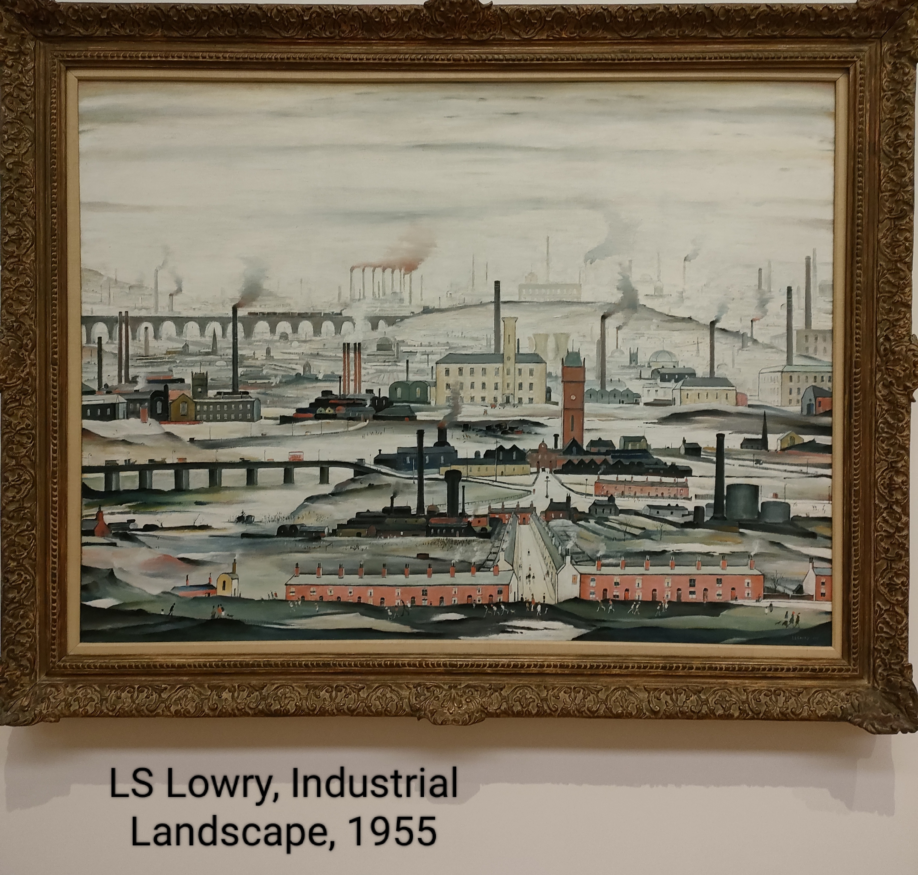
Of course, LS Lowry has a story to tell. I always remember Brian and Michael’s song, Matchstalk Men and Matchstalk Cats and Dogs (no women for some reason). I even bought that record. But revisiting Industrial Landscape (left) I noticed other things in the picture not seen before (that is the beauty of art, there is always something new in the familiar to see. There are not too many people in this image – a few in front of the houses and along the central street leading to the factories. I see the trains on the viaduct and the barges on the aqueduct (if I see it correctly). What was new was the colour of the chimney emissions. They are not just sooty, they are toxic red, particularly those in the background. I wonder!
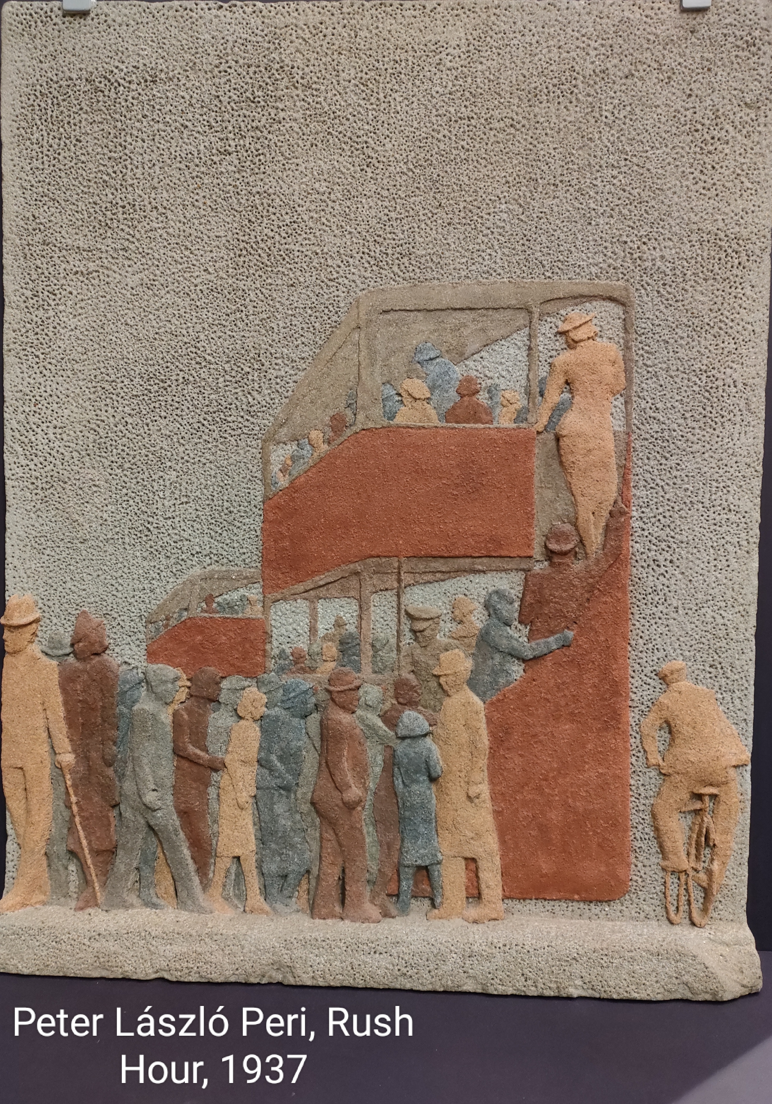
Slightly earlier (1937) the work of Peter László Peri. Peri does not paint, he uses stone to represent urban life. His rush hour incorporates one of my favourite images, that of the double-decker London bus. The image is effectively carved from a block of stone coloured in a rudimentary way; for example, copper red and earth brown. It is orderly and very English. On the one hand it looks like a depiction of the daily drudge of travel to-and-from work. But Peri sought to represent positively industrial society, so perhaps the woman climbing to the top deck of the bus represents progressive views about woman and work? There is also the cyclist taking on the diesel bus and wider traffic.
It is perhaps not surprising that Peri chose stone – he had been a apprenticed brick layer as well as a student of architecture in his birth city of Budapest, Hungary. Moreover, he was associated with the Constructivist movement dedicated to representing modern industrial society formed in Germany in 1915.
Peri arrived in England in 1933 – he was not in any way popular with the Nazis being both Jewish and a Communist.

Cliffe Rowe’s picture, Street Scene (left) depicts a pram (presumably for the health benefit of the baby inside) outside a terraced house. There is a woman sat of the step knitting (oddly revealing her underwear) and a man in shorts reading a newspaper. How typical this was, I do not know, but it seems to be a scene of aspiration. There is street lighting. Net curtains. In 1930, Rowe travelled to the Soviet Union and stayed for 18 months. He was impressed with the Soviets’ use of art to support the working class struggle; though he may have been taken in simply by propaganda. That said, on his return to England he became a founder member of the Artists’ International Association (along with Peri) which used art to oppose fascism.
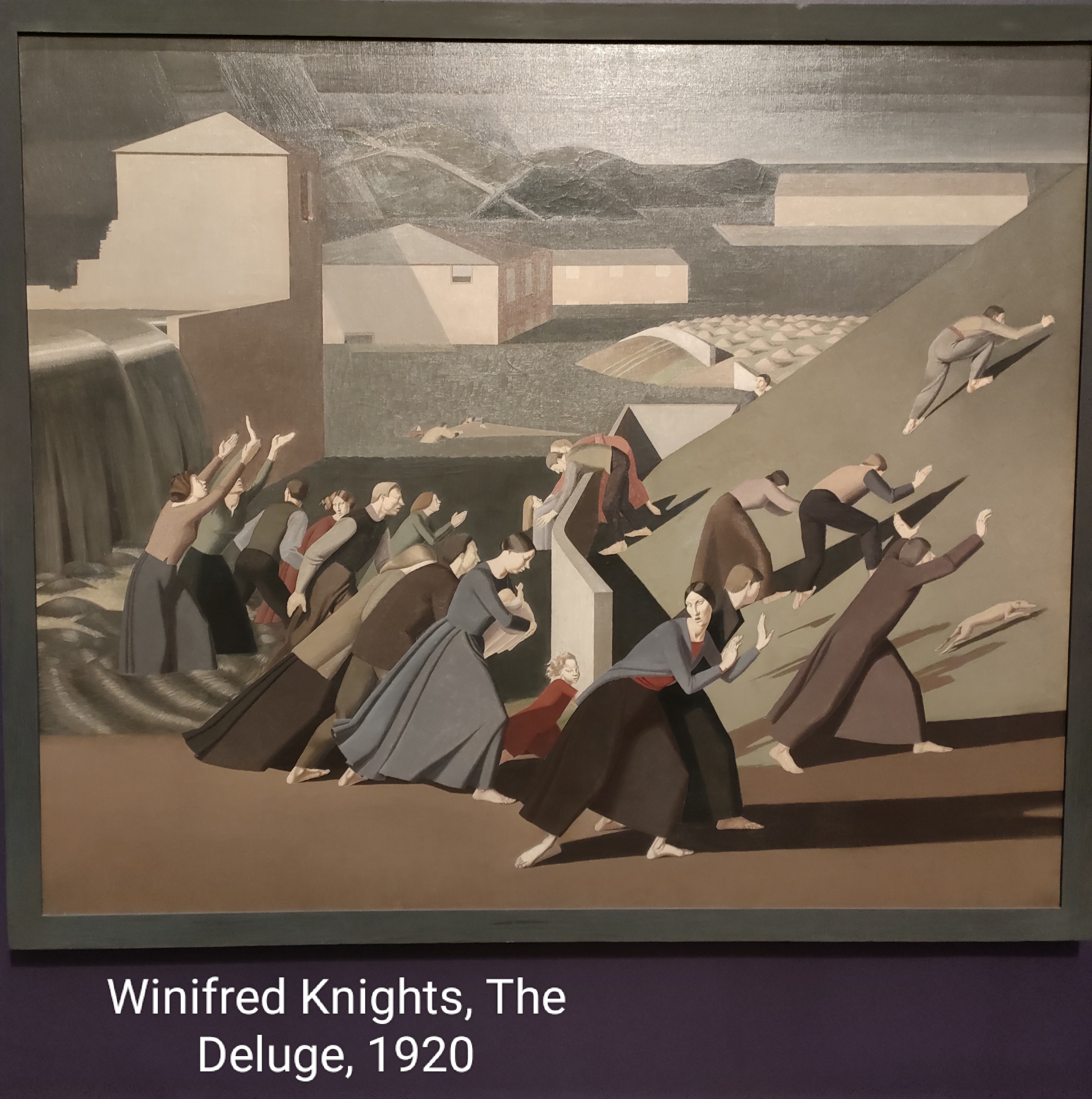
Predating both of these artists was Winnifred Knights. Her picture The Deluge (1920, right) has a very contemporary interpretation. Men and woman either flee or resist rising water in a representation of the Biblical flood in Genesis. Clearly a contemporary interpretation – or translation – is climate change and rising sea levels. Not an act of God, but an act of humanity against itself (and all other inhabitants of the planet).

To see what we forfeit in the industrialisation of economies, we can draw on some of the more conservative images of the period. Frederick Cayley Robinson’s Pastoral (left) is a good example from the gallery. It depicts a family and a flock of sheep by the waterside. A child holds a lamb as a symbol of rebirth. It is rural idyll in the post WWI world. It is rural, but not idyllic. There is only a windmill as a concession to technology – enough to enable this simple life. Of course, it is not where we ended up.
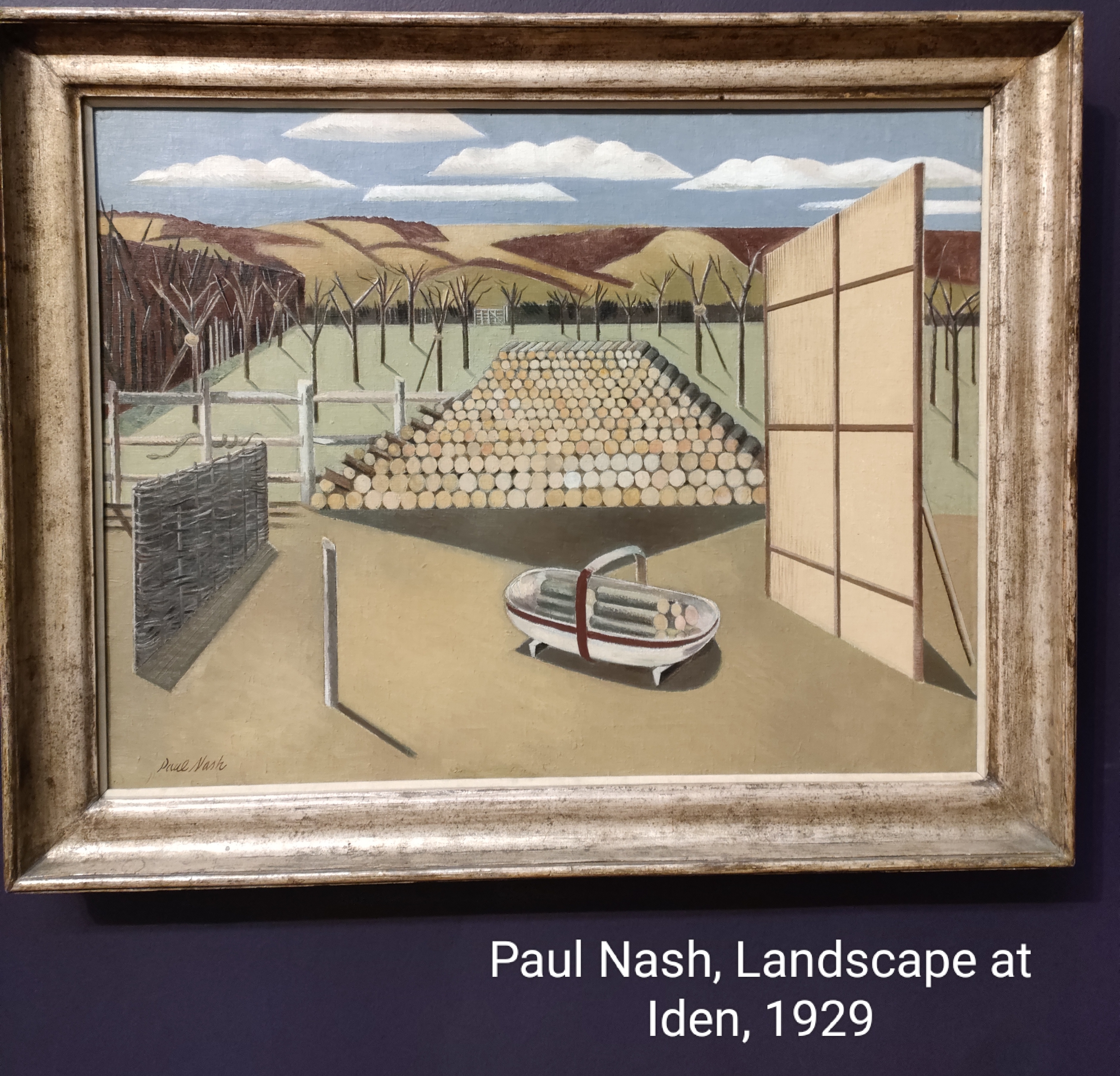
My penultimate choice is work by probably my favourite artist, Paul Nash. Nash was greatly affected by his experience of WWI. On my visit for the first time I saw Landscape at Iden (1929). His geometric shapes “blend” with the landscape, and in this case with felled trees. The felled trees are interpreted to mean lost souls in the war. The snake on the fence is easy to miss. It can represent evil, for sure (it was a serpent that tempted Eve to eat the apple), but pharmacies use the symbol of the serpent to represent healing. In Nash’s work it could go either or both ways, I sense. Whatever they are meant to represent, war, through history, has impacted on the natural environment. Despoiling it with armaments, clearings and extraction. I have not entirely convinced myself that this picture is translatable, but his pictures always leave me feeling understood.
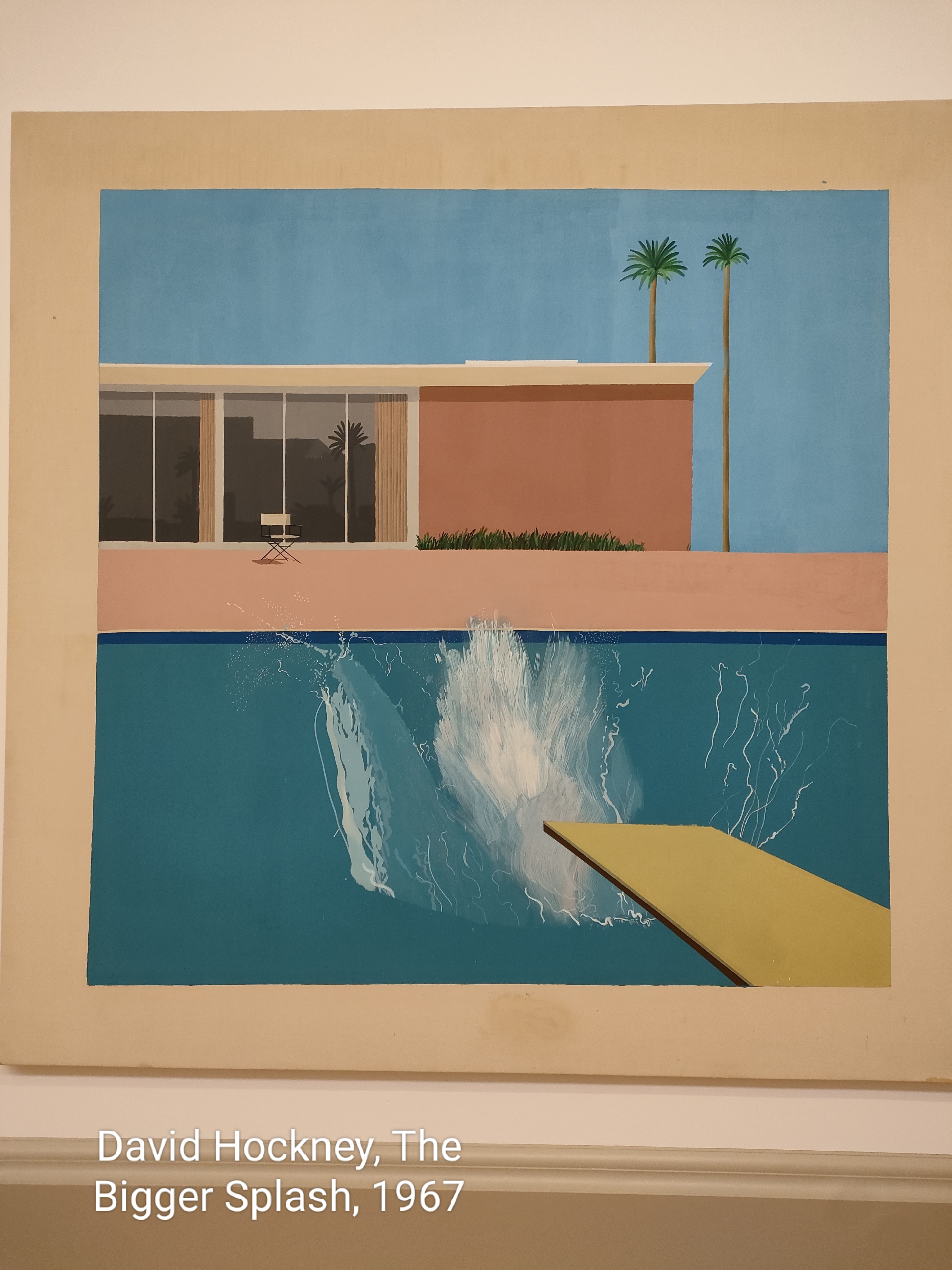
I’m going to take a liberty with my next choice – reinterpreting a living artist, David Hockney. His picture The Bigger Splash (1967) is a representation of the water’s response to a dive into a pool. I have always seen Hockney’s California period as a reflection of unreality (Hockney admits his splash is not realistic) – the good life that comes from industrial society that is endured by others, particularly in the industrial Eastern USA. I feel vindicated inasmuch as when Hockney returned to the UK he bought a house close to where I was brought up in East Yorkshire. Those images are most certainly about the land, its plants and change.
A random Saturday in Tate Britain
It mu st have been 20 years’ ago that I went to the Tate to see the Turner collection. I’d heard about it and thought it about time that I saw the collection for myself. Uninformed and unprepared, I looked at the pictures – particularly the later ones – not with awe, but rather with disdain. Part of the reason for this was my upbringing. My mother was an amateur and self-taught artist. She painted largely from postcards. Hers were the only pictures in the family house. My father framed them for her. Her masterpiece, Chester (left), has pride of place our bedroom. The problem was, however, that my mother’s art informed us more generally about what good art was. Consequently, Turner started okay with realistic landscapes, but went downhill rapidly when he started all of that light and abstract nonsense.
To get to the Turner collection at Tate Britain, one has to walk through the galleries for the 1920s and 1930s. These are two decades that I like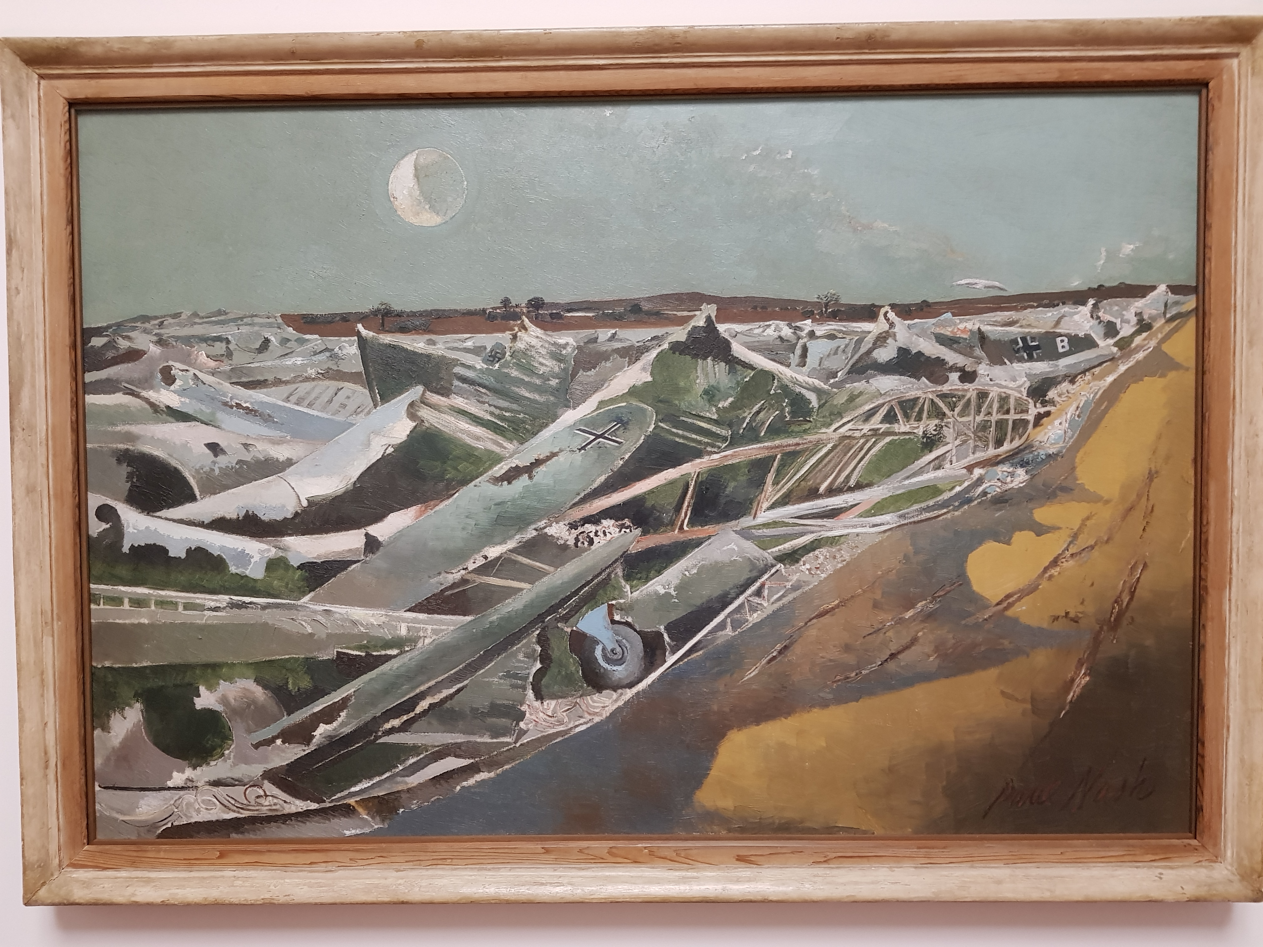 a lot, and not just for British art. There are some old friends in there, not least the disturbing “Totes Meer” (right) by Paul Nash. The washed-up planes are a stark reminder war’s destruction; but I like to think that Douglas Adams borrowed this idea for the Hitch Hikers’ Guide to the Galaxy when Arthur and Ford are rescued by the the Heart of Gold in its infinite improbability mode only to find themselves at Southend, though with the buildings washing up on the shore rather than the sea.
 Maybe Nash has some Turner in him? Certainly I like to think that Winifred Nicholson’s “Sandpipers” (left) from 1933 does. Though Nicholson did something that perhaps Turner did not do – he was very much a studio painter – incorporate real sand into his pictures. The abstraction is there, certainly.
Turner’s “The Chain Pier” in Brighton dating from 1828 (right) has all of the Turner qualities. Wonderful 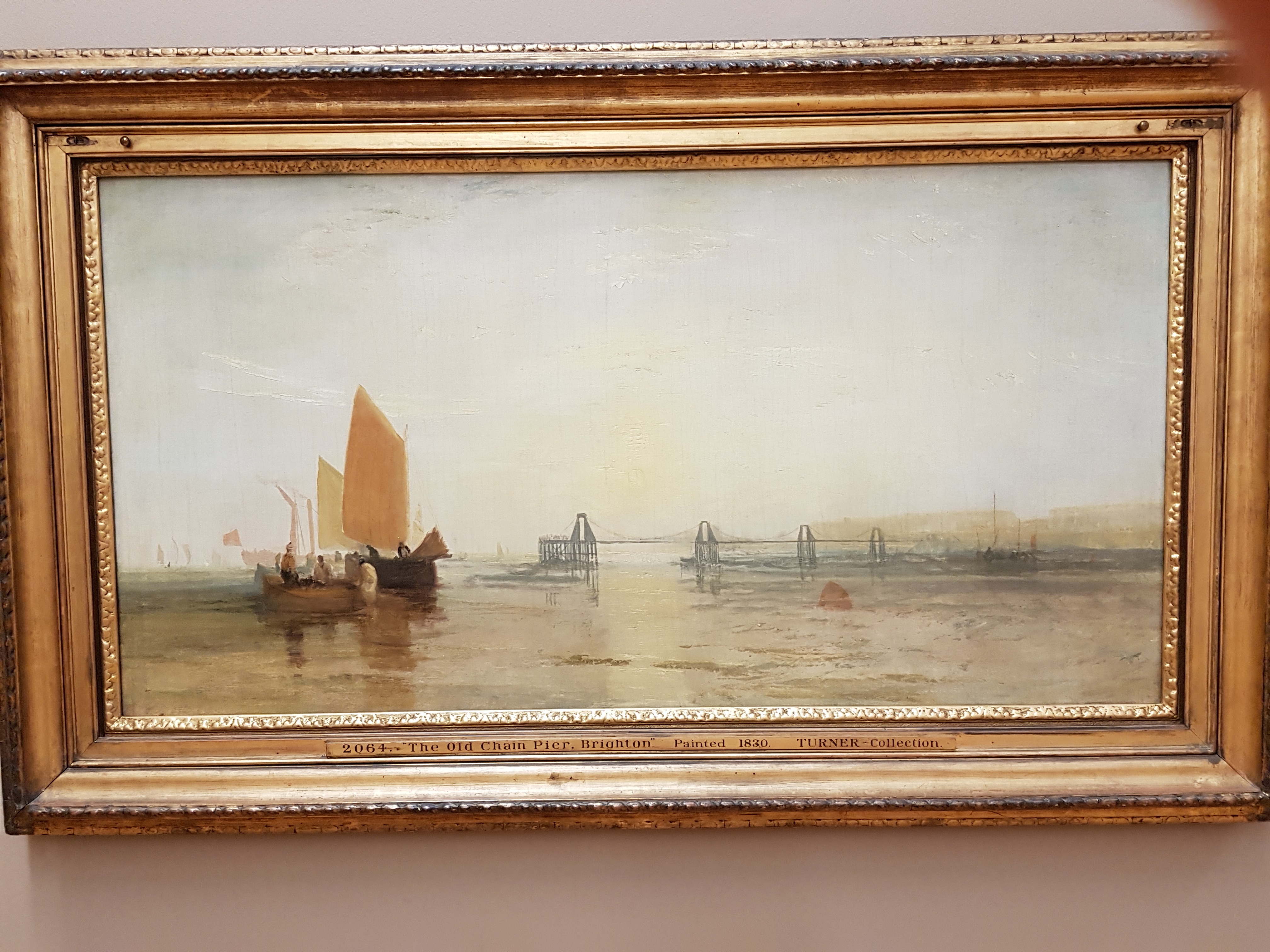 light, marine backdrop – here, ships and piers. There are some figures on the ships. The figures in the later abstractions are chilling, ghostly and translucent. For example, “A disaster
 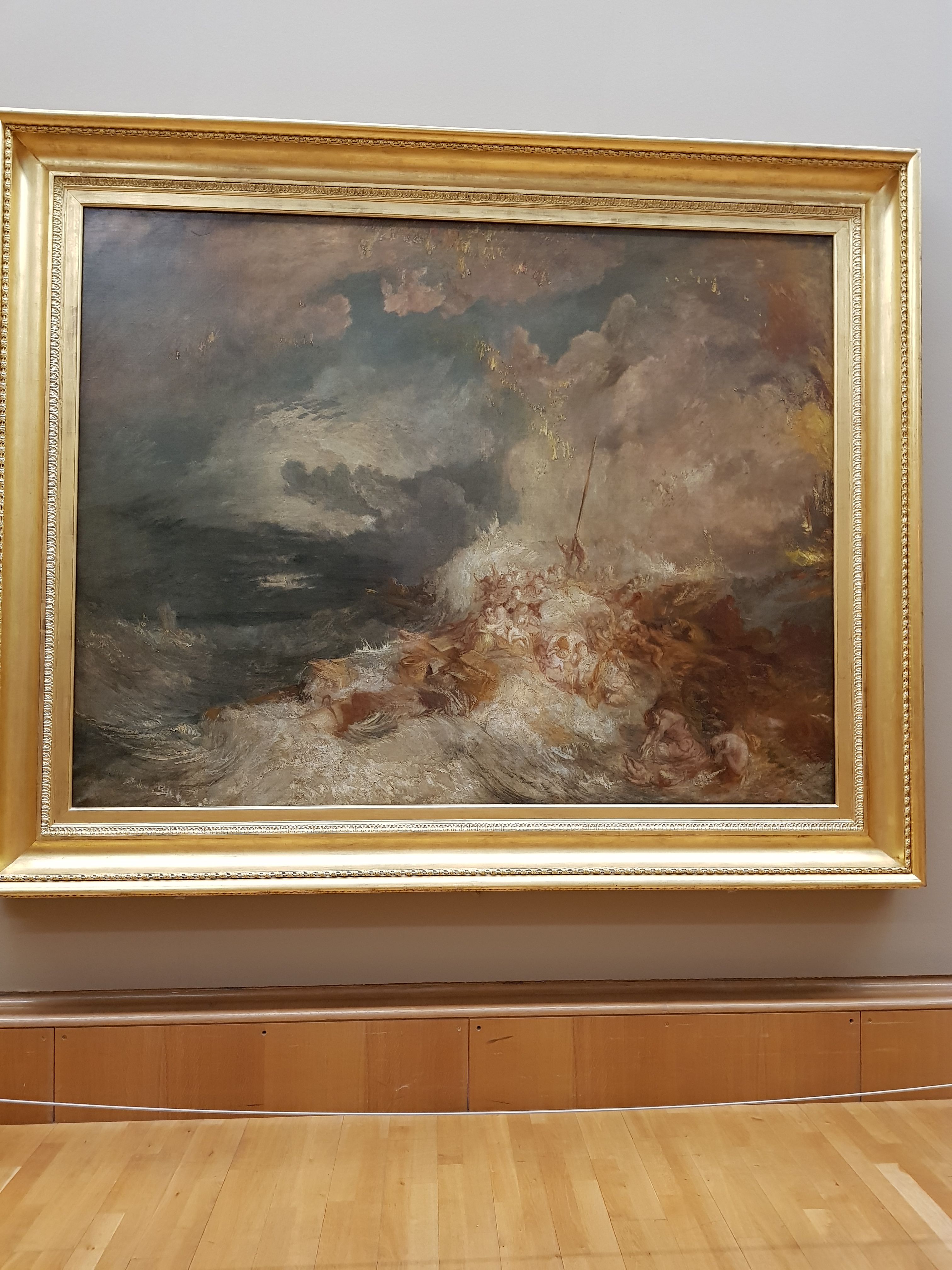 at Sea” (1835, left) is thought to be the scene of the wreck of the Amphitrite, off Boulogne, whose cargo was 108 female convicts and 12 children, abandoned to their fate by the captain. They were supposed to be going to Australia.
Finally, the most curious of all, Napoleon on St. Helena (right) after his defeat at the Battle of Waterloo in 1815. There he is in full military uniform, as we all imagine him, against a backdrop of 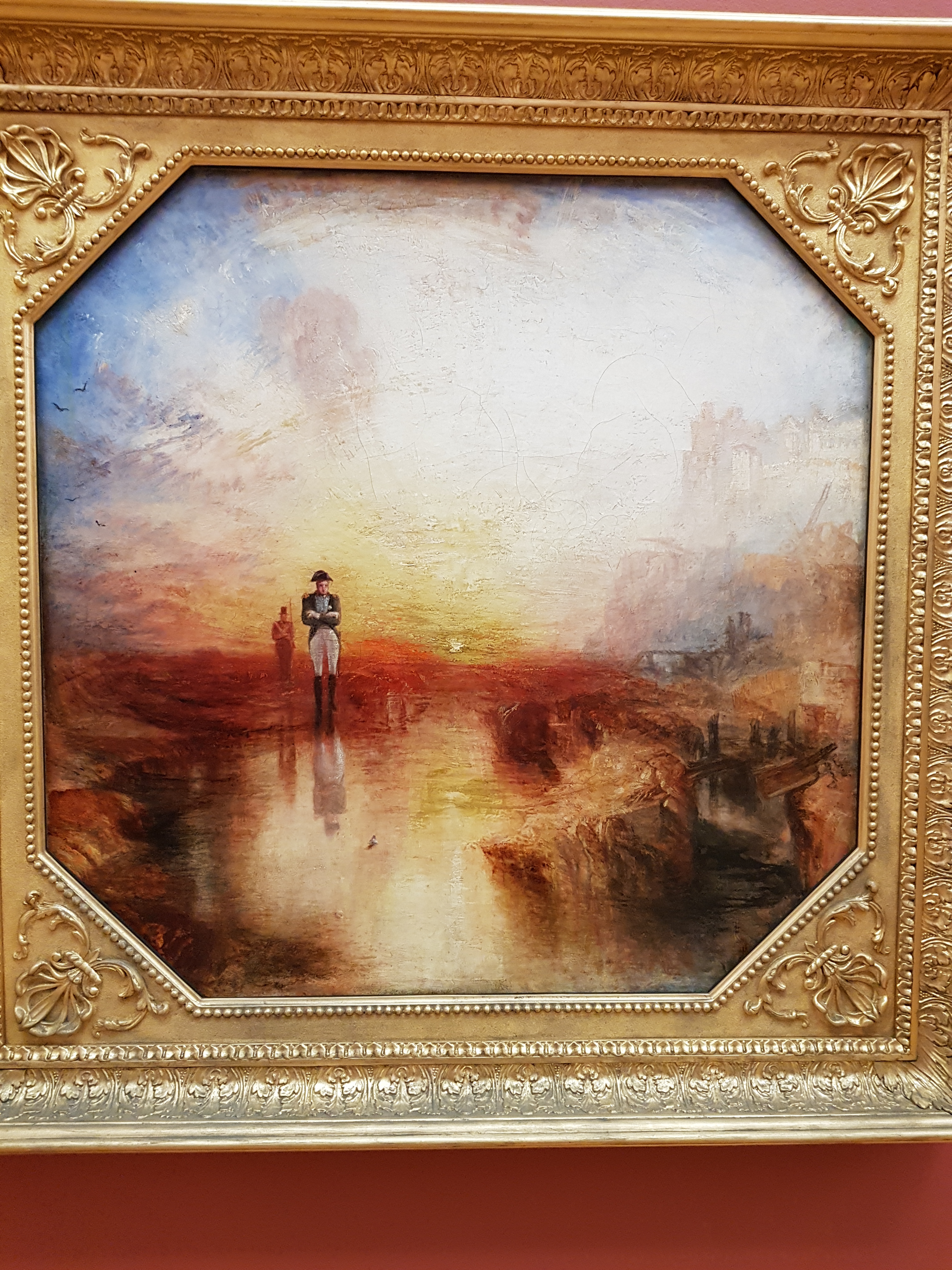 extraordinary colour created by an island sunset. Ah, the metaphors.
