Archive for the ‘Art’ Category
The High Art of the Low Countries
 Andrew Graham Dixon is back on form with his latest art history programme for the BBC, The High Art of the Low Countries (loosely, the Netherlands and Belgium). His forays into Sicilian cookery were dumbing down; but now he is back doing what he does best, telling the story of human development – bad or otherwise – through the art produced at the time.
Andrew Graham Dixon does what others tend not to do. He takes his time. He helps us to look at pictures. He guides us to the important symbols (fruit on the window ledge symbolising fertility, for example). In so doing, we not only learn how to read pictures, but learn how to use the pictures to understand the history they constitute.
The first episode discusses Jan Van Eyck, Hieronymus Bosch and Rogier van der Weyden.
Thursday evenings on BBC4: 2100
http://www.bbc.co.uk/programmes/b01rszrr
Picture: AGD with Ghent Altarpiece by Jan Van Eyck – BBC
Kate Windsor’s portrait
Filed under: Art, Royal Watching | Tags: Kate Windsor, royal portraiture
 Leave a comment
 The newly unveiled portrait of Kate Windor has proved to be quite a talking point. As usual with these matters. The subjects themselves are always delighted with the result. The Royal loyalists are always disappointed. The artists are castigated for being unfair; they present a distortion of reality, the true person.
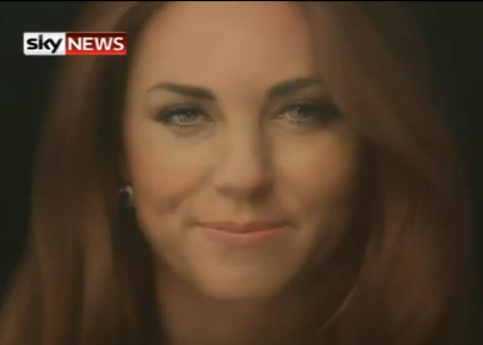 Whilst this new portrait is as near as a photograph one is likely to get, the comments remain that it makes her look old; or as the Sun newspaper put it, looking like Ian Botham, former England cricketer (cue opportunity to post a picture of Ian Botham onto the newspaper’s website). It is also the fault, it seems, of the National Portrait Gallery for promoting the use of photographs by artists. Also, bad choice of artist. In this case the artist – Paul Emsley – is very good at doing animals.
Mrs Windsor and her husband are, true to form, said to be absolutely delighted by it.
What is great about art, and particularly portraiture, is that we get an opportunity to see the sitter through the eyes of another. I’m no artist, but I have been a life model and seen many depictions of my own body; I was always fascinated at how different emphases, light, angle, colour, perspective, etc., impacted on the outcome. It is not for me to say whether the likeness was true. In this case, if the artist thinks Kate Windsor has bags under he eyes and and Ian Botham’s nose then she has. I was not there when she sat for the artist, nor have I seen the photographs that he used.
Artists are artists because they see what most of us do not see – or in Kate Windsor’s case – be allowed to see stripped of normal media management. If I had the opportunity to talk to Paul Emsley I would be inclined to say that I do not really like his portrait because I cannot see the point in hyper-reality. But even then, Emsley has subverted the perfection of the Kate Windsor fascade. That seems to be a problem for the ‘critics’. But that is the point of art.
Picture: screengrab, Sky News
University of Brighton degree show, 2012
This is always a great event with lots of excitement from students and visitors alike. It takes a lot of org anising with stress all round that is dissipated once the doors open. I sensed some conservatism this year, not least reflected in this work by Dean Mills (right). The flowers are fantastic; against the backdrop of an entirely different style in the form geometry, doubly so. These two familiar forms are both conservative and innovative at the same time.
  The work of Kate Longdon (left) uses colour to counter the pessimism in life and death cycles. There are the natural and human worlds, space and time in there somewhere.
So, next on my list of highlights is the work of Julia Arabadji. Arabadji provides the ‘glamour’. The picture (right) is stunning in the flesh, though I’m not so sure about those shoes. But the colours, contours and sheer si ze of the picture just say indulgence. There is real menace, however; the titles of Arabadji’s painting suggest that our woman is part of an undesirable set: Money Laundering, Euro up the Ass and Mind Games!
Next on the wow! list is a collage by Lucy Mazhari. Mazhari is a fine art printmaker. This one goes under the undistinguished title of Scroll #2. The cinemascope presentation gives it a voyeuristic quality  that means one has to look and look closely not to miss anything. It is so busy.
Then there is the work of Richard Willan. This was the spookiest piece. These Dalek-like creations are erected in a black space but investigate visitors as they e nter the cubicle. This investigation is accompanied by an appropriate noise. They could be friendly and they are made of familiar materials (mainly CDs). But anyone who has seen ‘Prometheus’ knows not to trust such unfamiliar ‘creatures’. The piece is called Auto-Form; unfortunately, I cannot upload my short video.
Finally, the conservativism and pessimism this year come out in the work of Jessica  Illsley. Three young women are depicted as the Dagenham Belles oil on canvas. Forgive my photography, but there is not much fun going on here.
Magritte at Tate Liverpool
This exhibition, The Pleasure Principle, has all the favourites – the bowler-hatted ordinary men raining down over the houses, the train coming through the fireplace, the pipe (the one that is not), the daylight darkness (the streetlights shine whilst the sky is bright and blue), the couple kissing shrouded from one another, etc.
In all, it took about 3 hours to go round the whole exhibition. To a painting, they are mostly familiar. One possible exception is the gallery with examples of his commercial work – artwork to advertise cigarettes, fashion, theatre and cinema posters. Some of the motifs are visible, but not quite so strident. Rarely was he political. Though he did depict the Belgian fascist leader, Léon Degrelle, looking into a handheld mirror (one of Magritte’s motifs) and seeing Adolf Hitler. And on only one occasion is a picture with a grey sky depicted; again a scene from the war.
Equally unfamiliar are the home movies that he made with his wife and other members of the surrealist movement in Brussels. Their playfulness is enchanting as they do strange things, using their bodies as objects for Magritte’s moving art (he was not a very good cameraman; reassuringly, the movies are no better than the ones I made on Super 8 when I was 10 years old).
http://www.tate.org.uk/liverpool/exhibitions/renemagritte/default.shtm
http://www.guardian.co.uk/artanddesign/2011/jun/10/rene-magritte-pleasure-principle-exhibition
Art
 However, the pearl in this series of programmes was Andrew Graham-Dixon’s The Art of Germany (following briskly on from his earlier The Art of Spain). This is what television should be about. Informative, energetic, watchable and imaginative. Well written, presented and produced, this was a gem of a series. He’s now doing some BBC4 documentaries about individual artists, the most recent being Vermeer.