Graduate Show, University of Brighton 2014
The graduate show always delights and infuriates in equal measure. Thematically, some portfolios are a shade generic, hackneyed, even. However, originality can be seen. As well as pure aesthetic beauty and delight.
 First, then, the originality. The work of Samuel Woodman, No Ark, seems to fit the bill.
  Here as part of a video loop, the animals as skeletons walk past us (left). And then us (right).
 Hannah Mary Kynoch’s work has originality in terms of subject matter. She has a thing about bathrooms, in particular student bathrooms. She uses colour to capture the fetid nature of student bathrooms. Green seems appropriate. More salubrious bathrooms have a lilac shade (left).
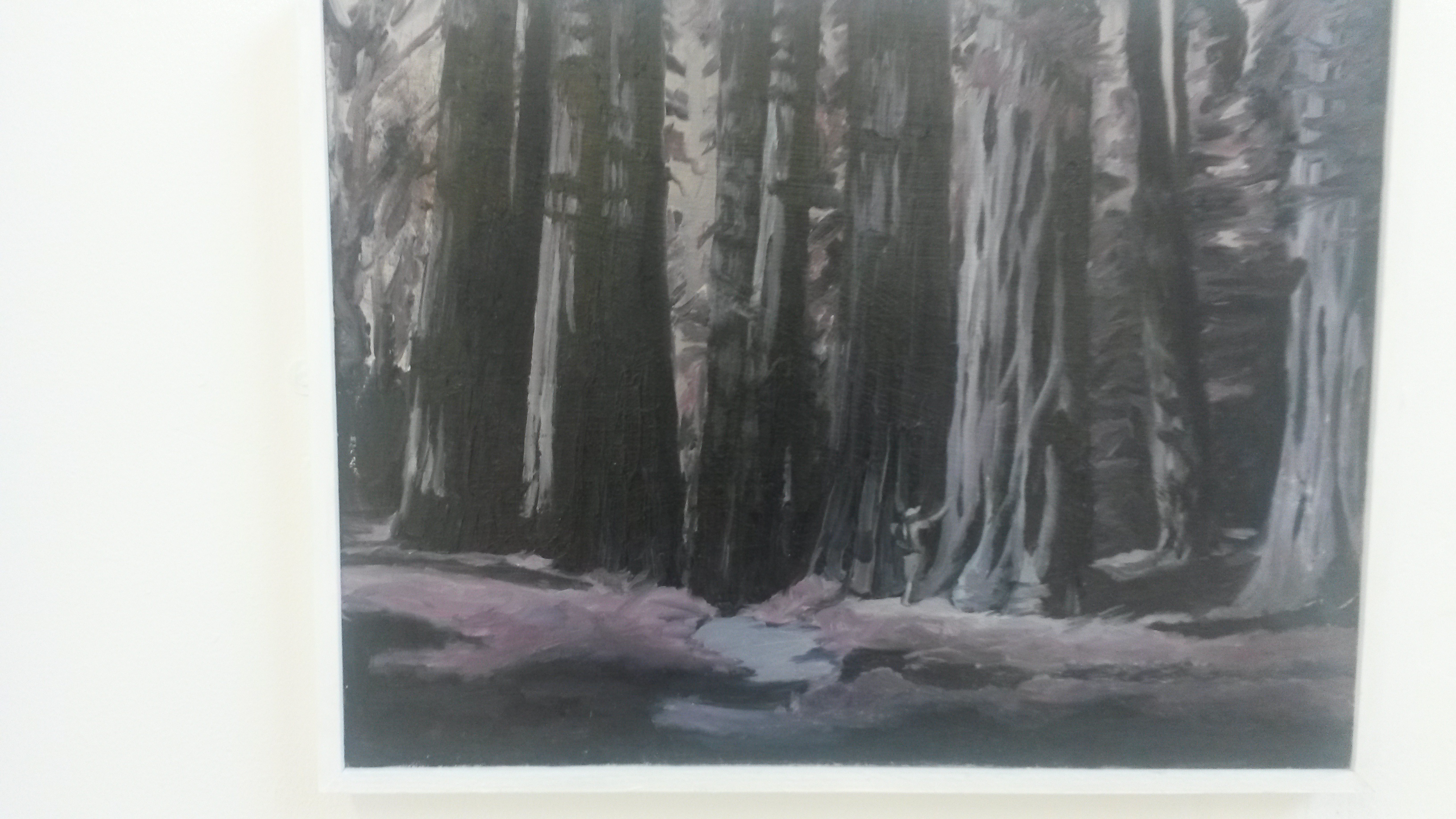
There is something this year about lilac and purple. I am seduced that by looking at the haunting forest scenes by Emily Hillier (Dark Trees, right), that lilac adds a bit of melancholy. It reminds me of the poems of Robert Frost.
 Wood features also in the work by William Wade (left). The wood this time is not forest, but rather wood found in urban settings, most particularly in parks in Brighton and Hove. At his stand at the exhibition are nice photographs of his very large works resting against their subjects saying ‘nice likeness’.
Next on my list was the striking portraiture by Charlie Schaffer. This is Dave. The creases in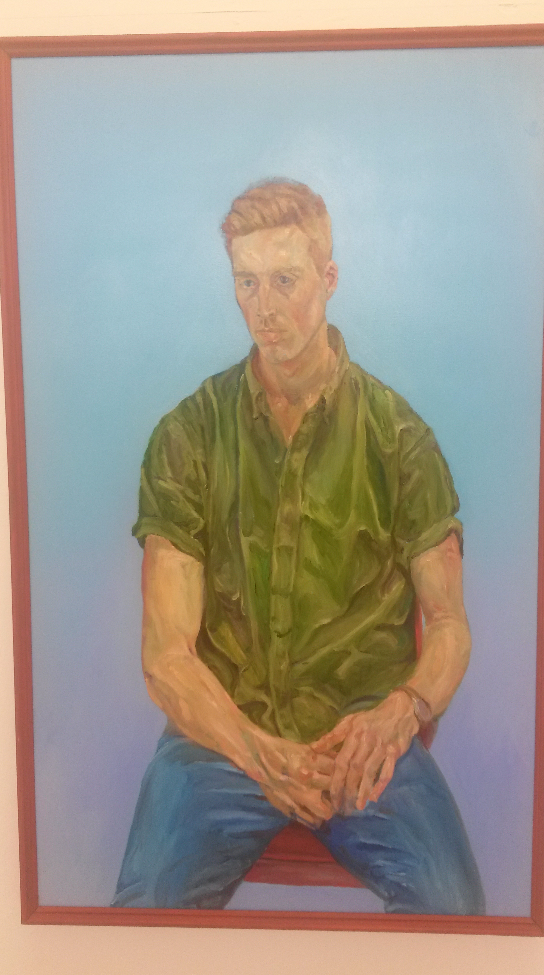 the clothes are juxtaposed with equally creased arms. There is a lot of primary colour in his work. I felt that I could actually talk to Dave, though I am not sure what we would talk about.
 There is one room that has the obligatory ‘explicit content’ note on the door. Often these rooms are a little disappointing. Often the work includes a lot of collage and does not, for those of us in mature years, have much to say. This year I found one portfolio that at least challenged my eyes. Emily Franklin presented a group of self-portraits, largely untitled (for example, left). These are large, colourful and ambiguous. Franklin’s explanatory panel is not too helpful in dealing with this.
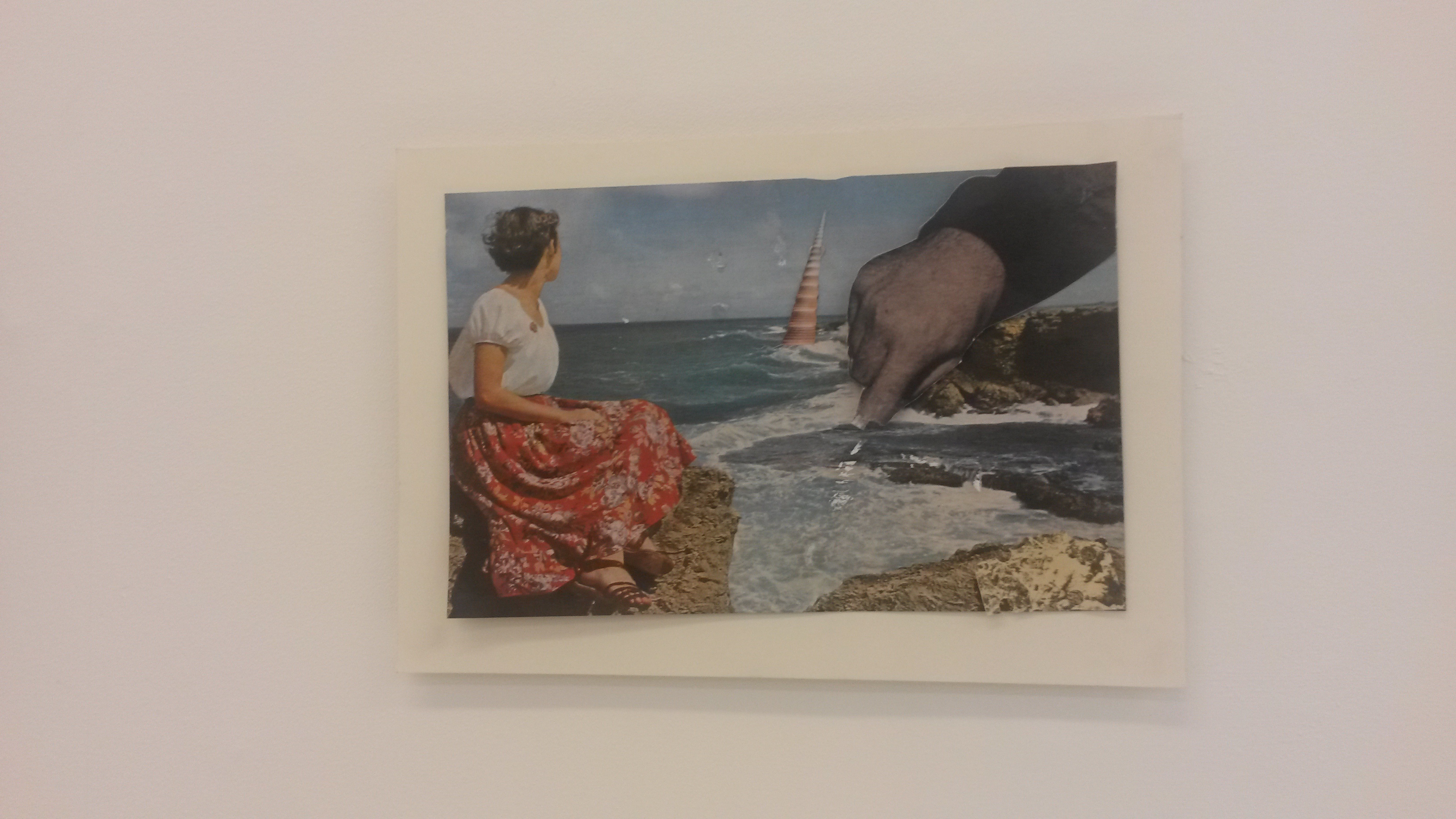
Rosie Hancock’s work has a disconcerting familiarity with it. Elements of the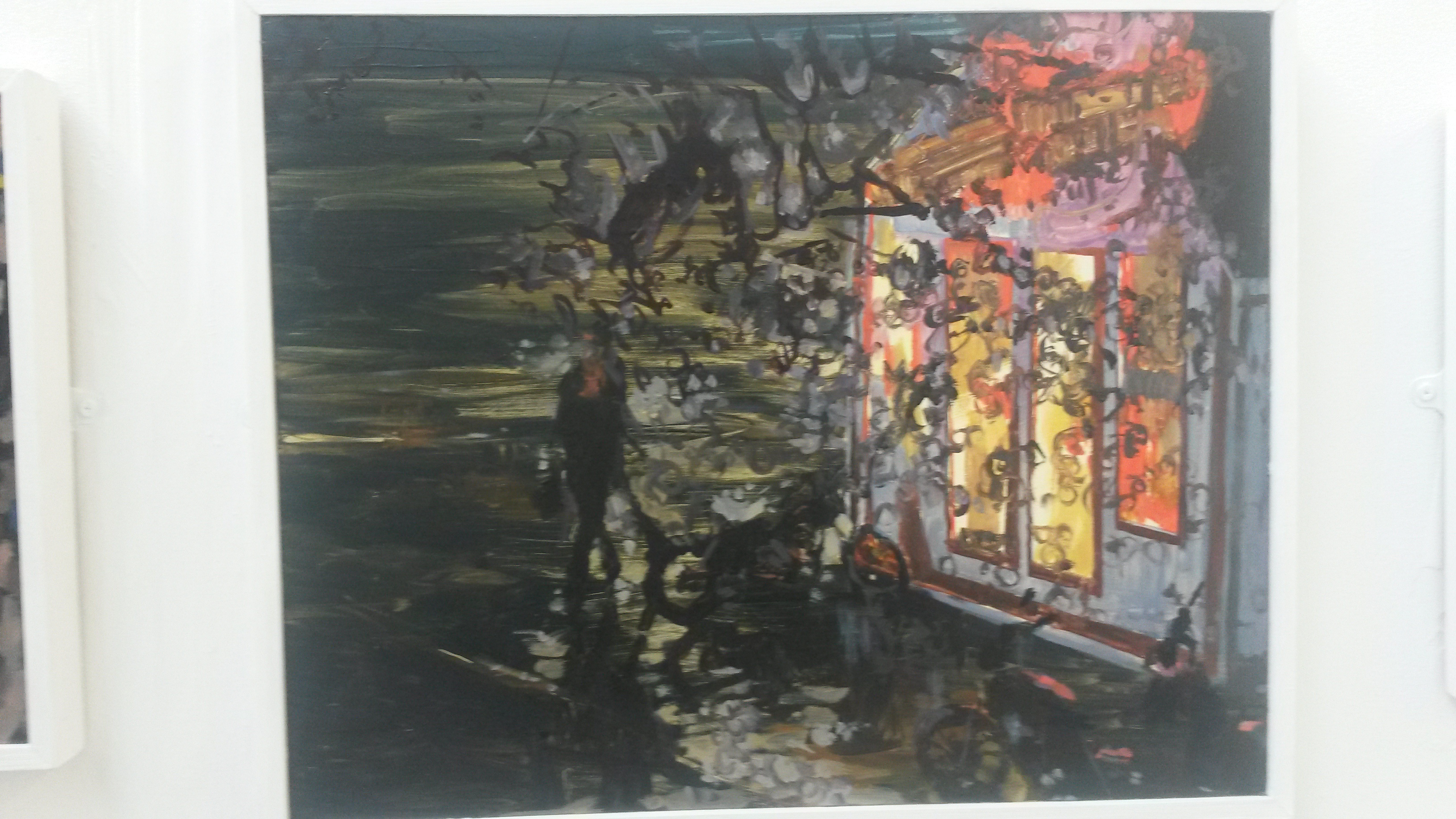 pictures have warmth, others menace. Put together, the pictures’ narratives need a bit of work by the viewer. The picture on the right has happy home feel about it; though the figure approaching is of indecipherable character?
 Sacha Pratt’s figurative work bears a certain ordinariness that is easy to recognise and feel at home with. I grew up in an industrial town. I think I know this place.
With art there is always room for romance. The portfolio from Francesca Salisbury was spot on. Using colour, visual  trickery and size, I fell in love immediately.
 Finally, I have a favourite postcard called “The idea of marriage never appealed”. The collage work of Mica McDonald is equally other worldly. And unlike most of the other pieces in the show, this is tiny (left).

Leave a comment