University of Brighton Graduate Show 2017 – Fine Art
I have gi ven quite a bit of attention this year to the 3-D objects. But the fine art remains the star attraction and it is fine indeed. As noted in my earlier post, I was a shade rushed, so my review is curtailed. Again, apologies to fine artists that I have not selected.
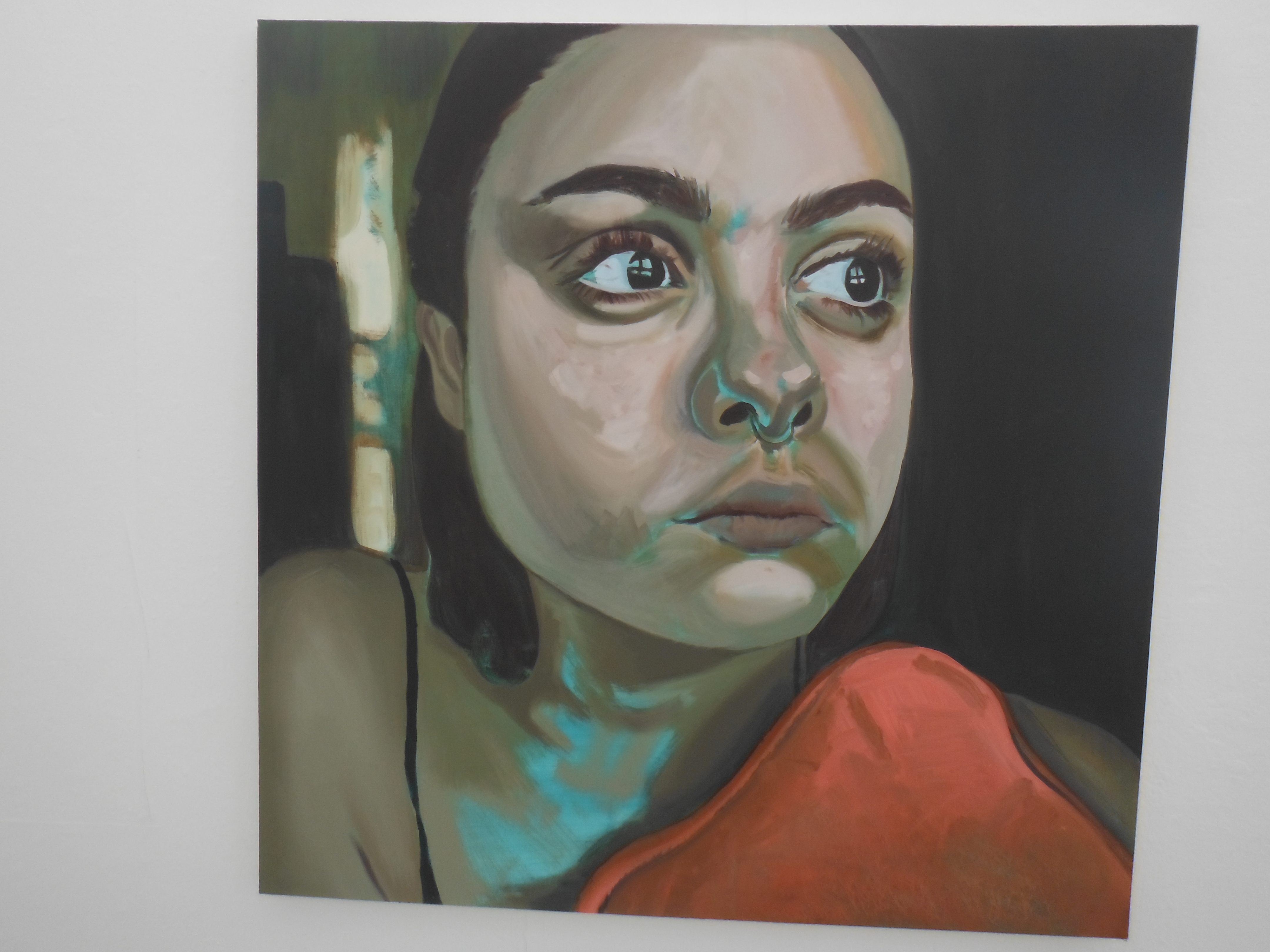
This year seems to me have been dominated by scale artwork. Big. There is also a good number of portraiture such as Jessica Zaydner’s work (above left). This is quite a face, despite its youth. There is something going on beyond the gaze, and I am not sure ho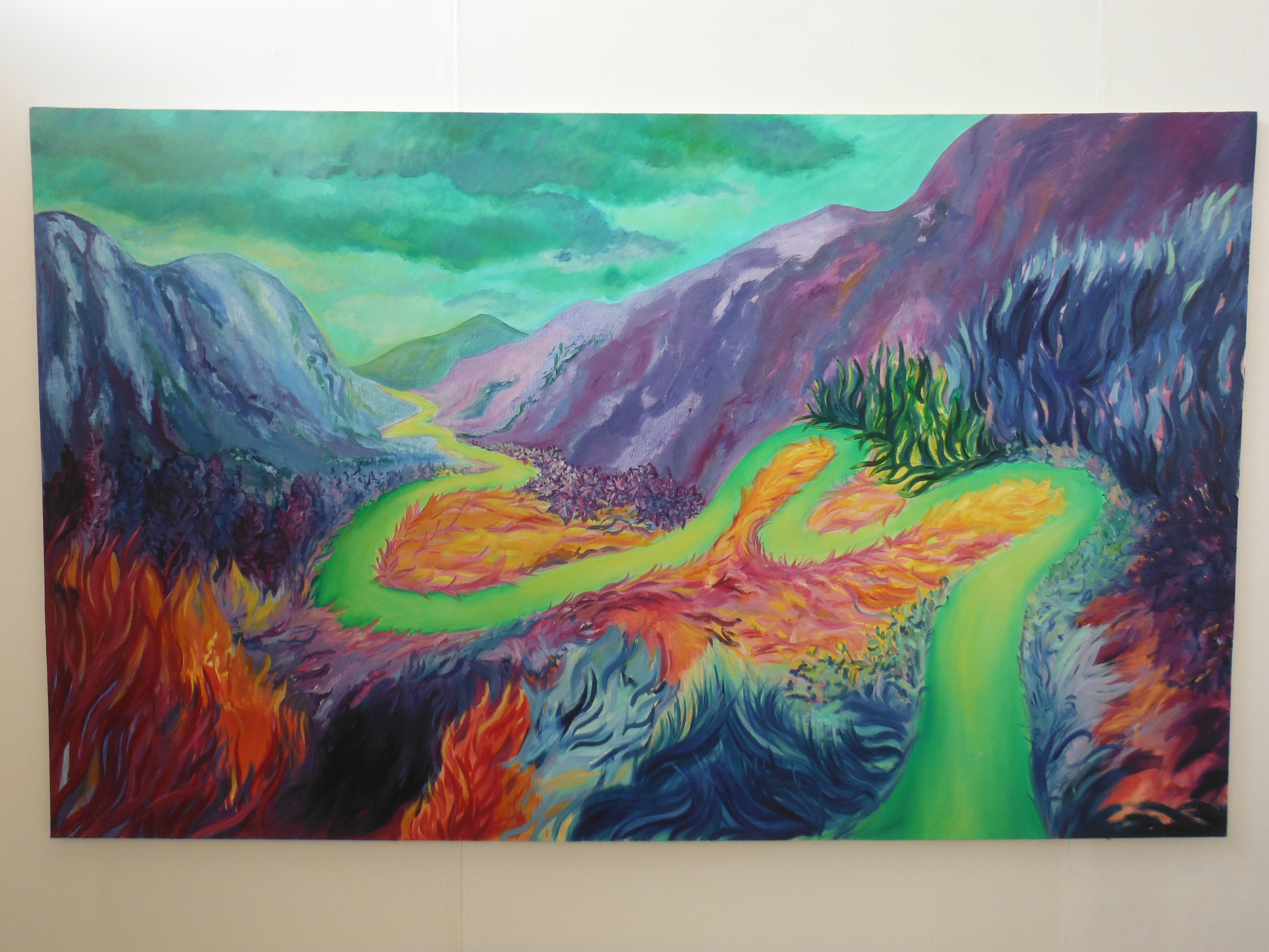 w good it is.
There is landscape as well, but not of the realist genre. The work of Bethany Carter is interesting here. Carter calls on influences from 1960s psychedelia to insist that we detach ourselves from our digital lives to think about the natural world. This psychedelic imagery spells out the interconnectivity between landscape and animals and what is natural anyway in the increasingly soiled environment “downtrodden” by human beings. Carter is asking a lot of questions in her work, not all of which I understand or agree with. But as a scale piece, A New Earth, works.
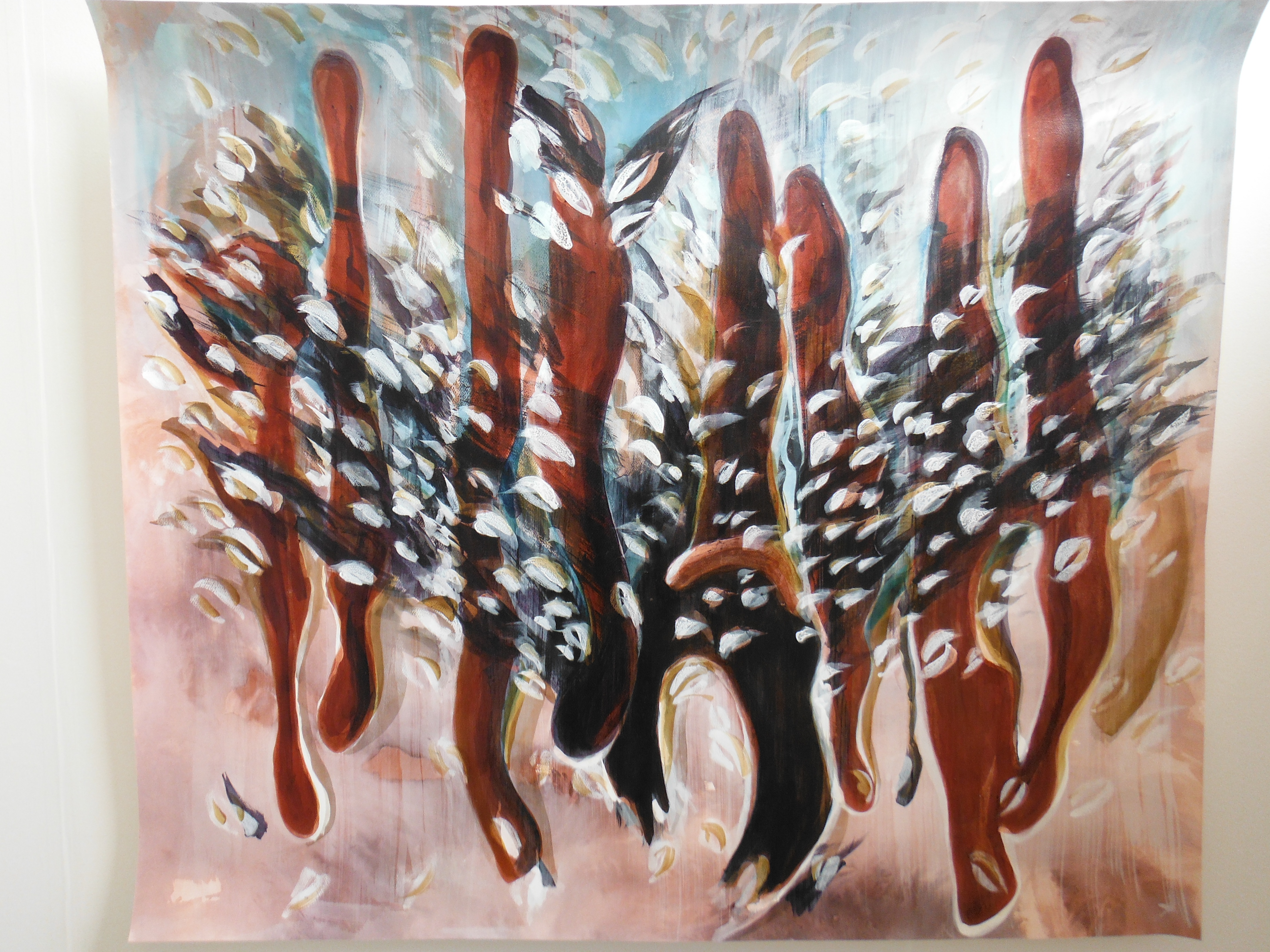
Next is the disconcerting work of Victoria Suvoroff (left). This piece belongs to her Phantasms show. Her work seeks to challenge gender’s social construction. The vehicle for doing this is to present body parts as phantasms (seen but not necessarily rooted in a physical reality). It is striking work.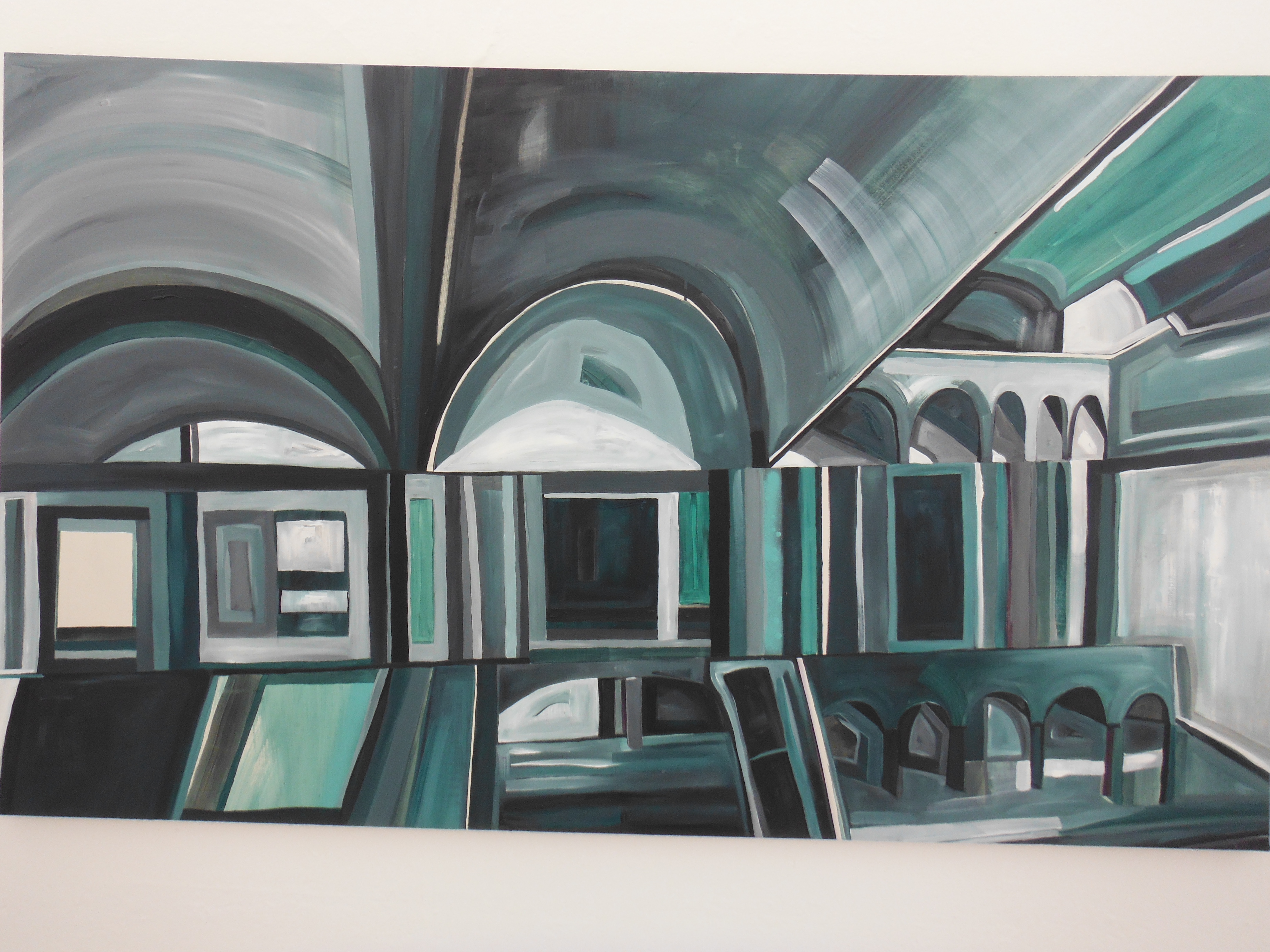
Emily Alice Garnham’s work I picked out because of its allusions to one of my own favourite artists, Paul Nash. Nash drew on his experience of war to paint is often disembodied figures. Garnham draws from urban landscapes.
Working from photographs the finished work is not a depiction of an existing cityscape. Rather it is the creation of what she calls “an original utopian scape”. The green hue alludes to the interaction between nature and concrete.

Lucia Hamlin (left) admits to grappling with being brought up as a catholic. She nicely brings together colour, history/archaeology and superstition. The history, it seems, tells us that extended craniums were often seen as belonging to gods or God-like figures. Sh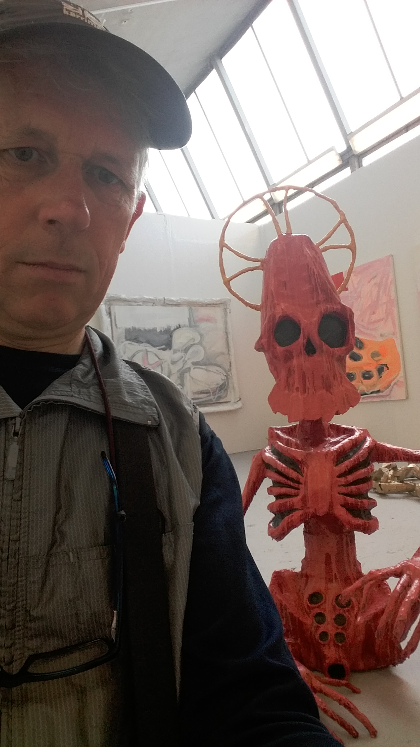 e makes her figures deliberately offensive and immature “as a dig at the narrow-mindedness of religion, and to put across the idea that God has stopped caring and is now mocking the obsceneness and immorality of modern humanity”. Hamlin’s work is on canvas and also as 3-D structure suitable for sharing a selfie (right).
Finally, my PhD many years ago was about railways in the UK. The logo for British Railways is a design classic. Two lines with arrows oppositely directed brilliantly captured the purpose of the railways, particularly in  its modernisation phase after WW2. An artist (whose name I could not find) has taken this logo and embedded it in something slightly bigger. I leave readers this year with the BR logo and the songbird (left). Naturally, my favourite piece.

Leave a comment