Archive for the ‘L&M’ Tag
Three killers together
Filed under: Cigarette advertising | Tags: Chesterfield, L&M, marlboro
 Leave a comment
 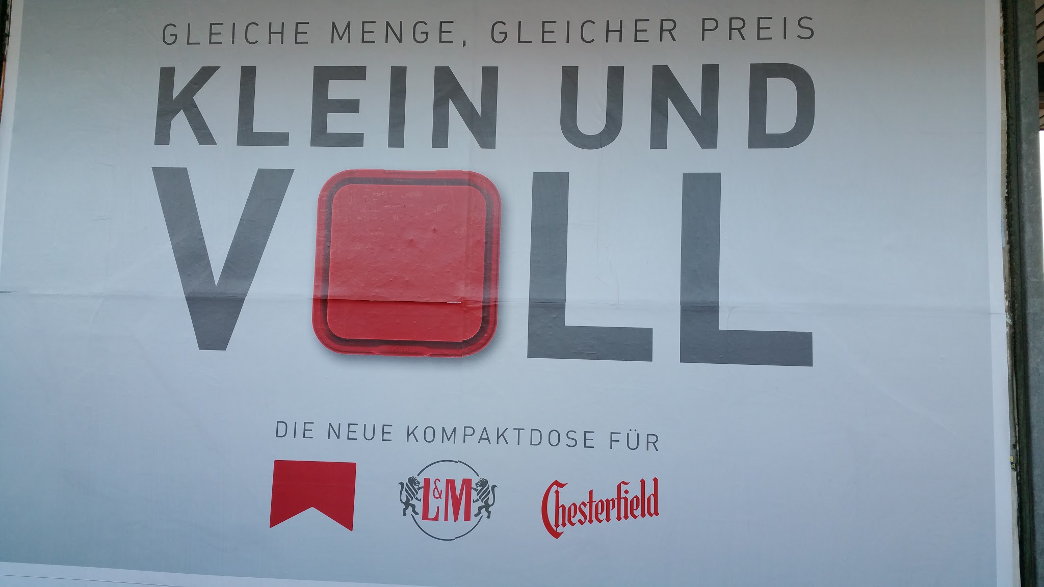 The three killer brands appear on the same billboard – Marlboro, L&M and Chesterfield. To what end?
Seemingly, they will now have the same box but with similar numbers of sticks. I assume this is something to do with European packaging regulations where two-thirds of the pack have to show the lethal side of the product rather than the brand. I need to check the packets in the shop.
L&M advise on home contents disposal
Filed under: Cigarette advertising, Uncategorized | Tags: L&M
Leave a comment  Well here is the latest L&M advertising masterpiece. Couple sat on the floor in a room with no furniture. An open fire and mantlepiece with a couple of glasses of wine on it have been sketched in using some insipid brown colour for some reason.
It looks to me that the couple have sold all of their possessions in order either to feed their nicotine habit or, as is more likely, they have some terminal illness which means possessions are superfluous. They fondly think about the good times before L&M.
L&M beach women
 The L&M brand is the summer winner in German cigarette advertising. Munich is blanketed with this idyllic image of four women enjoying the beach, two of whom are smoking. What can one say about the strapline? “Without extras and everything inclusive”, including chronic disease. Enjoy the peace and inclusivity whilst you can, I say.
L&M go green. Literally
 Not a great picture taken across a railway line at day break, but this poster is the only thing that appears green at the minute in Munich. L&M battle it out across that railway line with Pall Mall and Marlboro. Strapline rather curious: cigarettes for purists and delicious. In a way that asbestos in buildings is for purist architects, no doubt. Tödlich, as they say.
Few cigarette campaigns over Festive period
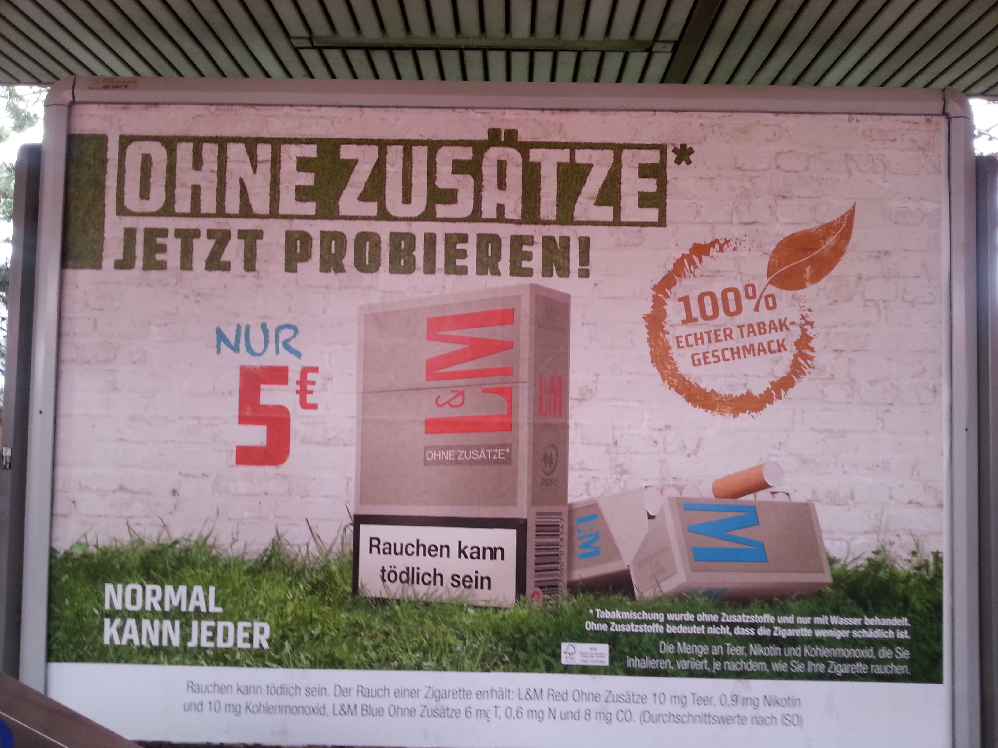
 In Germany the tobacco companies, I assume, do not try to compete with the more traditional Christmas advertisers – alcohol, mobile phones, chocolate – for expensive billboard space. The L&M brand, however, seems to have decided to be the smoke of the season promoted by this inspirational effort “5 Euro and more inside” (left). No frills, essentially.
The more, I assume, is the fact that there are 20 cigarettes inside the packet (other brands have fewer). But you get what you pay for, no doubt. In the case of cigarettes, conceivably, the no frills product offers the chance of death before Christmas. Not worth the billboard cost, if you ask me.
New crop of cigarette advertisements
Filed under: Cigarette advertising | Tags: Gauloises, John Player Special, L&M, Lucky Strike
Leave a comment  Cigarette advertisers have finally launched their summer campaigns. Four are now visible on the streets of Munich. Galloises (pictured left), L&M (below right), John Player Special (below left) and Lucky Strike (below right).
The new Galloises campaign is not new at all. It continues to align smoking with the good urban – Parisien – life. Like its predecessor (see post 5 June 2012) there is leisure, urban greenery and attractive young people. Only one of them smokes. The emphasis continues with the ‘natural’ sense of the product and that it is without additives.
 Meanwhile, the L&M brand pursues two distinct approaches. First, and similar to Galloises, the natural line (right). The greenery is there, there are no additives, the packaging is recycled. Surely one should try them? Compelling, don’t you think?
 However, that may not be compelling enough. So, in parallel, L&M have the good value approach (left). A big choice and a good price. Presumably these do have additives at no extra cost?
John Player Special continues with the ‘Just Free’ theme. Previously in this campaign, three young people stride forward from the shackles of ordinary life towards cancer (see post 23 March 2013). The latest edition has a lone young man jumping over these exact same shackles.
 And not to be outdone – or maybe an afterthought – women can jump over them, too.
A winning campaign if you ask me.
And finally, Lucky Strike. What is going on here (right)?
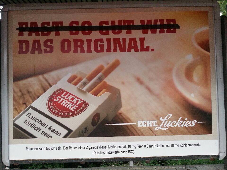
 The strapline reads – assuming my translation works again – Almost as good as the original – with the ‘almost as good as’ struck out. Luckily, no doubt.
There are two more in this series – ‘taste the difference’ (left) and ‘taste is everything’ (right). In advertising terms, it is a bit of a mystery how these are  supposed to achieve customers. Is it something about making the viewer work a little to get the point? Or is it that they are seen to be clever?
Echt! As they say.
